A hearty Thank You!

You're invited!!  We are throwing a little party here on StyleMutt Home.  Nope, we're not poppin' the champagne a tad early on our 6 month birthday, we are celebrating you!

You guys!
THANK YOU!!!

When we sat down on September 19, 2014 for our first official business meeting, (NOT in a hot-tub), we were in a frenzy of excitement. We had high hopes and dreams for StyleMutt Home and couldn't wait to get rollin'. But there's always that little voice of reality that holds those expectations in check and keeps our feet on the ground. We were confident in what StyleMutt Home could be, but had no certainty it would get there in a timely manner, if ever.

And now, nearly 6 months later, we are just blown away by what you have made us! Not only has StyleMutt Home become what we dreamed it to be, it's better than we had imagined because of you! You have overwhelmed us with encouragement  on Instagram, sent us such supportive emails, and most importantly blown us away with your unique input to StyleMutt Home.  

This blog is not about two people; it's grown into this amazing community which we are so grateful for!  Our desire from the beginning was that this be an inspirational, informative DIY and Home Decor resource; a place for others to come and gather ideas, tips and tricks for their own home projects.  We just didn't anticipate how much of a blessing it would be to get to know you all through this cozy spot in the great world wide web!

We've been so showered with your support and encouragement that this post is difficult to write! You have blessed us beyond what our words can express.  So we'll just have to show you how we feel...

Blogging 101: 
Every blog needs it's own cute mascot.

15.jpg

Check.


We just wanted to drop by today to tell you how much we so appreciate you all. We'd much rather invite you all over and throw down, but since our guest list would span the globe (!!!), we've got the next best thing: A GIVEAWAY!!! Whoop, whoop! 

Deets on that juicy news will be up tomorrow, so stay tuned!


An Educational Guide to Vintage Chart Hacks

Guys, I have another completed furniture flip bucket list item to share!  Believe me, I am as surprised as you are - this is the first time I have ever been this intentional with my New Year's resolutions and I have you all to thank for it!  Seriously, without the accountability of sharing my intentions with you, I would still be piddling around the thrift store.  This new level of productivity is madness, I tell you, madness!  

Not only does this post mark the second completed item, but I actually have 2 more on deck.  Can you guess which ones will be crossed off next?  

Ok before we begin, let's take a look out our muse: the vintage pull-down chart

Source: Mighty Vintage

Source: Mighty Vintage

Oh $400 Rose Cherry Botanical Chart  - why must you elude me so?  In all fairness, this is a particularly rare print which is why it's up-there in price.  But still, I can't be shelling out $200 a pop to feed my pull-down chart obsession!  So as I like to say: if you can't join 'em...

HACK em'

Keeping with the schoolhouse theme of the vintage educational charts,  I thought we could grade my findings on the following scale: printing, color quality, size options, and of course...cost.  First up: inverse engineer prints.

Printing: on paper at Staples

Color Quality: none

Sizes:

18"x 24"
24" x 36"
36" x 48"

Cost: $2-$8 engineer print + framing supplies


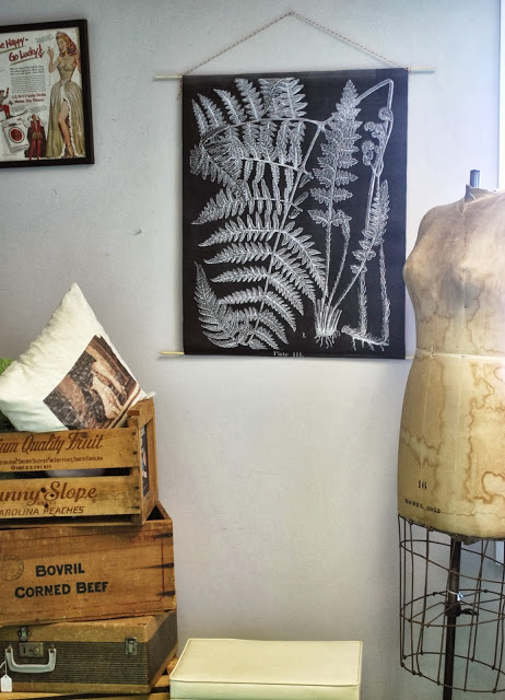
Since engineer prints are stuck being black and white, why not mix it up a little by printing one that's got a black background with a white design?

Teacher's Notes: This hack does not fulfill the "In Color" portion of the assignment.  But at least has some cool factor and the dark background is very on-trend with vintage charts.  Overall Rating: C+

Nothing to really take home and put on the fridge (based on this assignment) so moving on.


Print.png

Printing: On poster paper at Staples     

Color Quality: High         

Sizes:

11.3” X 17.3”
18” x 24”
24” x 36” 

Cost: $20-$36 for printing + shipping + framing supplies 

I uploaded this Free Lavender Botanical Printable from the Graphics Fairy to Staples online print site and found that ordering a poster takes you through this fun little preview tool.

Teacher's Notes: You’ll want to find a high-quality graphic that works with the limited dimension options because (as I've found) cutting the poster paper curls the edges.  Overall Rating:  B


Chartify 2.png

Printing: None required 

Color Quality: High

Sizes: Various     

Cost: Varies with poster size + shipping +  framing supplies


Buy a poster to chartify like Chris Loves Julia did in their Greta's Butterflies Post.  They get extra credit for the added card catalog label!  Nice touch you two.  Like their look? You can buy this Butterfly Specimen Chart for $24 at Urban Outfitters. They have a wide selection of posters that range from botanicals and quirky quotes to moon phases and maps.  You can easily stick to the vintage educational chart look or veer into more modern wall art piece. 

Teacher's Notes: Yes, there are endless poster possibilities for sale, but you're missing the image-customization factor because you're stuck with what you can get for market value.  Overall Rating:  B+


Printing: On paper at Staples

Color Quality: None

Sizes:

18” x 24”
24” x  36”
36” x 48”

Cost: $2-$8 engineer print + coloring supplies + framing supplies 

Source: Scout and Whistle

Source: Scout and Whistle

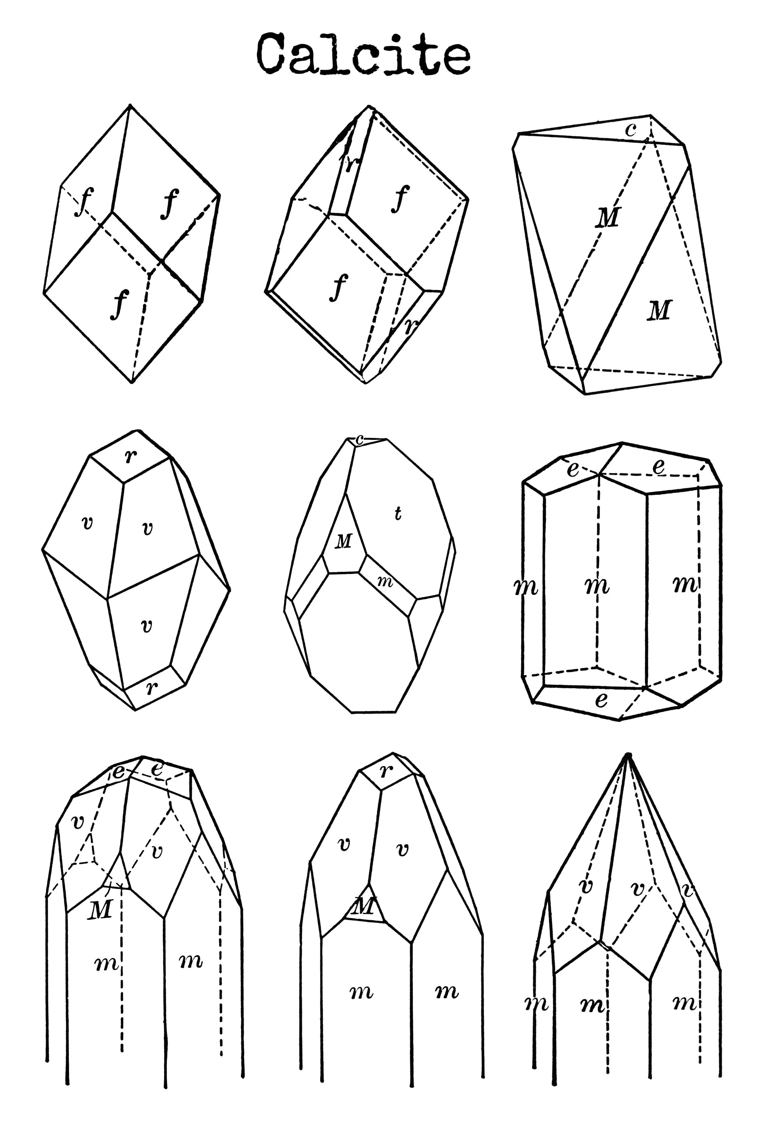
So I've been drooling over this Gem and Crystal Print from Scout and Whistle for a while now.  I just wish it was a better price for it's petite size.  So this got me thinking... couldn't you just make like 2nd grader and color in the lines or your own black-and-white engineer print?

I rendered my own mineral coloring page to show you. The facets make it so easy to color block your way to a kick a** chart.

Teacher's Notes: Although it's not a glamorous a solution, it could have really fun results!  Give it to the kids as a giant coloring page and get a one-of-a-kind art project!  Overall Rating: A- 


Printing: On vinyl at Staples

Color Quality: High

Sizes:

19.2” x 36”
30” x 48”
30” x 72”
30” x 96” 

Cost: $20-$67 printing + shipping + framing supplies 

Vintage charts are printed on more of a fabric material than paper anyways.  So the suppleness of vinyl is a natural step in the right direction.  In fact, the pull-down charts in my elementary school were made of vinyl so why not adapt a banner to our needs? 

Thank you Staples preview image, but we're not going for the display-table-at-an-expo look.  But retro-fitting the banner with the wooden framing strips looks lovely!


Teacher's Notes: Decent price for such large results.  Plus the material makes it actually feel like a pull down chart!  Overall Rating: A+


There you have it!  My personal winner is the vinyl banner route.  I actually scored a Staples printing sale and ordered my 19.2" x 30" for only $15.  Adding in the wood for my frame brought that total to about $24 - and it's so much more durable than the paper!  

If course after I handed in my findings I stumbled up on this on the Staples printing website:

Labeled 2.png

I haven't tried it yet, but I'll report back to you if I do.  And if you've done your own research for a colored pull-down hack and have a different take on these findings, please share with the class!

Reader Design: Shima's Clever Re-design

Hi friends! As promised, we're serving up another hot Reader Design on this long-awaited Friday! Last week Cate mentioned we'd be cutting Reader Designs down to one a week - a fun Friday Special to kick off the weekend! This gives these special posts some breathing room and allows readers, (and us), to thoroughly enjoy and be jealous of each one. :) 

You can find all our Reader Designs on our SPACES page - as you can tell, we've got quite a range of styles already! Thinkin about sharing your own? Mull no more! Reader Designs are an open invitation to share your unique design and creativity.  There are no requirements to be a professional decorator or even a fellow blogger. The purpose of Reader Designs is simply to share incredible rooms with fresh ideas and document these features in our SPACES section to use as a reference of inspiration.

Shima1.jpg

This Reader Design is certainly near to our hearts as Shima is from our neck of the woods! She's an interior designer serving the DC/MD/VA metropolitan area, and worked her magic on this gorgeous living room update! 

From Shima:

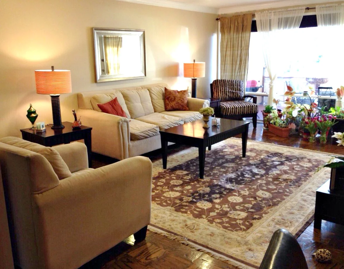
"My client wanted to update her living room as her existing furniture was not comfortable. She desired new sofas and chairs (especially a grey colored sofa), and wanted to keep her existing mirror, side tables, coffee table, and beautiful rug."

What a fantastic Before shot! Usually Befores are so utterly detestable that you imagine even the slightest bit of work would be a huge improvement! This room has great bones already! But we can't stop here. :)

Before: 0 After: 923,497,190

"The first thing we did was find a sofa that she liked, and we found this great sofa from Macy's that was comfortable and firm to sit on. Then we had a fun shopping trip to Home Goods where we picked out the arm chair, 2 high back chairs, and other decor items. She liked the color turquoise so I made that the accent color."

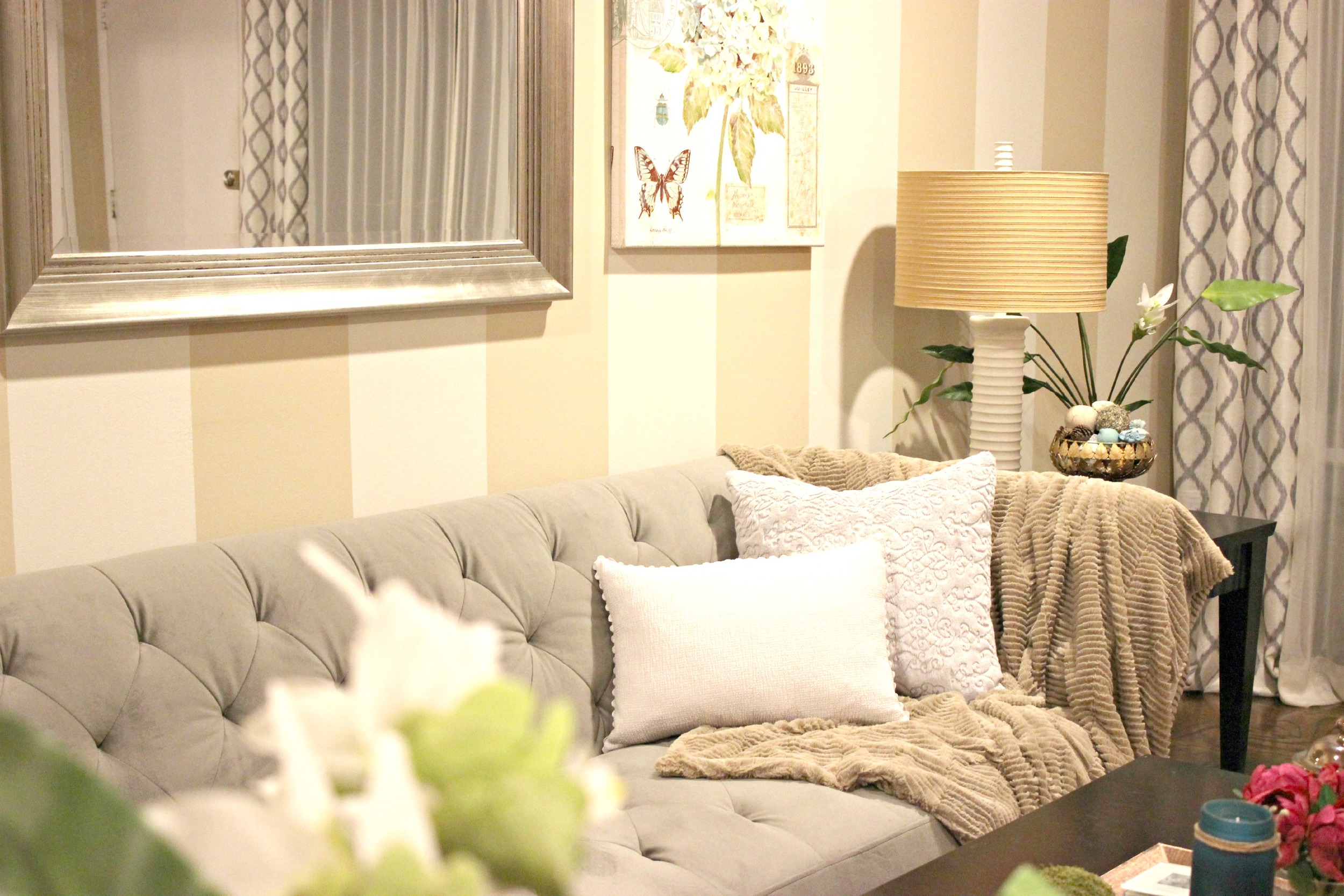
"The entire house was painted in this beige color, so what I did next was simply add vertical stripes.  Since the wall was very long and bare, this helped to dress it up.  I used Behr Paint, Marquee line, and the color is "varnished ivory" . Once the walls were painted, we had used the leftover paint for the lamp bases, bowl, and plant vases. These were also coated with a sealer. The main reason for painting these items was that they were dark brown and I thought the room had too much brown in it; I really wanted to lighten the look of the room. "

A personal favorite here at StyleMutt Home, too!

"Even though the main accent color is turquoise, I think it's nice to have the pops of fuchsia in there so that the eye does not get tired with the colors. I found this perfect artwork from Home Goods that had turquoise in it, along with a cute candle and fuchsia flowers.  I found vase fillers that had turqoise in them. I used the vase fillers to decorate the coffee tray (3 green moss colored balls) as well as fill a bowl for the side table."

"Since we had a grey sofa with a very strong shape to it, I wanted to soften it up with a chenille faux fur throw over one of the arms-- this also provided a nice texture and tied in the brown color of the throw with other browns (such as in the rug) so it tied it all together. "

That spot. Right there.

"Lastly, we bought the patterned curtains from Home Goods and worked on the ottomans.  My client already had two unused ottomans (also dark brown!). I went to the fabric store and found left over fabric marked down 75% and used that to reupholster the ottomans. I used only scissors and a staple gun. It was a fun project! The ottomans can be stowed under the coffee table when not used and they add a fun pattern that coordinates with the other grey colors in the room. 

All of these DIY updates to the existing items saved my client a lot of money (which was one of her objectives!) and gave these items new life and purpose."

Talk about upgrade! This makeover is nothing short of impressive, but it's especially inspiring given the number of items that were kept and reused! We often talk about working within budget here and it's amazing to see how others creatively stretch theirs. 

What a blessing this was to your client, Shima! Way to work it out, girl! You can follow Shima's brilliant work @house_of_shima on Instagram!

Have a wonderful weekend friends and thank you for stopping by!

Don't forget to share your own unique space with us by tagging #stylemuttspaces on Instagram or share photos directly to our Facebook wall!