Reader Design: Lauren's New Build Nest

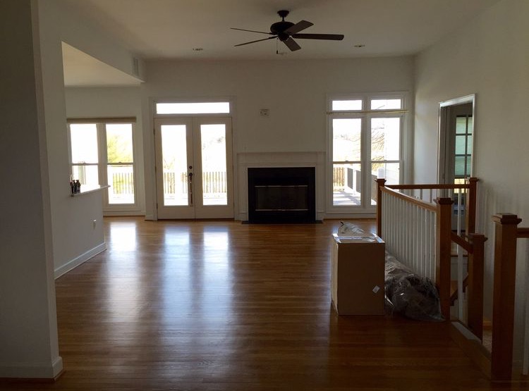
Lauren's home may only be 18 months old, but it's filled with a sense of warmth and character that can only be attributed to Lauren's eye for design. The home was built on Napoleon, Indiana soil that grew corn and beans for harvest, and those same down-to-earth roots can be felt throughout this home. 

From Lauren:

I love to create and recently found this passion for interior design through creating our spaces here in this new home. My husband and I both grew up here in Indiana, so even though there are many different style running throughout our home, we try to keep the bones of our home as the farmhouse we intended it to be, making this house our home!

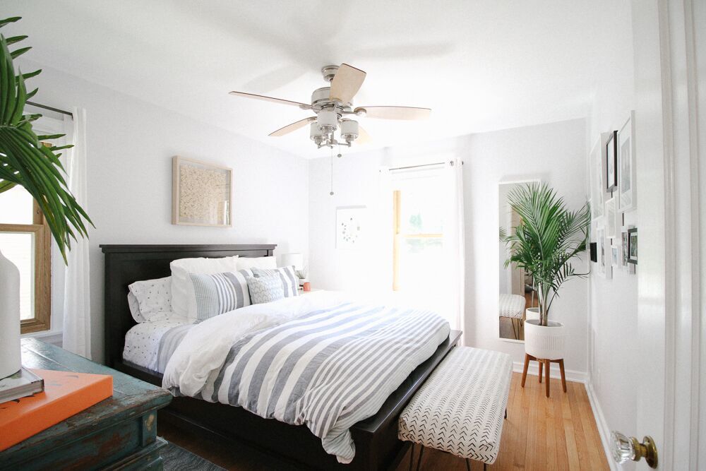
This home is where Lauren and her husband are raising their three boys, so this home is playing the most important role there is. The oldest just moved into his own room - there are exciting things happening in this household!

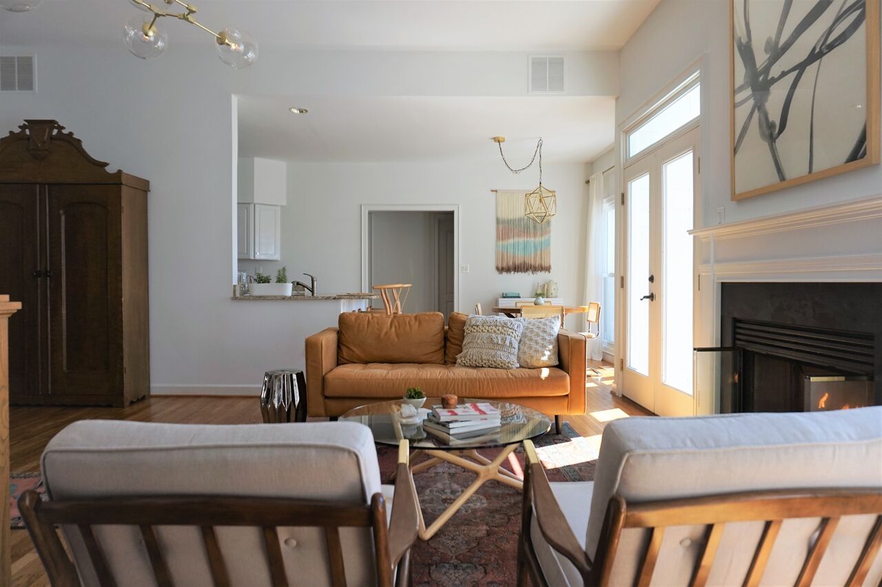
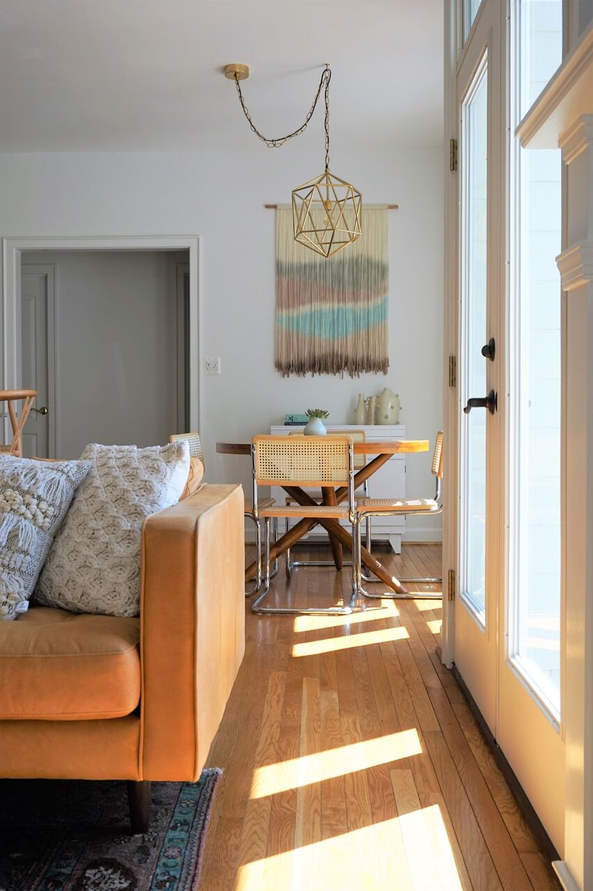
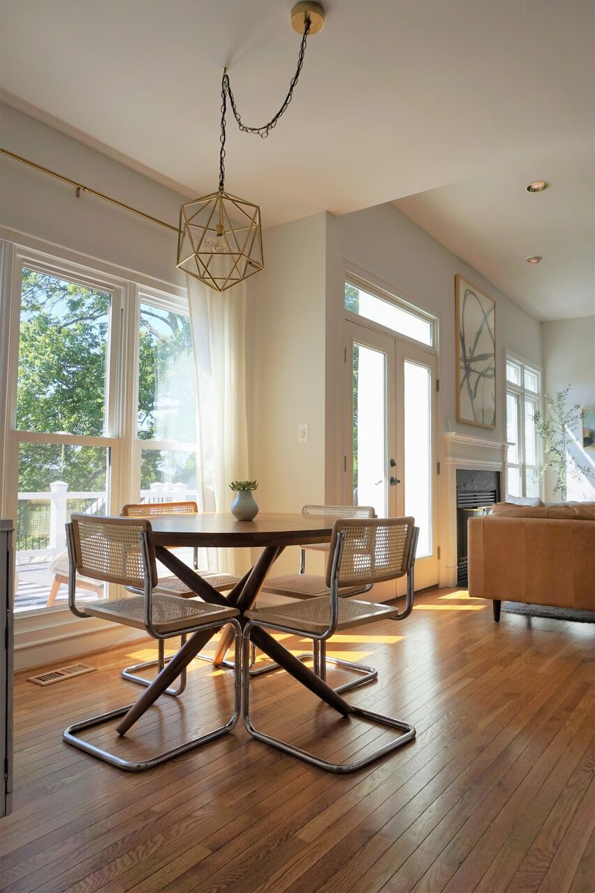
Her favorite piece is in the dining room: the geometric Ikea statement rug. Lauren has moved it around her home a few times before finding the perfect spot! 


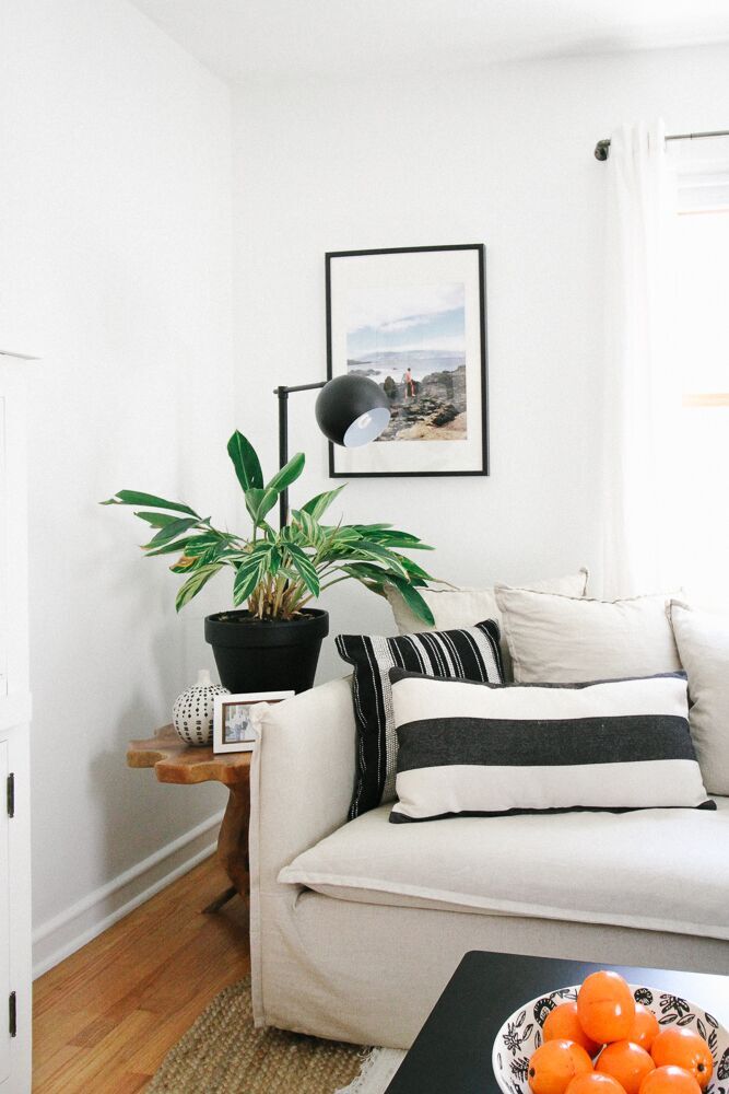
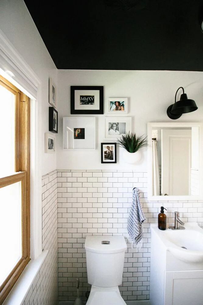
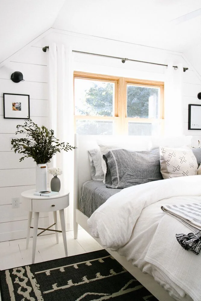
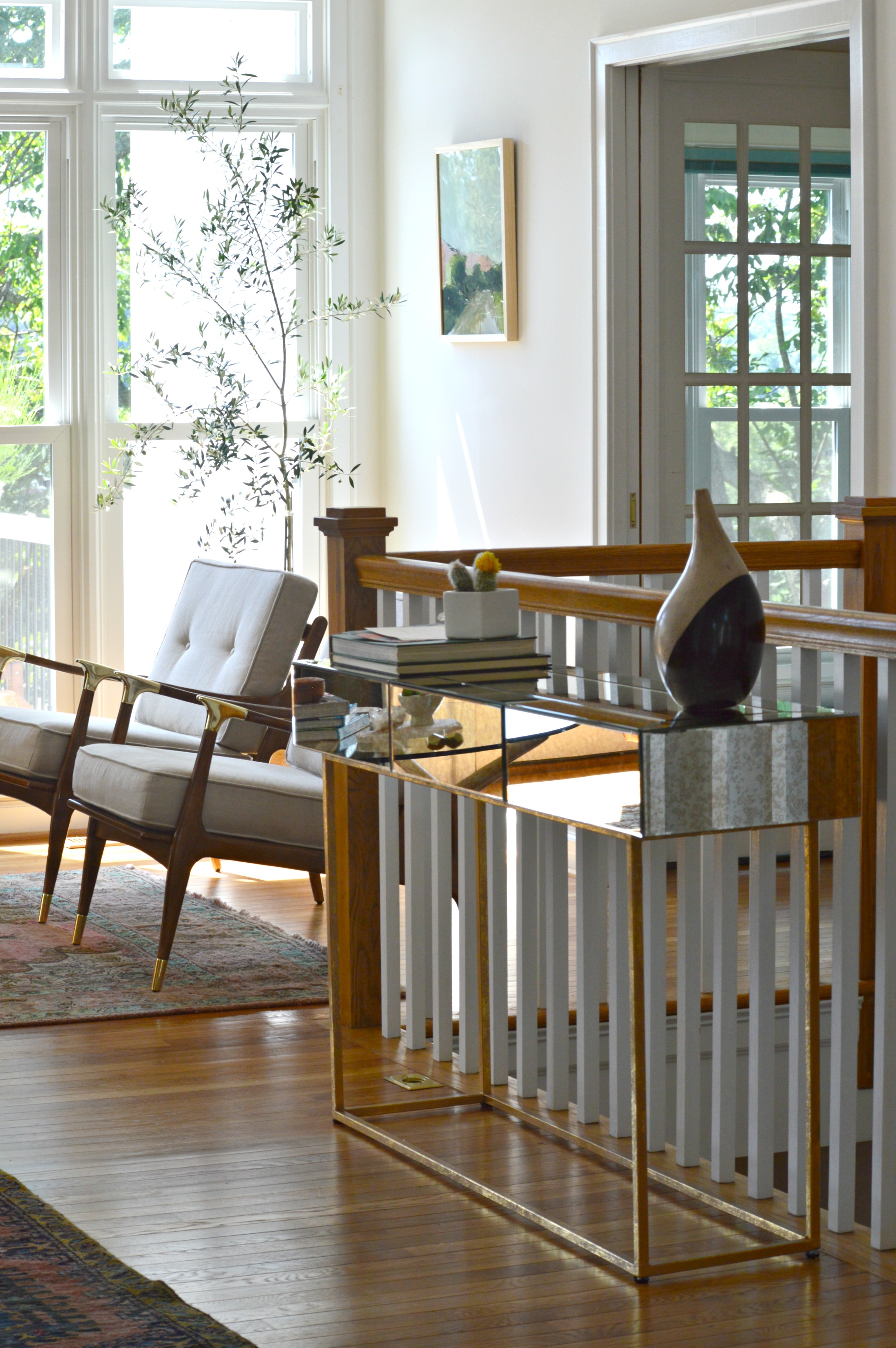
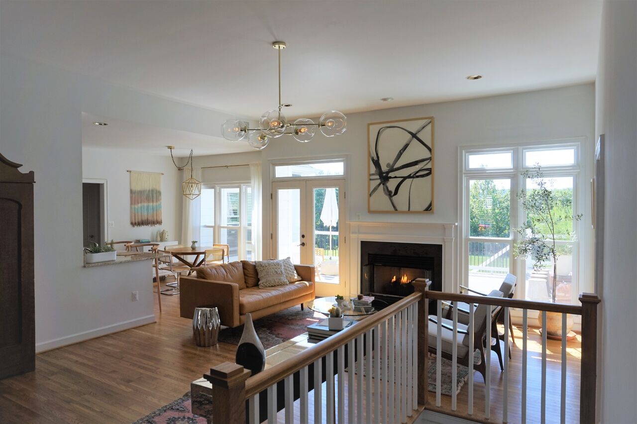
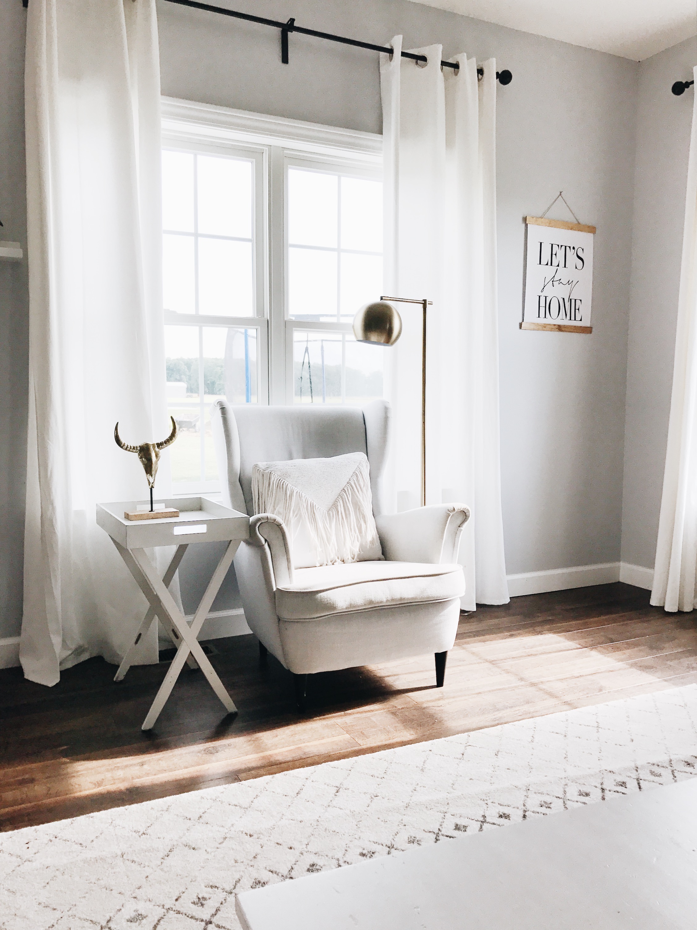
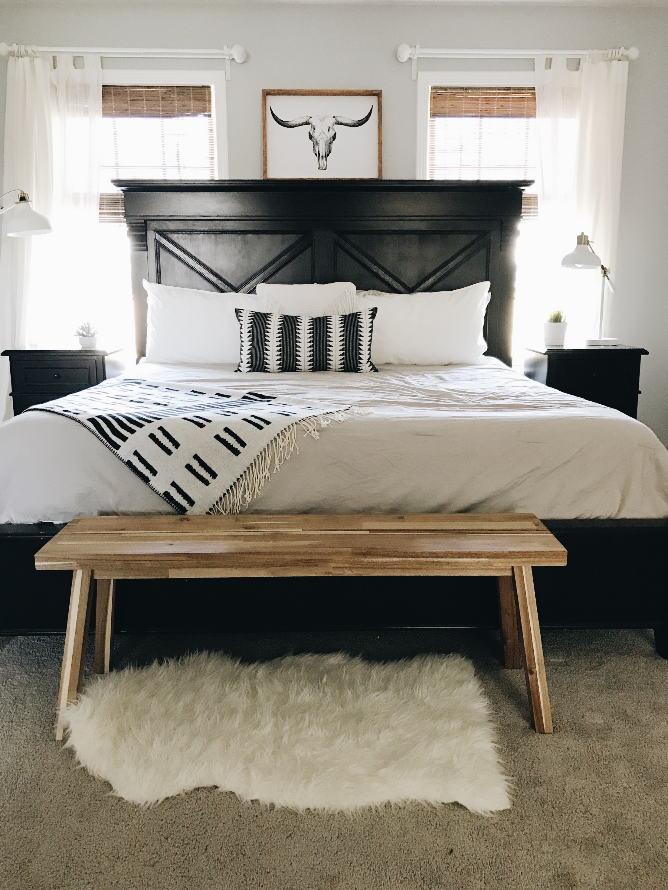
Lauren describes her style as 'farmhouse eclectic,' with a heavy emphasis on wood, black, and white. It's modern, with bohemian elements, 

I always try to create calm and peaceful spaces in our home. It’s important to me to have spaces for everyone and give my boys places they can thrive in.

She doesn't get caught up in fads, like shiplap (despite her love and admiration of Joanna Gaines), and feels confident sticking to what she knows. As you should, Lauren... as you should. 

That said, if you put something with stripes in front of her - ANYTHING with stripes - she'll probably bring it home. Vases, textiles, rugs... you name it. It's one pattern Lauren can't get enough of, but thank goodness that stripes are totally timeless. 

(Take a look at that dining room rug again. Stripes, of course)

This is a gorgeous family home that's ready and able to grow an awesome family inside it's walls. Lauren, hats off to a job well done. Thank you for showing us around!

Follow Lauren along on Instagram @laurenraes for more!

See you next week,

Reader Design: Kiel's 'Scandifornian' Home

I am so excited to share today's feature with you all! I know you're all probably curious as to what Scandifornian (a term Kiel himself coined) means - but fear not, you will quickly understand once you see what this home is all about. 

Their Milwaukee, WI home was built in 1951 and was slathered in orange and brown paint when they found it. Kiel, an architect, and his husband, an apparel designer, were clearly the perfect buyers for this fixer-upper and quickly got to work making it their own. 

We love the neutral, minimal qualities of Scandinavian/Nordic style, which also delicately balance modern, traditional, and rustic sensibilities, but we also go after the light, airy, organic qualities we loved from our Californian lifestyle. We have shoved all of those into a Cape Cod in Middle America and feel that it’s a recipe that lends to a very happy life for us.

Both having backgrounds in design, Kiel and Andrew each had strong opinions on the direction they wanted to follow for their home. Andrew gravitated toward color and pattern, while Kiel preferred neutrals. They used a familiar favorite for designers and amateurs alike, Pinterest, to curate their inspiration. Surprisingly, they quickly realized they were pinning the same images and landed on their aesthetic: "bright white spaces with minimal-leaning appointments."

They stuck to their guns, even when others questioned their decisions, and used social media inspiration to pull off the look. 

Our all-white rule is often not understood by Wisconsin locals, who rightfully question how we could possibly want to spend the Winter months, when the ground is covered in snow four months out of the year, trapped inside a white box. But we counter by reminding that those same four months are also very grey and dark, and that our white rooms maximize what light there is and bring to us a great amount of peace and serenity.

The couple took their time picking finishes, large-scale items, and accents alike, realizing and appreciating the importance of each choice. 

The mobile lighting fixture in the dining room was the first thing we bought for the house, and we feel it set the tone for us to add some streamlined accents in this very traditional house.

One of the most difficult decisions was that of the tiles. Kiel was drawn to the look of graphic painted concrete tiles and even placed a huge order. But they eventually realized that it was time bound trend, and their money would be better invested elsewhere. They instead to decided to focus on creating a home that would make them happy for years to come. 

My personal favorite space in their home is the master bedroom. The shiplap detail and white painted floor created a space that is immediately restorative and serene. As Kiel says, "It's an incredible room to wake up to in the morning!" ...I'll bet! 

This entire home is just full of memorable and beautiful design moments. Kiel, hats off for a job well done, and congratulations on owning your first home! Thank you for inviting us in. 

Follow Kiel along on Instagram @kielaaron for more!

Until next time, 

eDesign Reveal: Dani Barbe's Great Room

Hi friends! We hope you are all enjoying your Summer, wherever that may be! We've been so ridiculously excited to share one of our favorite eDesign projects so far that we picked up in the early Spring and recently finished. Today we are sharing part 1 of our amazing client, Dani Barbe's, home. This sweet lady contacted us with excitement, motivation and a completely open mind - all the makings for a wonderful eDesign adventure for us all! She is a self-made jewelry designer, (she has a collection in Anthropologie!), and to work with someone who inspires us so much has been such a gift. First up is her Great Room and Breakfast Nook, with more to come from her country side home in Frederick, MD shared with her fiance and their 'Lonny' - the most adorable french bulldog to walk this earth.

If you'd like to look back at our design boards and 3D renderings of this space before you see the entire finished product below, you can check out this post! Otherwise, come on in!

BEFORE

Fairly early on we settled into a less stuff-better stuff mentality all around. It's not overly filled but every piece was selected through thoughtful consideration of the grandeur of the room. Although the space is grand, indeed, Dani and her fiance are quite laid back and desired a space that was comfortable and easy to entertain young and old alike.

The light in this space was really inspirational in the design process and when we were faced with tough decisions, we ultimately focused on the natural glow of the space and what pieces would enhance that! Pastel colors came into play from the beginning, with mixed dark and light wood tones peppered throughout.

Both the area rug and runner for this space were ebay scores that we were definitely throwing virtual fist bumps over. Lol!

The entry way is balanced by an antiqued mirrored and brass console as well as an epic antique Craigslist find, (keep scrolling). Mixing in these unique old, (or old looking), pieces into the space, along with the vintage rugs, gives the modern bright white space some necessary grounding and storied character.

25.jpg

Ah-ha! Here is our extraordinary Craigslist find. I've truly never seen anything like this and admit I found and saved this piece in my phone before any aspect of the design even begun! I remember quickly creating a hypothetical design around this piece so I could share it with them and they could snatch it up before it was too late!!

As it goes with every design job, there are always a couple hurdles to overcome. The area rug turned out to be a bit smaller than what the seller had listed, so in order to fill a bit of awkward empty space on the side of the sofa where the sofa should have reached, we added an inexpensive mirrored accent table from Urban Outfitters. It balances the mirrored console beautifully and adds a touch of reflection to the darker side of the sofa!

On to the dining nook! Serious confession; I've been waiting for just the right opportunity to use a custom made fiber piece from Designs by Filia, who's work I've been following for a while. I don't know how she does what she does, but she's amazing at doing it! When we selected just the right furniture pieces for this spac and the light fixture, it just needed one final statement. Since we decided to forgo a rug in here, I really wanted to bring a touch of color and texture up the wall - and our opportunity was born! We worked closely with Filia to pick just the right colors for this space and she just knocked it out of the park! As I mentioned earlier, our focus was to maintain the natural glow of this entire space, and this piece does that so well.

When we mentioned that a tree of some sort would be ideal in this far corner, Dani mentioned that she had her eye on an olive tree. Little did we know what a green thumb she had - when we arrived to shoot this space we got to see all the olives on this thriving tree of hers!

Minted art for the win, folks. The black and white watercolor over the mantle is Minted as well!

Two of our most clutch finds were a StyleMutt Home team effort - McKenna nailed the art for over the mantle and Cate hit it out of the park with this light fixture found in Etsy shop, Intermountain Lights.

That's it for now! As you head out you'll notice this gorgeousbrass vortex fixture that gives the entry way all the attention it needs!

Speaking of attention, Lonny would love to say hello before you go.

Thank you all for walking through our latest project with us! This one was pure joy for us to work on and we thoroughly enjoy getting to share it with you friends. Stay tuned for more from this home! Hint: Green velvet, apothecary storage, raw minerals and gemstones, cement coffee table - we've got another doozie of a reveal ahead for you!