Reader Design: Kelly's Effortless Bedroom

Guys, I have a new happy place.  It’s the StyleMutt SPACES page.  I mean, would you LOOK at all that eye candy?!?  But you wanna know why it’s my favorite place – or collection of places rather?  Because of you

Seriously, this page is all you.  This gallery represents décor from all over the world, all walks of life, and all kinds of Style Mutts.  And you don’t have to be a designer, a blogger, or a betty-homemaker to join this league of extraordinary rooms!  Just use the tag #stylemuttspaces on Instagram or post to our Facebook page to enter your pics. 

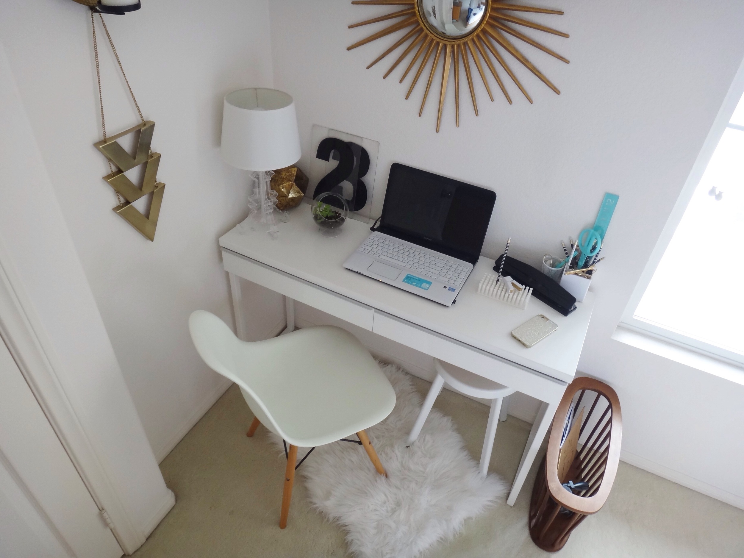
Today’s reader design is from San Diego, California.  Kelly from House of Aqua started with a desk and a magazine rack and built an entire bedroom around it!

image.jpg

From Kelly:

Our master bedroom design was inspired by my desk nestled into the corner of our bedroom. The desk was originally in our living space but I no longer had room for it so I moved it into my daughter's room. My daughter wasn't using the desk and wanted more floor space for playing so it ended up in my room, awkwardly placed behind the bedroom door as it was the only available place in our small house to put it. I realized that if I had a stool or chair without arms it could function as a desk without interfering with the bedroom door. I've logged many hours in my cozy desk area while conducting research and writing my thesis for my graduate degree! 
image.jpg

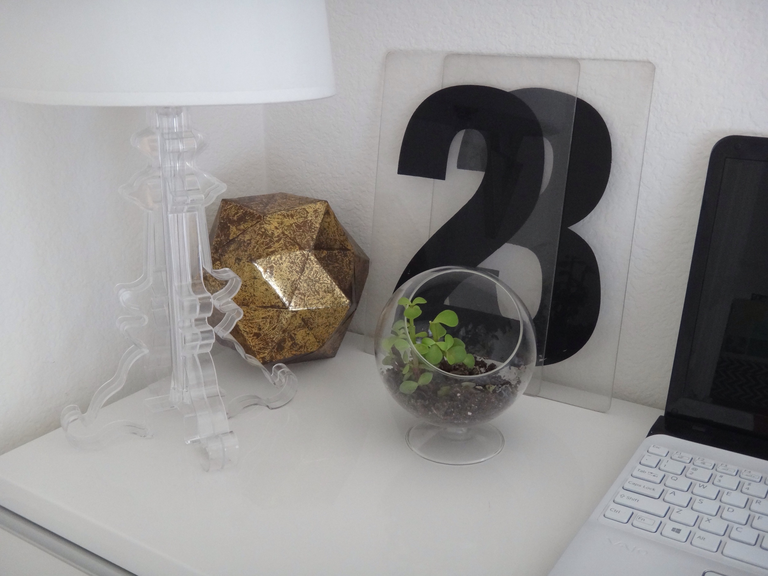
Those oversized acrylic numbers once belonged to a Gas Station marquee!  Clever clever salvage.

image.jpg

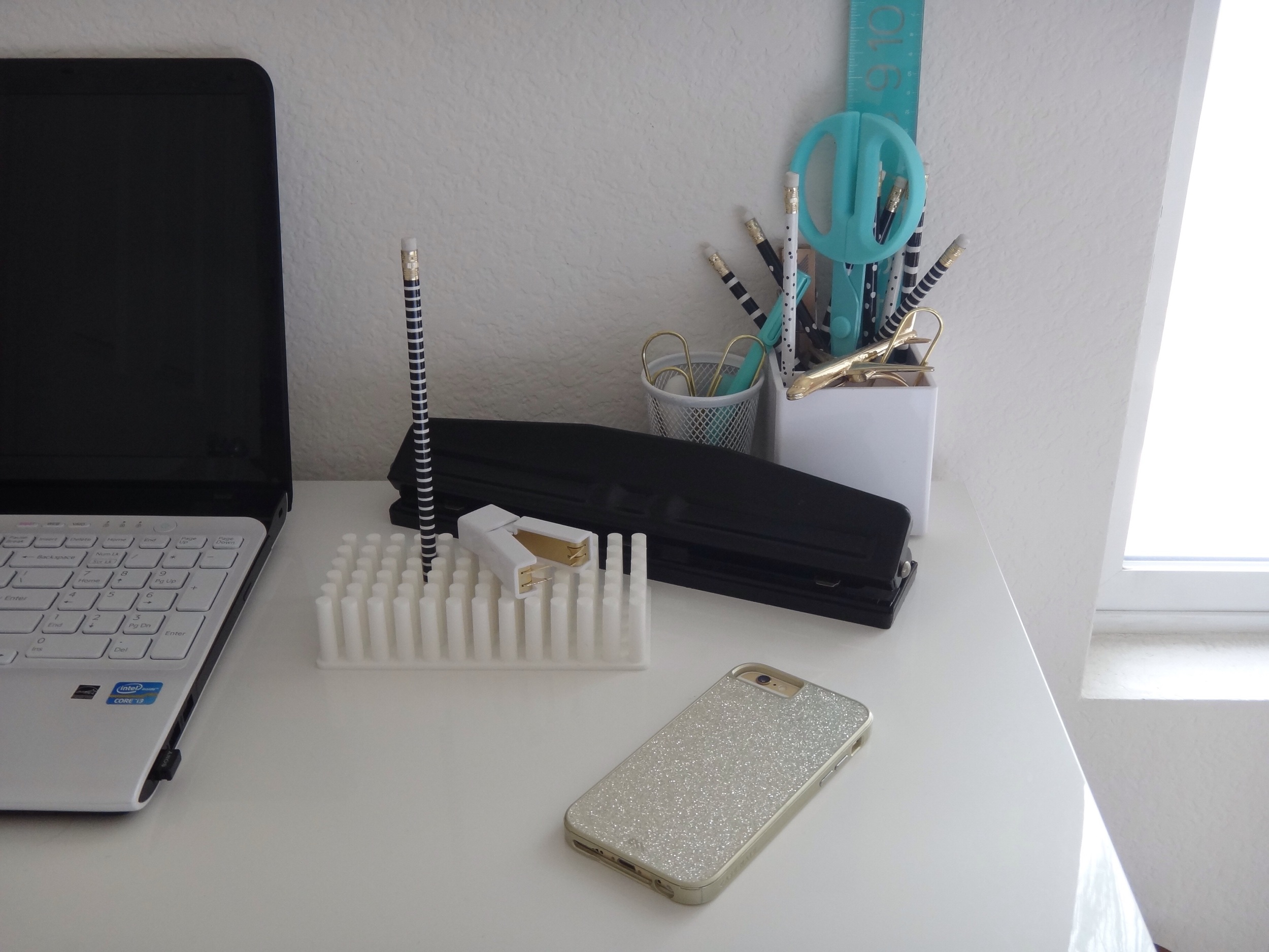
I keep my desk supplies to a minimum by only keeping what I need so that everything fits into the shallow drawers of the desk. For example, I only keep one set of pencils and a couple of pens which are in the cup on my desk.

image.jpg
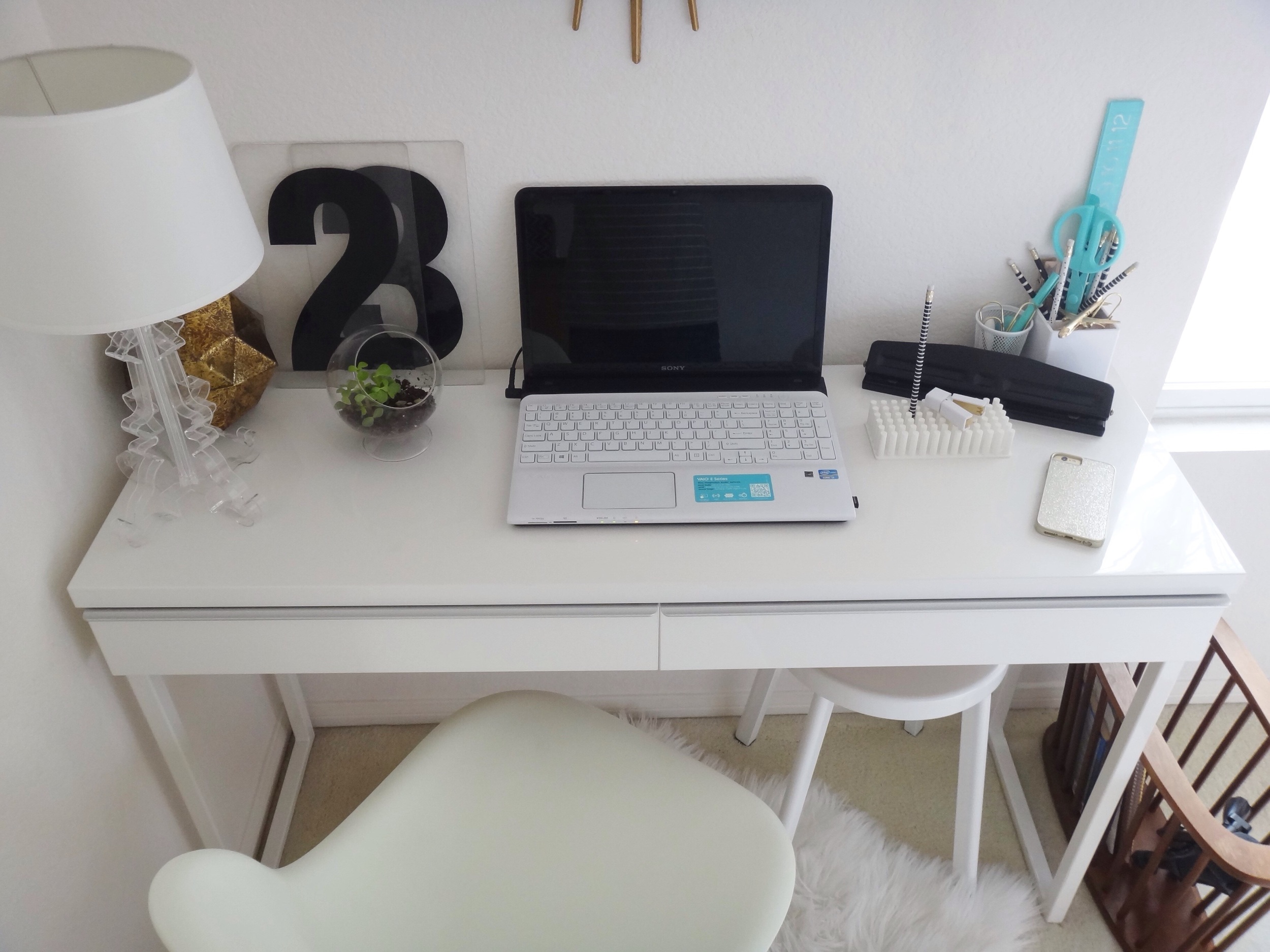
Our bedroom furniture it just over ten years old and I was ready to replace the set with an upholstered bed and white furniture until I thrifted a midcentury modern magazine holder that sits next to my desk.
For whatever reason that magazine rack helped me link together a design that I didn't know I wanted and helped me fall back in love with the bedroom furniture I already had.  Most of the decor is hunted down in HomeGoods and thrift stores. I find that I gravitate towards a mix of elements such as acrylic, wood, stone, and nature. I like crisp white bedding but I bring in different textures with functional pillows.

That’s funny, Thor sleeps almost exactly the same way as Emmy there…

image.jpg

Gah!  Where'd she find those Swiss cross sheets?!

image.jpg
image.jpg
The mirrors propped on our nightstands help to make the room feel larger by reflecting light...  We maximize storage by using the decorative vase and box to store belts on our dresser.

image.jpg

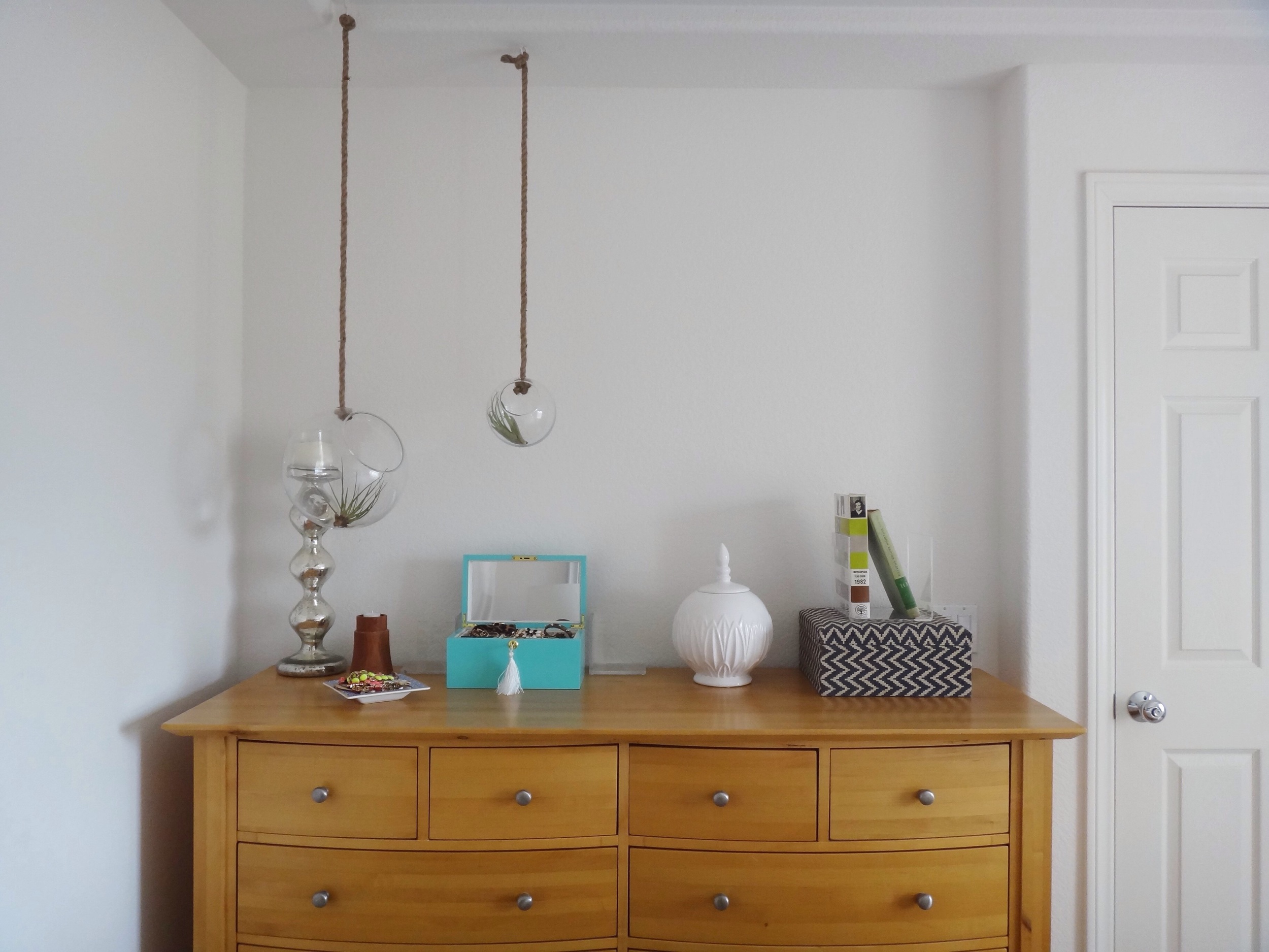
UGH!  More adorable terrariums!  I want them all.

image.jpg
image.jpg

Aren’t you just amazed that this whole room effortlessly started with such a relaxed workspace?!  I just wanna set up camp at this desk and blog for dayssssssss…

image.jpg

Thank you Kelly for opening up your home to us this Friday!  Follow Kelly (@houseofaqua) for more easy-breezy style!  And if you are on the fence about submitting your own room for your chance to be a Friday feature, then ask yourself one question: do you like what your style has to say?  If the answer is yes, then we want to hear it!  You never know who else out there will be empowered to develop their own voice...xoxo


Congratulations to Sally!

Hi friends! My Mason did a name draw and we've got a winner for our One Thousand Gifts giveaway!

Congratulations, Sally! Please email me at chelsea@stylemutthome.com with your mailing address and I'll have your copy of One Thousand Gifts shipped asap! Thank you for your comment and I hope you enjoy your new book!

Thank you all so much for your sweet words after the Thirty-Wonderful post - my heart was so full reading your comments here, on Facebook and Instagram. Finding that which is extraordinary in our day-to-day living does not come easy, does it. The Lord has really used One Thousand Gifts to start adjusting my perspective and really seeing all that is remarkable day in and day out.  If you're interested in diving into an inspiring Summer read you can find the book new and for a great price here!

Thank you for stopping by! On deck for tomorrow is another spectacular Reader Design home tour - it's a goodie!

Kitchen Makeover! ||Again||

Hi All! I've been so excited for today forgive me if I whiz through and show too many photos. The truth is, I've kept something from you - our kitchen! It's been the sore spot in our home for a while now and the last time I shared it was several years ago when I painted all the cabinets and a chandelier in chalk paint. I thought it was great at the time! But we didn't have a happy ending. Let's recap:

Phase 1: Prior to moving in we painted our kitchen walls aqua blue. This space doesn't get a whole lot of light so I thought a pretty color would do wonders. Phase 1 also included removing our cabinet doors?? I don't know. But props to myself of 5 years ago for taking night time pictures that would eventually turn into solid 'BEFORE' pictures. I mean, as far as before pictures go, the worse the lighting the BETTER, right?!

Phase 2: I discovered how easy chalk paint was to work with and chalk painted every cabinet and a yard sale chandelier. Upper cabinet doors went back on and we finished with a high five.

This didn't end so well for us. Even after sealing and resealing, old cabinet bleed through was only the beginning of our problems. With three young kids who are only 'yay' high, (that's a universally understood height, right?), our chalk painted cabinets absorbed every grease smudge,  finger print, and foot print, (yes, foot print - the kiddos scale up the cabinets to reach the sink to wash their hands). They were impossible for me to keep clean, (and I specify 'for me' because I know others who are much more on top of keeping up with their cleaning, and perhaps don't have young children climbing up their cabinets).

So the chalk paint was a no-win for us. But it wasn't just our product choice, it was color. I've really come into a style groove with our home which has felt very natural and enhances all the sunlight we get. Our house is nestled in such a way that although we back right into a woodsy yard, we also get a substantial amount of natural light at any given time of day. My go-to for this particular house is to get down to a white canvas, add in some natural wood elements, snaps of black, and a subtle mix of metallic. Various colors come and go as the seasons change, but that's my basic formula and it has worked marvelously for every room. With the aqua walls and creamy off-white cabinets that our kitchen was rocking before, it felt very out of place in our house. My goal with every room is to play up it's positives and try to distract from it's negaatives. The result after the chalk paint debacle did the opposite - it didn't enhance anything!

If at first you don't succeed, try, try again!

Same layout, same mismatched appliances, same cabinets - but a few little change-ups and this space feels fresh and new! Here are a few examples of some lesser appealing aspects of this room which have been greatly improved by this makeover:

Bummer: Unfinished, shortish cabinets - These 35 year old builder grade cabinets which don't even have some of the finishing touches of current day builder grade cabinets. With our vaulted ceiling, the cabinets appear to stop short - both at the top and at the bottom with no toe-kick.
But wait: By using the same exact paint color on the walls AND cabinets, the line between the cabinets and wall is blurred, and their unfinishedness doesn't seem so obvious. 

Bummer: Little natural light - this room is fairly closed off from the rest of our main floor, with just the window over the sink streaming light directly in.
But wait: I opted for a higher gloss paint this time around to help bounce the light around, and now the light just doesn't quit!

Bummer Mismatched appliances - We have a faux stainless steel fridge and dishwasher, and a white oven. But wait: To help streamline the look of our kitchen without spending on new appliances, we closely matched the paint color to our white oven to blend it in. 

After winning a gift card prize from a photo contest by Dot and Bo, Matt and I decided on this hammered brass pendant from the eclectic, curated site. Backed by a natural bamboo shade, we've got our warm wood and touch of metallic, giving that relaxed, yet sophisticated look we've strung through our home.

This time around we used a brand new paint product! To seal in the bleed through we'd been experiencing with these cabinets, I decided to go oil-based. I had used the Rust-Oleum Gloss Protective Enamel spray on this piece, and was so impressed with it I got the idea to use it on our whole kitchen! I used the spray for our cabinet doors and the can and a brush for the cabinet bodies. (We painted our walls in the same color that is throughout the rest of our home, Ultra Pure White by Behr). It cleans like a DREAM and reflects the light all over the space.

I love this progression! It took a little time to get it right, but everything I've learned through this room alone makes it so worth while!

Displaying our new DIY hand towels that the kids helped make!

And finally, some daily practice.:) 

That's it! Any questions or want to know more? Feel free to leave a comment!

Thank you so much for stopping by! Don't forget to check back in tomorrow when we announce our One Thousand Gifts giveaway winner - there's still time to enter if you look back at yesterdays post and leave a comment! And friends, thank you, from the bottom of my heart, for your incredibly touching birthday wishes yesterday. You guys are the greatest. Nuff said. :)