Reader Design: Shima's Clever Re-design

Hi friends! As promised, we're serving up another hot Reader Design on this long-awaited Friday! Last week Cate mentioned we'd be cutting Reader Designs down to one a week - a fun Friday Special to kick off the weekend! This gives these special posts some breathing room and allows readers, (and us), to thoroughly enjoy and be jealous of each one. :) 

You can find all our Reader Designs on our SPACES page - as you can tell, we've got quite a range of styles already! Thinkin about sharing your own? Mull no more! Reader Designs are an open invitation to share your unique design and creativity.  There are no requirements to be a professional decorator or even a fellow blogger. The purpose of Reader Designs is simply to share incredible rooms with fresh ideas and document these features in our SPACES section to use as a reference of inspiration.

Shima1.jpg

This Reader Design is certainly near to our hearts as Shima is from our neck of the woods! She's an interior designer serving the DC/MD/VA metropolitan area, and worked her magic on this gorgeous living room update! 

From Shima:

"My client wanted to update her living room as her existing furniture was not comfortable. She desired new sofas and chairs (especially a grey colored sofa), and wanted to keep her existing mirror, side tables, coffee table, and beautiful rug."

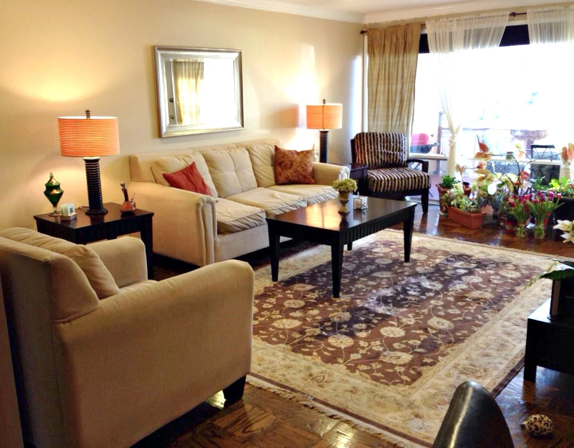
What a fantastic Before shot! Usually Befores are so utterly detestable that you imagine even the slightest bit of work would be a huge improvement! This room has great bones already! But we can't stop here. :)

Before: 0 After: 923,497,190

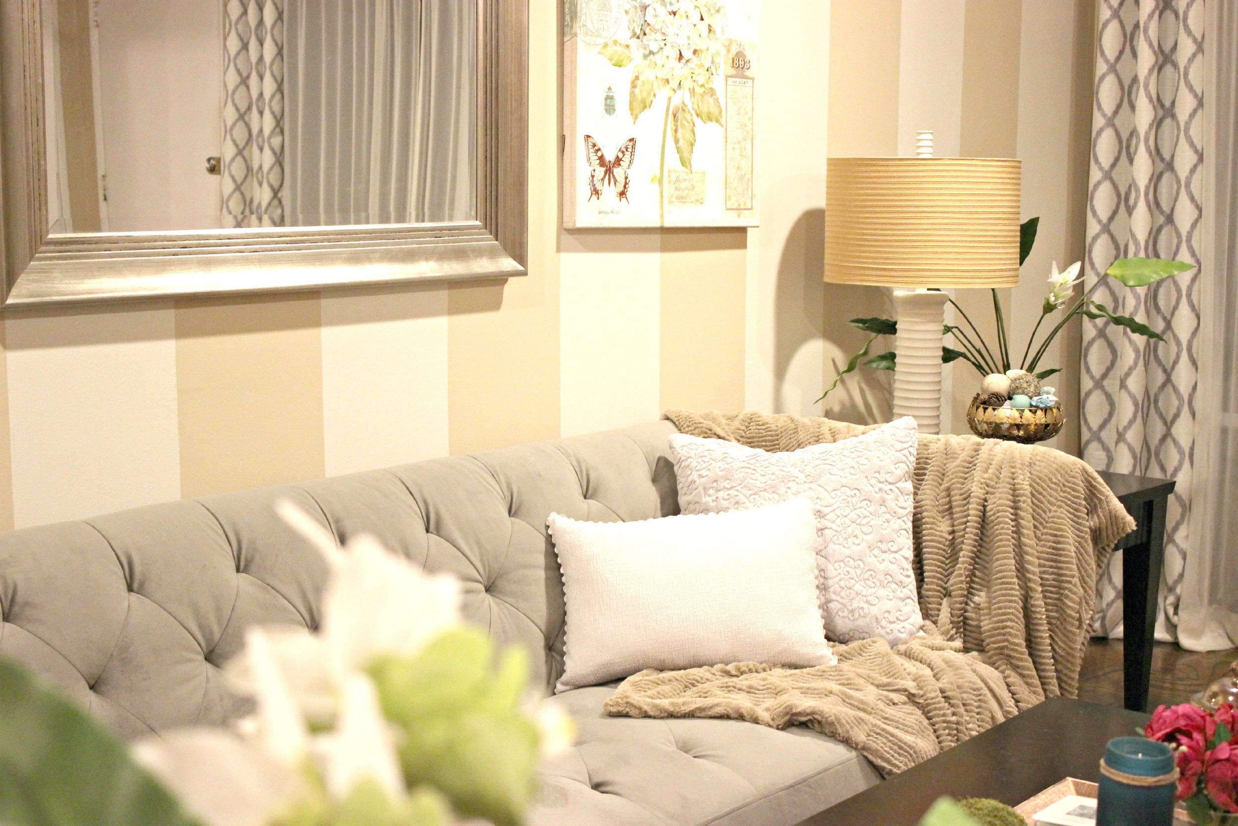
"The first thing we did was find a sofa that she liked, and we found this great sofa from Macy's that was comfortable and firm to sit on. Then we had a fun shopping trip to Home Goods where we picked out the arm chair, 2 high back chairs, and other decor items. She liked the color turquoise so I made that the accent color."

"The entire house was painted in this beige color, so what I did next was simply add vertical stripes.  Since the wall was very long and bare, this helped to dress it up.  I used Behr Paint, Marquee line, and the color is "varnished ivory" . Once the walls were painted, we had used the leftover paint for the lamp bases, bowl, and plant vases. These were also coated with a sealer. The main reason for painting these items was that they were dark brown and I thought the room had too much brown in it; I really wanted to lighten the look of the room. "

A personal favorite here at StyleMutt Home, too!

"Even though the main accent color is turquoise, I think it's nice to have the pops of fuchsia in there so that the eye does not get tired with the colors. I found this perfect artwork from Home Goods that had turquoise in it, along with a cute candle and fuchsia flowers.  I found vase fillers that had turqoise in them. I used the vase fillers to decorate the coffee tray (3 green moss colored balls) as well as fill a bowl for the side table."

"Since we had a grey sofa with a very strong shape to it, I wanted to soften it up with a chenille faux fur throw over one of the arms-- this also provided a nice texture and tied in the brown color of the throw with other browns (such as in the rug) so it tied it all together. "

That spot. Right there.

"Lastly, we bought the patterned curtains from Home Goods and worked on the ottomans.  My client already had two unused ottomans (also dark brown!). I went to the fabric store and found left over fabric marked down 75% and used that to reupholster the ottomans. I used only scissors and a staple gun. It was a fun project! The ottomans can be stowed under the coffee table when not used and they add a fun pattern that coordinates with the other grey colors in the room. 

All of these DIY updates to the existing items saved my client a lot of money (which was one of her objectives!) and gave these items new life and purpose."

Talk about upgrade! This makeover is nothing short of impressive, but it's especially inspiring given the number of items that were kept and reused! We often talk about working within budget here and it's amazing to see how others creatively stretch theirs. 

What a blessing this was to your client, Shima! Way to work it out, girl! You can follow Shima's brilliant work @house_of_shima on Instagram!

Have a wonderful weekend friends and thank you for stopping by!

Don't forget to share your own unique space with us by tagging #stylemuttspaces on Instagram or share photos directly to our Facebook wall! 

Rustic Farmhouse Buffet ||Before+After||

We've got some fresh meat in the Garage Shop this week! Who's hungry?

I, for one, am ravenous! Since much of my free time, (i.e. my children's afternoon nap), is spent in the garage painting and flipping furniture, the winter gets brutal after I've been away from 'my office' for a couple months straight! It was time to lean into what I know, despite the negative temps and cue of snow storms.

What you're looking at above, (but doesn't pick up so well in pictures), is layers of varying hues of white and green, and lots of chippy charm. Getting this finish was not difficult, but lets start with The Beginning.

Not bad! Not bad at all. And major bonus - this beauty is on hidden casters! So, to begin, (nothing like a rogue 55 degree day to jump start the process), my Shire and I slapped on a first coat of Annie Sloan's Pure White and Old White. (We didn't mix the colors, we just worked side by side, Shire had the Pure White and I had the Old White). Since I knew I'd be layering multiple colors, the first coat didn't matter a single bit.

Oh how I love painting with this one! After a couple coats of white, our piece here was looking perty!

And then it was time to rough it up! I used 220 grit sandpaper in my electric sander to get a good bit of the paint off. I knew I'd be going over this with milk paint which crackles beautifully over smooth, non-porous surfaces. Chalk paint is extremely porous, so it was important to sand down to the wood a good bit so the milk paint would crackle and chip off in those spots.

And the milk paint did not disappoint! I used one of Miss Mustard Seed's newer colors, Layla's Mint. You can see here where it had crackled down to the wood on the side, and with gentle sanding, (I used a medium grit sanding sponge), revealed the white underneath.

The last coat of paint was more white on top of the green. Again, I used Annie Sloan Chalk Paint in Pure White for the final coat.

After 4 coats of paint, it was time to get started on bringing this piece to life! I used fine 220 grit sandpaper again in my electric sander and just lightly went over most of the edges and corner surfaces - just a gentle touch with the sander took the already crackling and peeling paint off beautifully!

I circled a couple spots in the photo below where you can see the layers of green and white. I'm crazy for layered colors on a piece! It just has a way of adding decades of charm!

For the top surface I removed quite a bit more of that final coat of white in order to get down to the green underneath. 

On deck are two sleek and modern looking pieces! A far cry from today's time-worn goodness. We are style mutts here after all... :)

Charming Chippy Dresser, (or buffet or media center)
Available or sale
66" x 31.75" x 20"
$685

Contact chelsea@stylemutthome.com if interested in this or a similar custom order!

Thank you all for stopping by! 

Got any piece which you've shown some TLC? We'd love to see your handiwork! Share them directly to our Facebook page or tag #stylemuttrefinishes on Instagram!


DIY Baby's Breath Wreath

Hi All! Who could use a little hopeful reminder that Spring will, indeed, arrive? If you just got dumped on over the weekend with another snow, it might feel like a distant reward. Decorating for Spring only helps remind us of the hope that it's coming, right?! So let's get on with it!

I came up with the idea for making a Baby's Breath wreath when considering how to balance the industrial presence of our pipe shelves with a softer, natural element, (there go my bohemian tendencies again). Baby's Breath is actually my favorite flower! Can we call it that? Any botanists in the house? Anyways, it's soft, whispy and wildly untamed look is perfect for covering a wreath frame!

Dreamy, isn't it?! And so easy to make. Here's what you'll need:

Supplies:
-12-16" wreath frame
-twine
-4 bouquets of Baby's Breath

To begin, separate sprigs of Baby's Breath from the whole stem:

Gather up 3-4 sprigs in a bunch, unravel a length of twine, and simply wrap the sprigs of Baby's Breath around the frame.

Continue on gathering up small bunches of sprigs and laying them over the previous bunch on the frame, going over top of the twine from the last bunch.

When you get all the way around, just tuck the ends of the last bunch underneath the first bunch, and tie your twine in a small knot in the back to hold everything secure.

I used the stems from the Baby's Breath to lay across the top shelf. I love how naturally structural they are! 

Mission accomplished! I've seen quite a few Spring wreaths starting to circulate on Pinterest and Instagram. Here are a few other ideas, (the bottom right is by my other Sis-in-law, Megan! The other three you can click through to the source).

Hang in there, flower buds, Spring's-a-comin'! Thank you so much for stopping by!