Hello, hello! It's good to be back here with you for another eDesign reveal! If you're newer around these parts of the great World Wide Web, first off, welcome! So glad you're here! I'm Chelsea and peeled off from doing furniture refinishing about 2 years ago to focus on the design branch of StyleMutt Home. It's been a really exciting challenge to learn how to do design work, (primarily eDesign), and navigate where the specific skills can be used. Although we have been blessed with a full load of individual clients this year, I accepted and began a freelance design job over the summer with a corporate company who is similar to Airbnb. They're purchasing condos in major cities around the US and Canada and making them available to travelers as home-away-from-home stay places. But between their purchase and that first lease, there is a lot of work to do on these condos! My job is the design, (i.e. the fun part)! The work is very fast paced and often unpredictable. I design these spaces from the comfort of my own home, never stepping foot inside the physical space. I never know what information they'll be able to supply me with on a unit before I get started on the design. Many times they give me a floorplan with measurements and that's it. If I'm lucky I get pictures, and maybe even a video tour! Regardless of what info I'm given for a space, they require all the details that make up a complete eDesign in a day or two. It's a lot of fast research, drawing, note taking and, <gulp> math, but the exciting part is having the creative freedom to design the spaces how I wish. The company always gives me a style direction, (industrial, old world, California cool, etc), but from there I can run with it.
The space I'm sharing today is in Chicago and came with all the lovely before photos a girl could ask for. It is a 2 bedroom condo with a comfortable living space complete with a full kitchen. When I saw the before photos the space just looked tired. The blue-gray walls just made the it all look kind of 'blah'; especially the kitchen. There is absolutely nothing modern or industrial about the architecture here like in many of the other spaces I have designed for this company, so my desire was simply to freshen it up and make it cozy. In my short experience with design thus far I have learned that the most successful designs are a natural extension of the space. Since this space is already very traditional, I stuck to fairly classic pieces that read traditional with a modern twist. When I first showed Cate her remark was how very equestrian it felt with the dark moody colors, rich velvets and warm leather. So I'm calling this the Equine Condo! Lol!
Let's take a look!
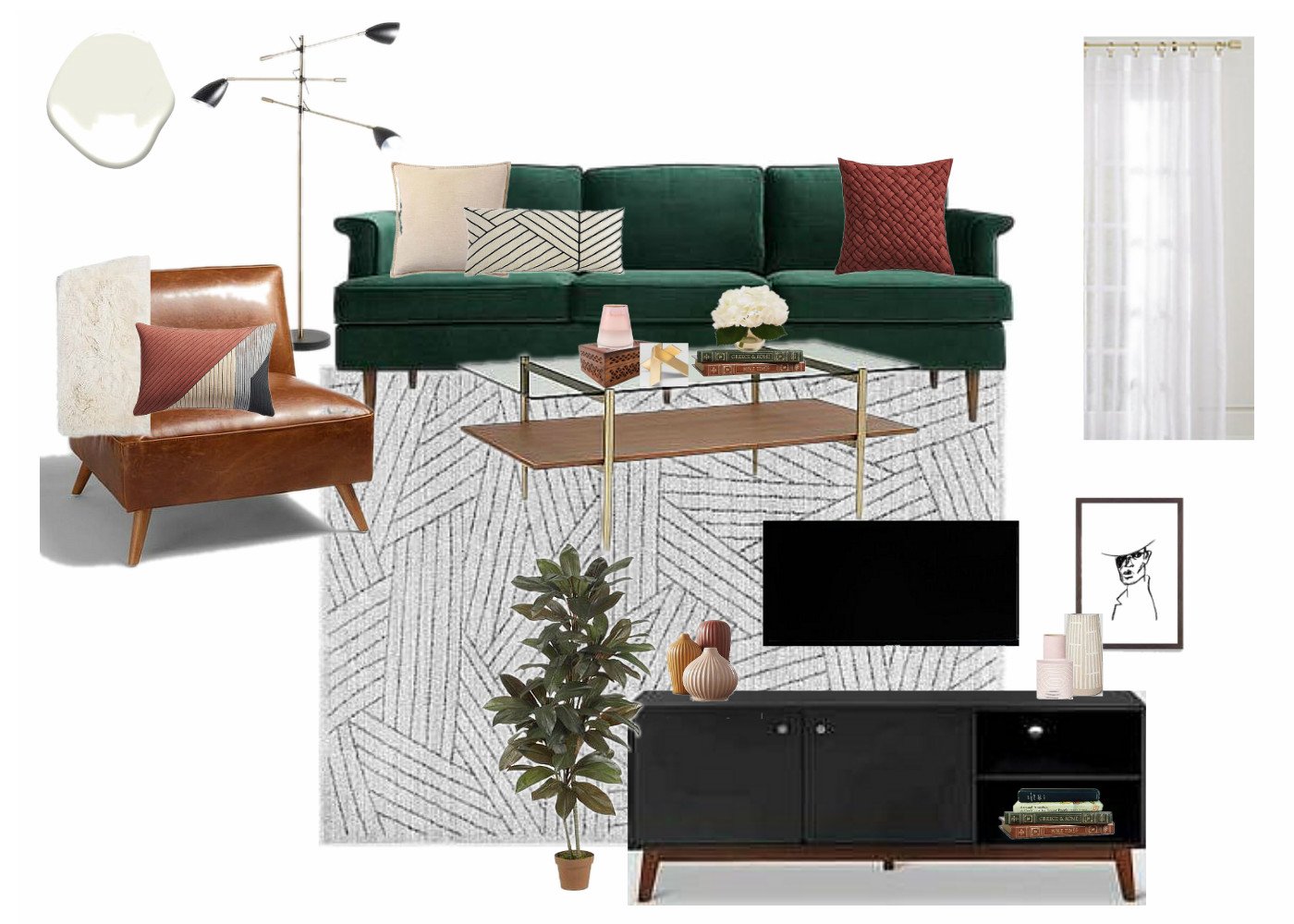
LIVING ROOM
Below is a before picture of the living room paired with my design plan:


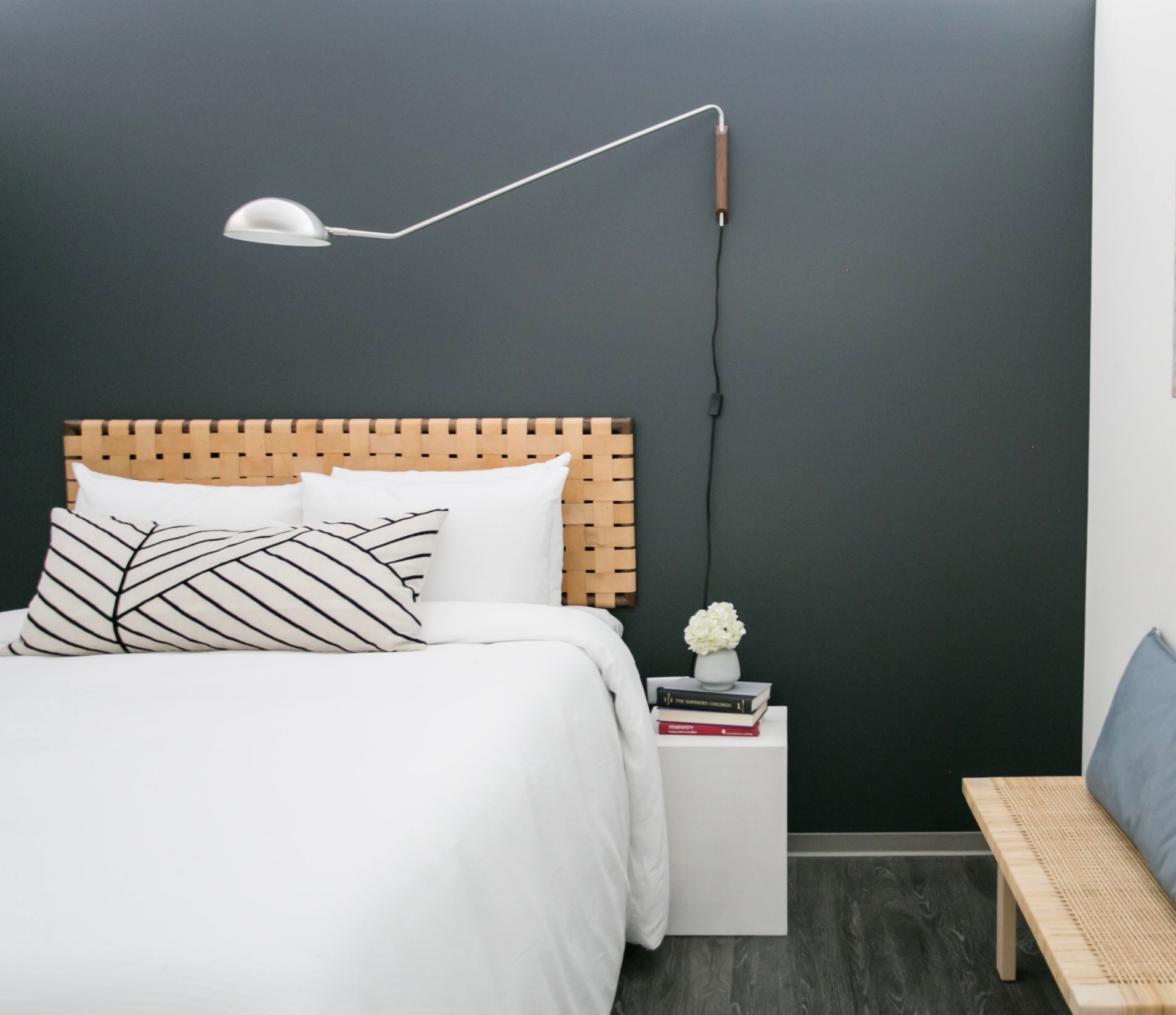
BEDROOM 1


I'm telling you, it's so hard to design rooms without the current season on your brain. I worked on this space right as the days were turning crisp and pumpkins were being displayed on doorsteps. Can you tell?! I went all out cozy. It's a rather large bedroom and I just wanted to make it feel inviting, quiet, and relaxing. It's like a big green cave and I just love it.


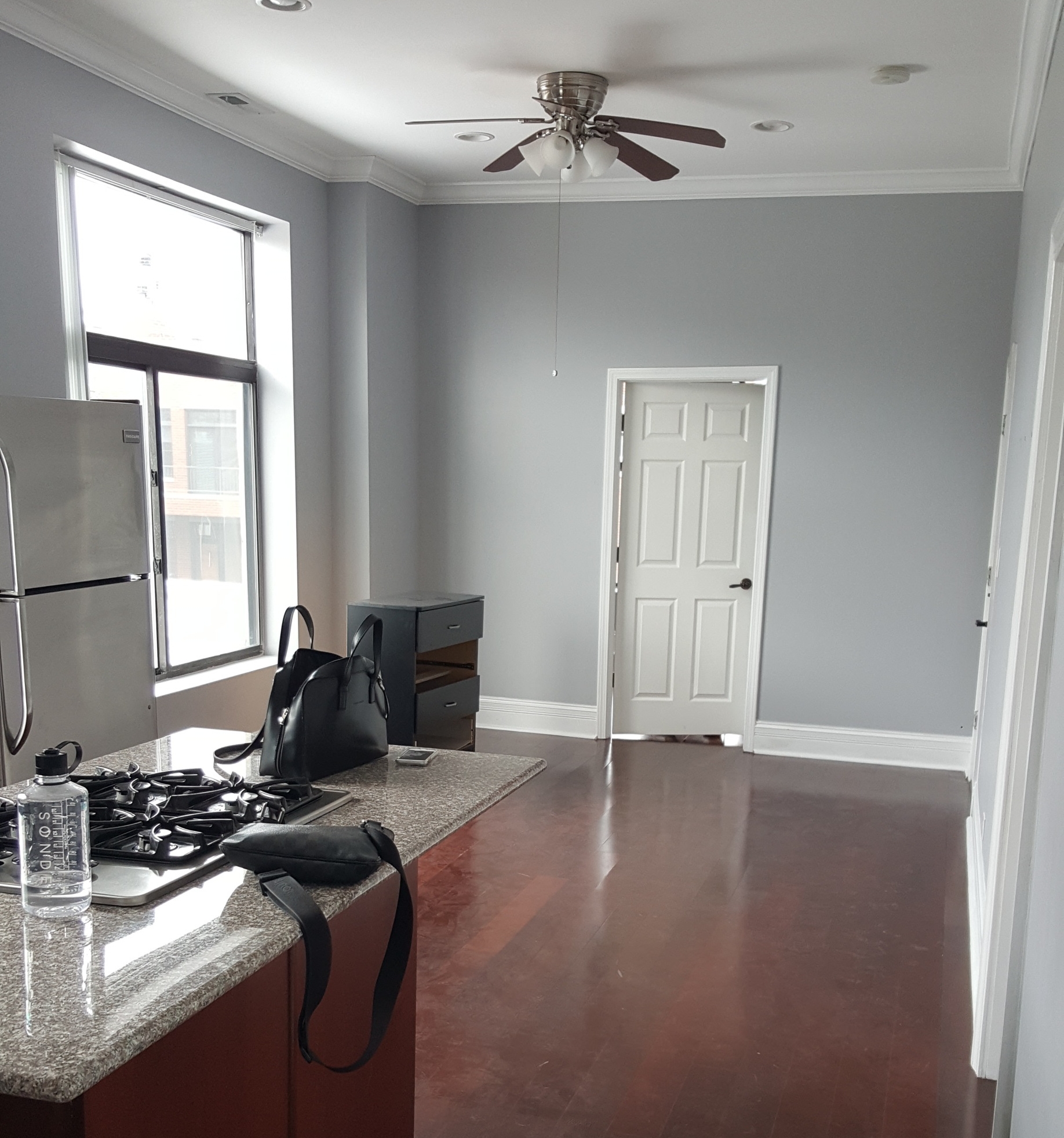
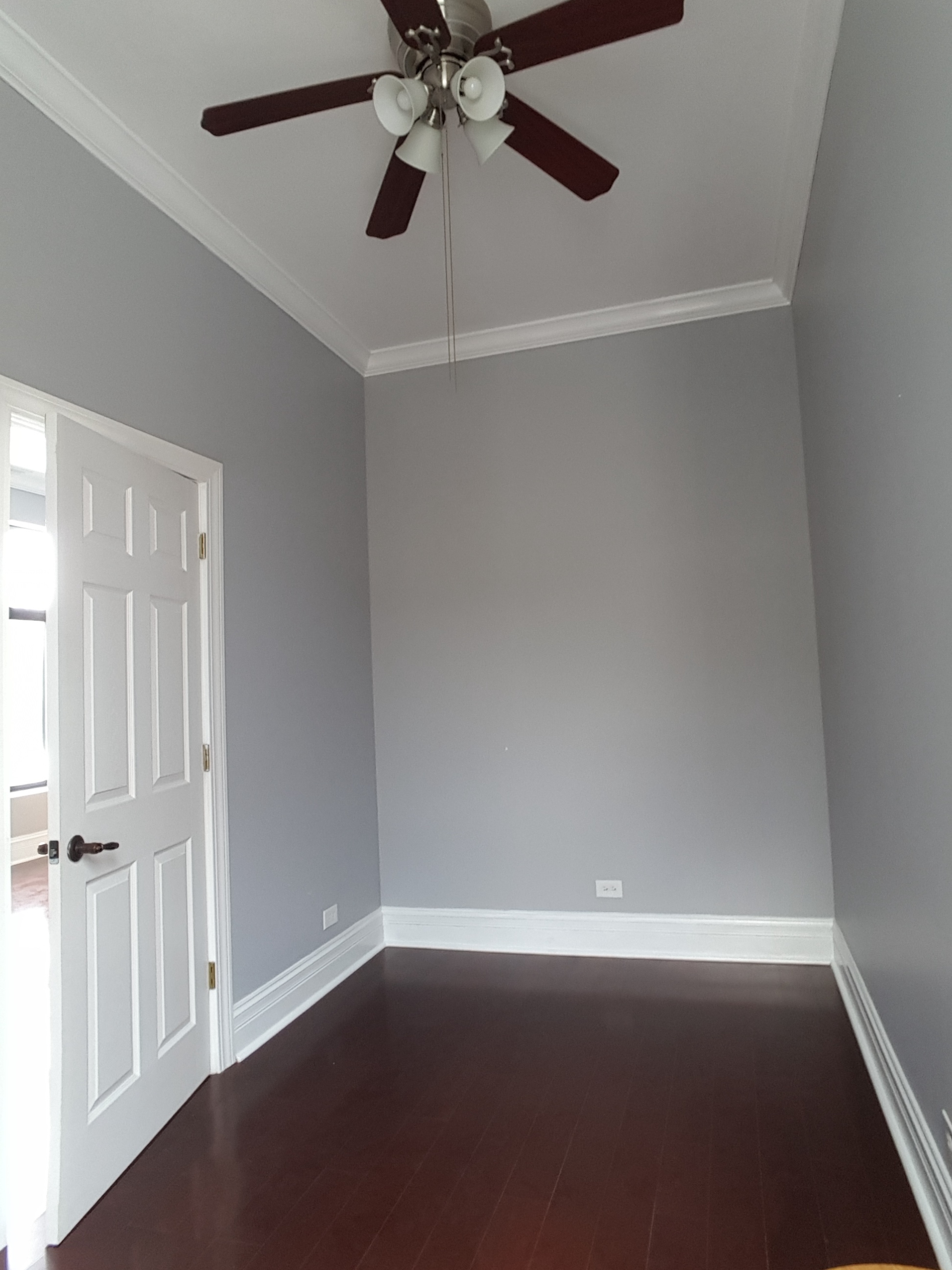
BEDROOM 2
They said a bed couldn't be done. They said a dresser could never fit. Literally - I actually (accidentally) stumbled onto other designers' notes on this room. The client deeply desired this space to be a second bedroom, and with an en-suite bathroom it surely made sense. I studied that floorplan and researched beds. I knew if the measurements were right that a full bed mattress would absolutely be doable. A bedframe, maybe not. So I found an adjustable bedframe that could be pulled inward a few inches if need be but still support the full size mattress. And with the bed nestled cozy in the corner there was more than enough space for a modest tallboy dresser with a small footprint. I'm not usually one to sit and work on puzzles, but I thoroughly enjoyed figuring out how to fit the pieces together comfortably in this room!
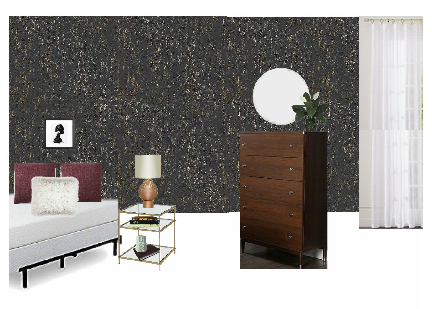
And how about that wallpaper?! Target has a gorgeous line of peel-and-stick that is ~$30 for 27.5 sq ft! That's a lot of impact for a tiny bit of $! I'm still fairly weary of using wallpaper, but I'm so pleased with how it turned out in this space. It's the perfect tiny room for it.


KITCHEN


I admit I wasn't thrilled with these cherry cabinets and cherry floor - it was a lot of red wood, hurt my eyes. Hah! But once again I am floored by the magic of a fresh coat of paint. My design for this space included painting the entire main living space in Swiss Coffee by Benjamin Moore and it absolutely wakes this space up. With all the red wood, the stools may seem an odd choice. I totally get it; why add even more red toned wood? Well, for one thing I didn't want any statements in the kitchen. I was adding a lot of contrast to the living room right next to it and wanted the kitchen to just be easy on the eyes, nothing sticking out. Secondly, although the red toned wood itself is not my favorite, keeping it all the same gives this space a slight modern feel. It's monochromatic which I love.

That's a wrap! I hope you enjoyed looking around - I sure am grateful to you for coming by!