eDesign Reveal: Dani Barbe's Great Room

Hi friends! We hope you are all enjoying your Summer, wherever that may be! We've been so ridiculously excited to share one of our favorite eDesign projects so far that we picked up in the early Spring and recently finished. Today we are sharing part 1 of our amazing client, Dani Barbe's, home. This sweet lady contacted us with excitement, motivation and a completely open mind - all the makings for a wonderful eDesign adventure for us all! She is a self-made jewelry designer, (she has a collection in Anthropologie!), and to work with someone who inspires us so much has been such a gift. First up is her Great Room and Breakfast Nook, with more to come from her country side home in Frederick, MD shared with her fiance and their 'Lonny' - the most adorable french bulldog to walk this earth.

If you'd like to look back at our design boards and 3D renderings of this space before you see the entire finished product below, you can check out this post! Otherwise, come on in!
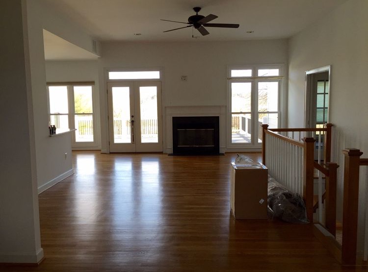
BEFORE

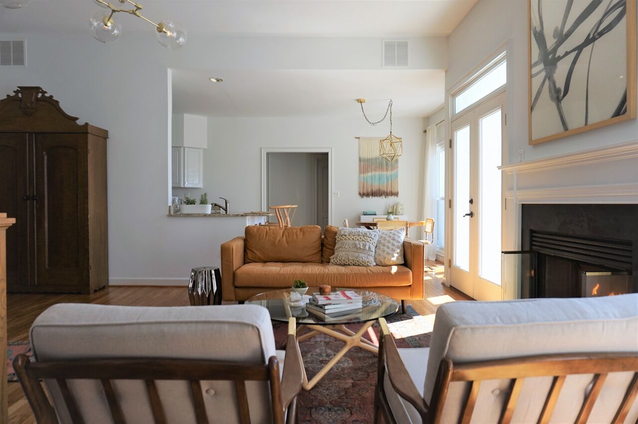
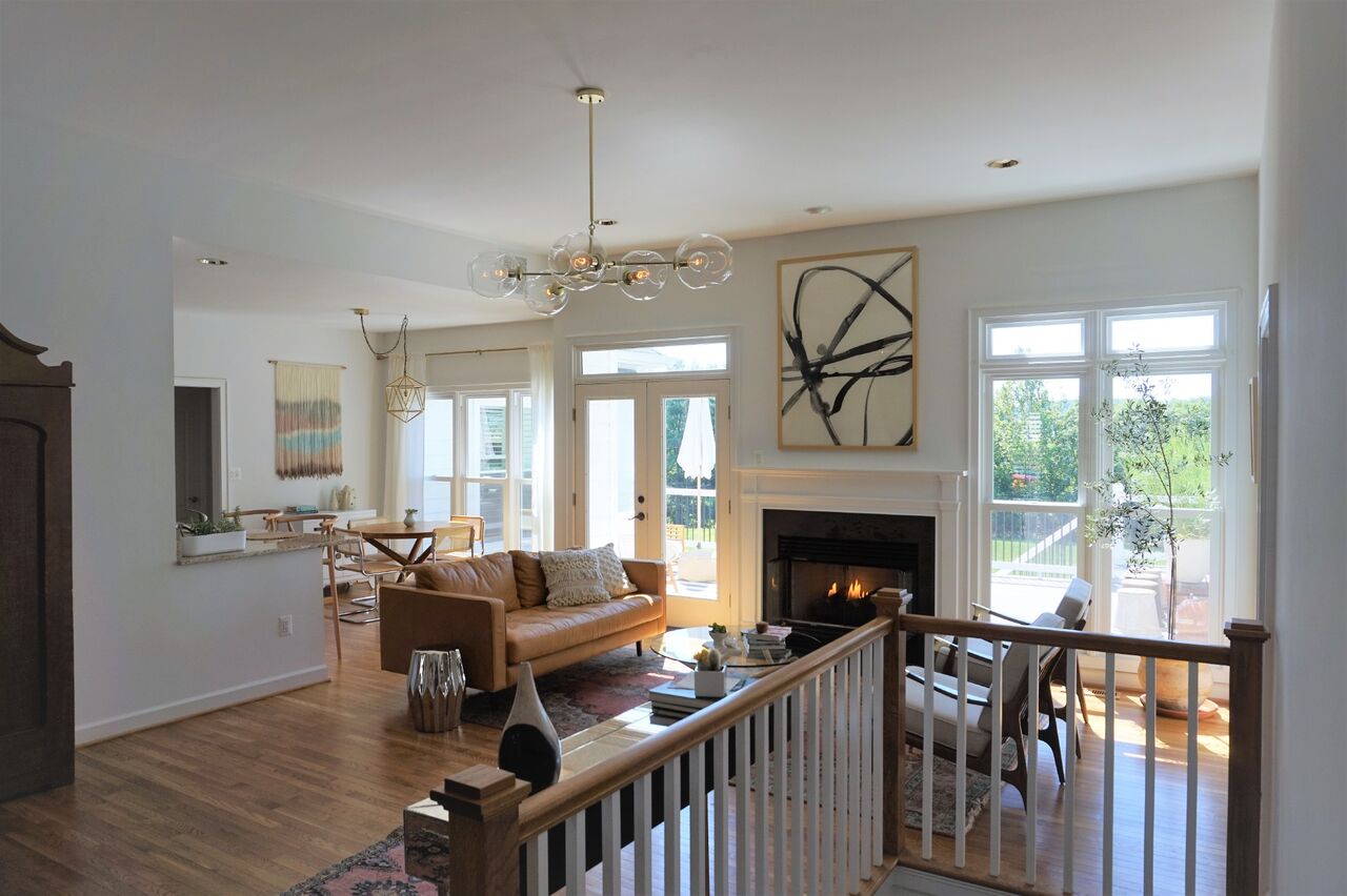
Fairly early on we settled into a less stuff-better stuff mentality all around. It's not overly filled but every piece was selected through thoughtful consideration of the grandeur of the room. Although the space is grand, indeed, Dani and her fiance are quite laid back and desired a space that was comfortable and easy to entertain young and old alike.

The light in this space was really inspirational in the design process and when we were faced with tough decisions, we ultimately focused on the natural glow of the space and what pieces would enhance that! Pastel colors came into play from the beginning, with mixed dark and light wood tones peppered throughout.

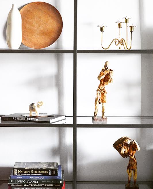
Both the area rug and runner for this space were ebay scores that we were definitely throwing virtual fist bumps over. Lol!

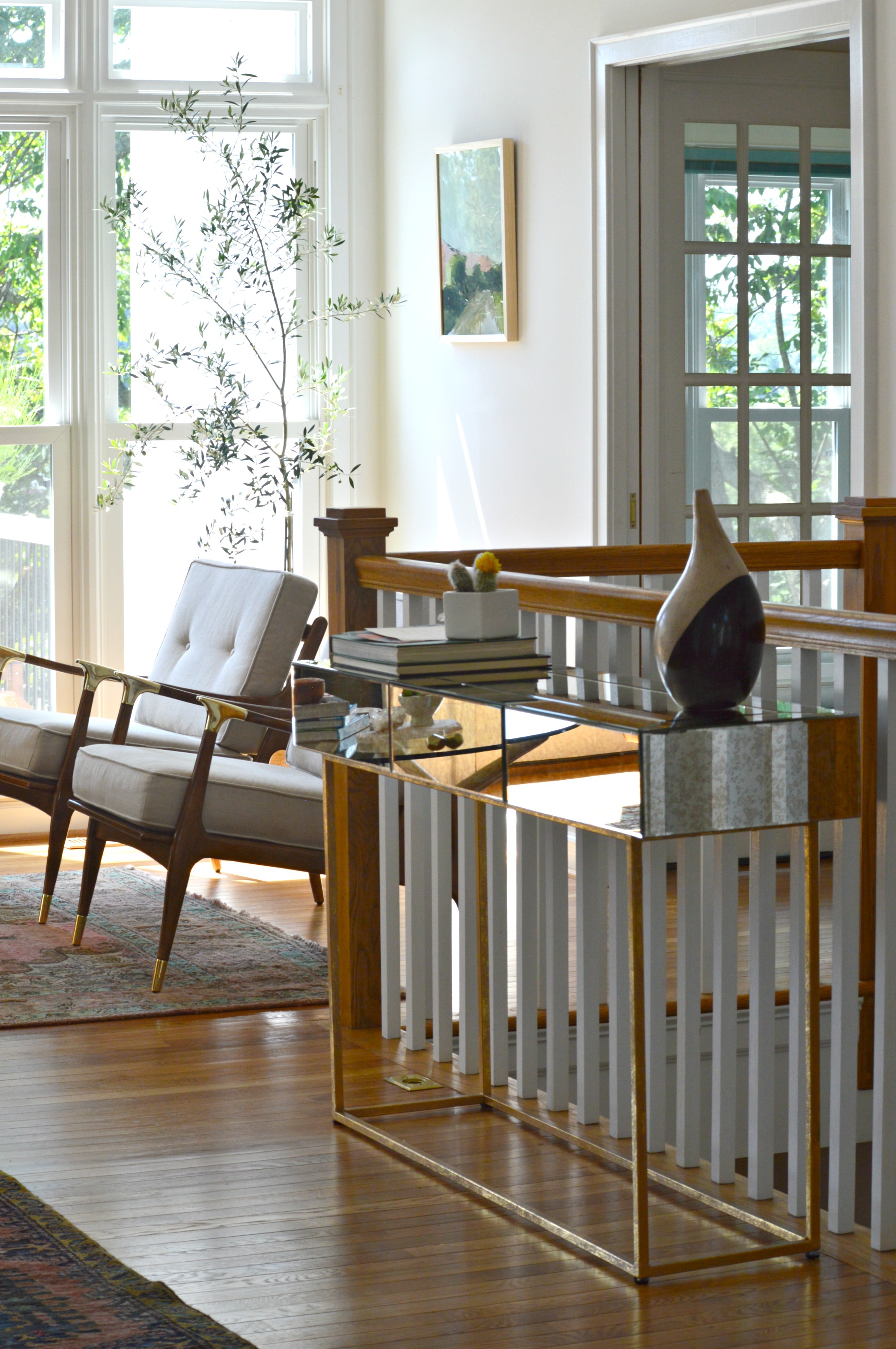
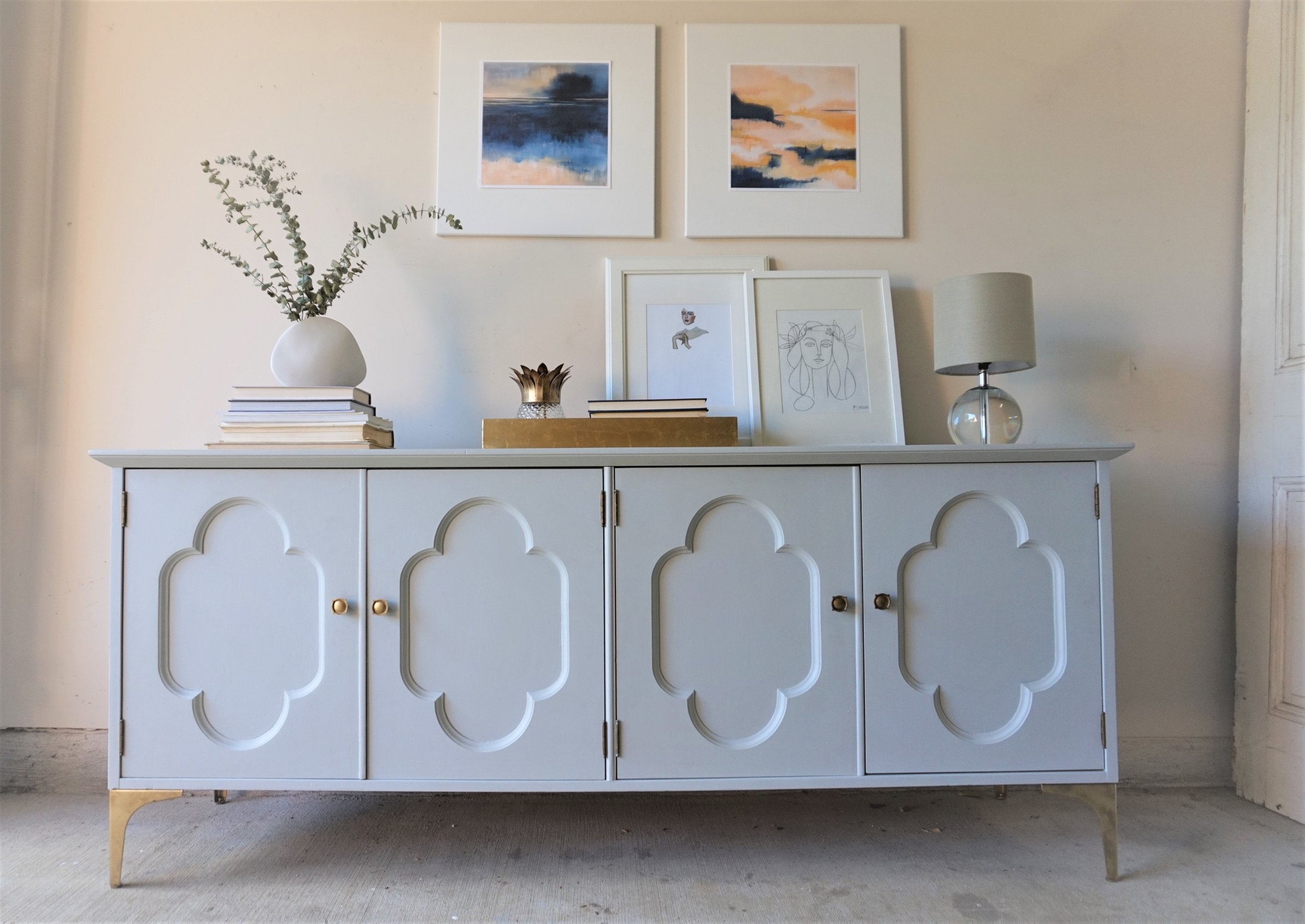
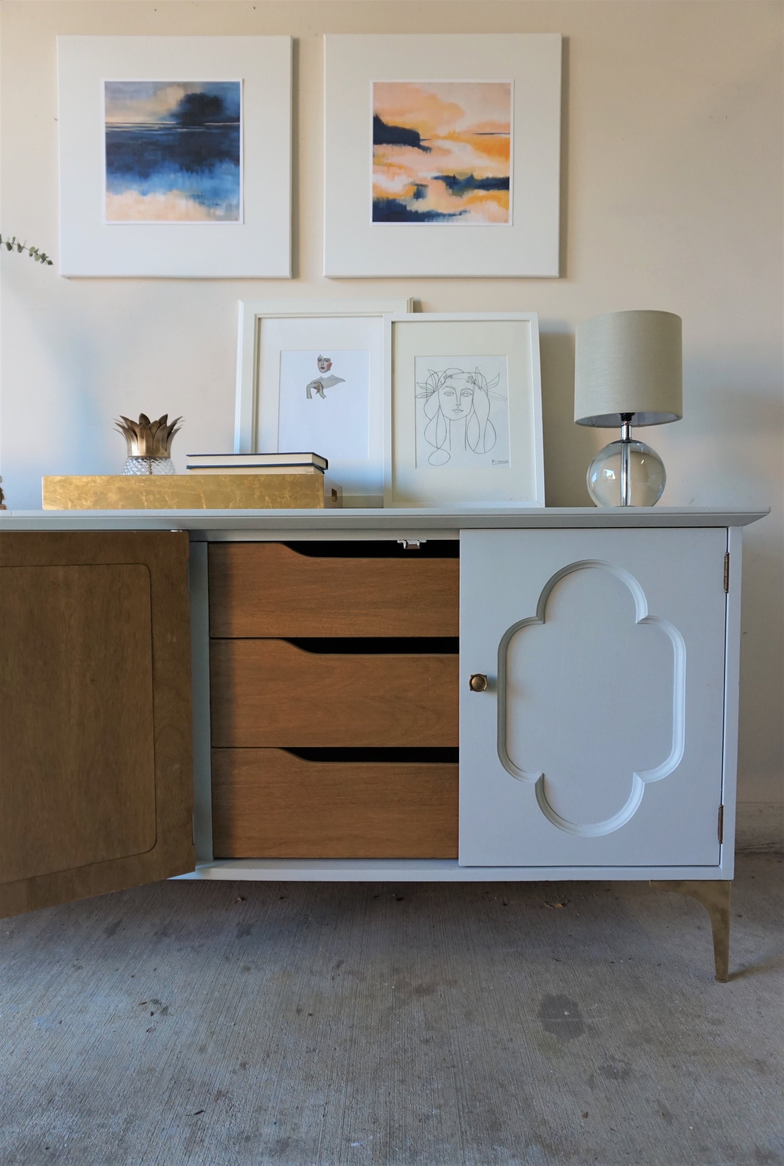
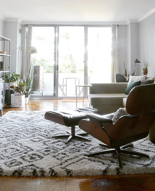
The entry way is balanced by an antiqued mirrored and brass console as well as an epic antique Craigslist find, (keep scrolling). Mixing in these unique old, (or old looking), pieces into the space, along with the vintage rugs, gives the modern bright white space some necessary grounding and storied character.

25.jpg

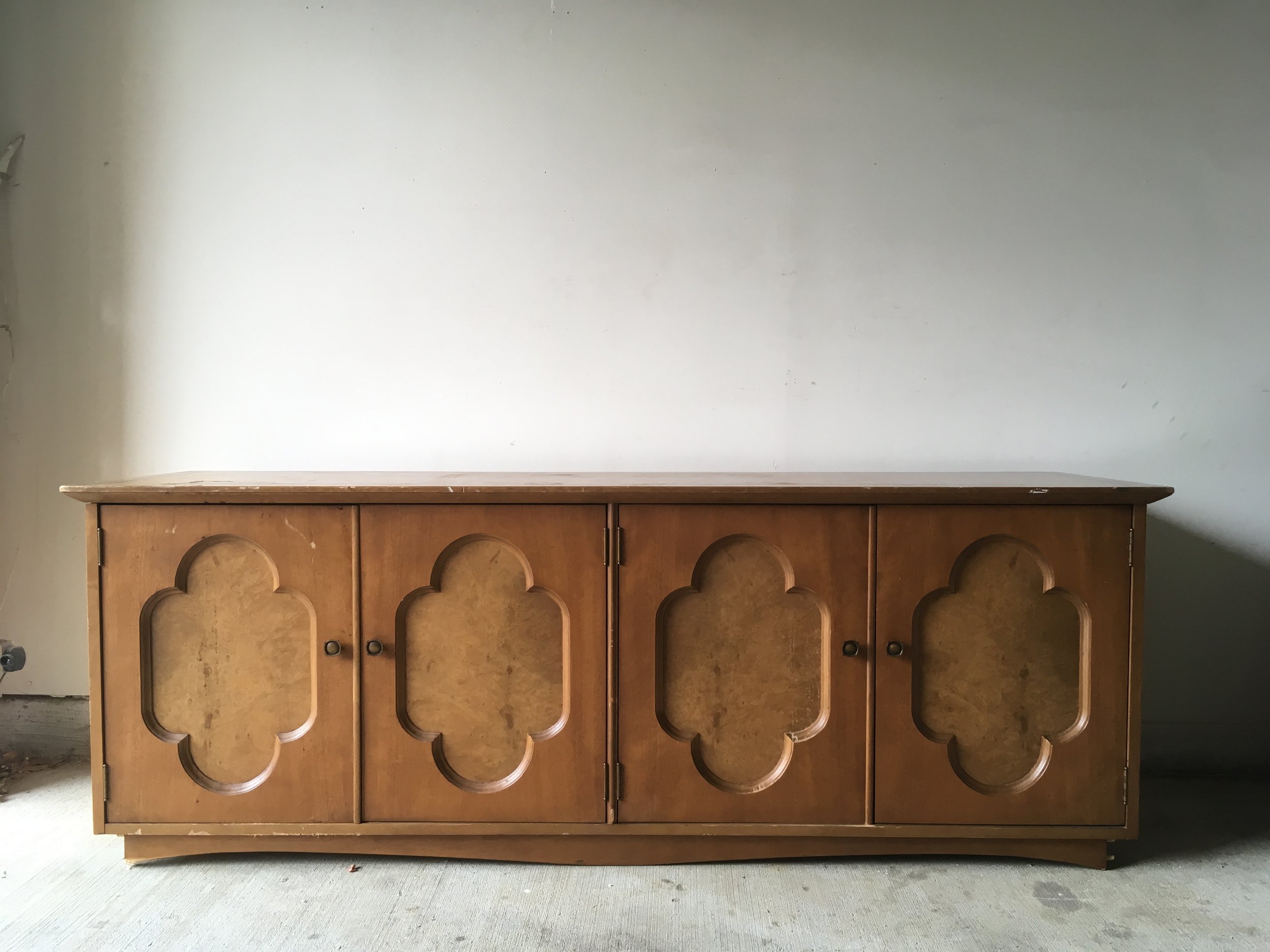
Ah-ha! Here is our extraordinary Craigslist find. I've truly never seen anything like this and admit I found and saved this piece in my phone before any aspect of the design even begun! I remember quickly creating a hypothetical design around this piece so I could share it with them and they could snatch it up before it was too late!!

As it goes with every design job, there are always a couple hurdles to overcome. The area rug turned out to be a bit smaller than what the seller had listed, so in order to fill a bit of awkward empty space on the side of the sofa where the sofa should have reached, we added an inexpensive mirrored accent table from Urban Outfitters. It balances the mirrored console beautifully and adds a touch of reflection to the darker side of the sofa!

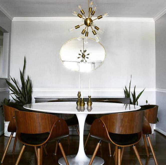
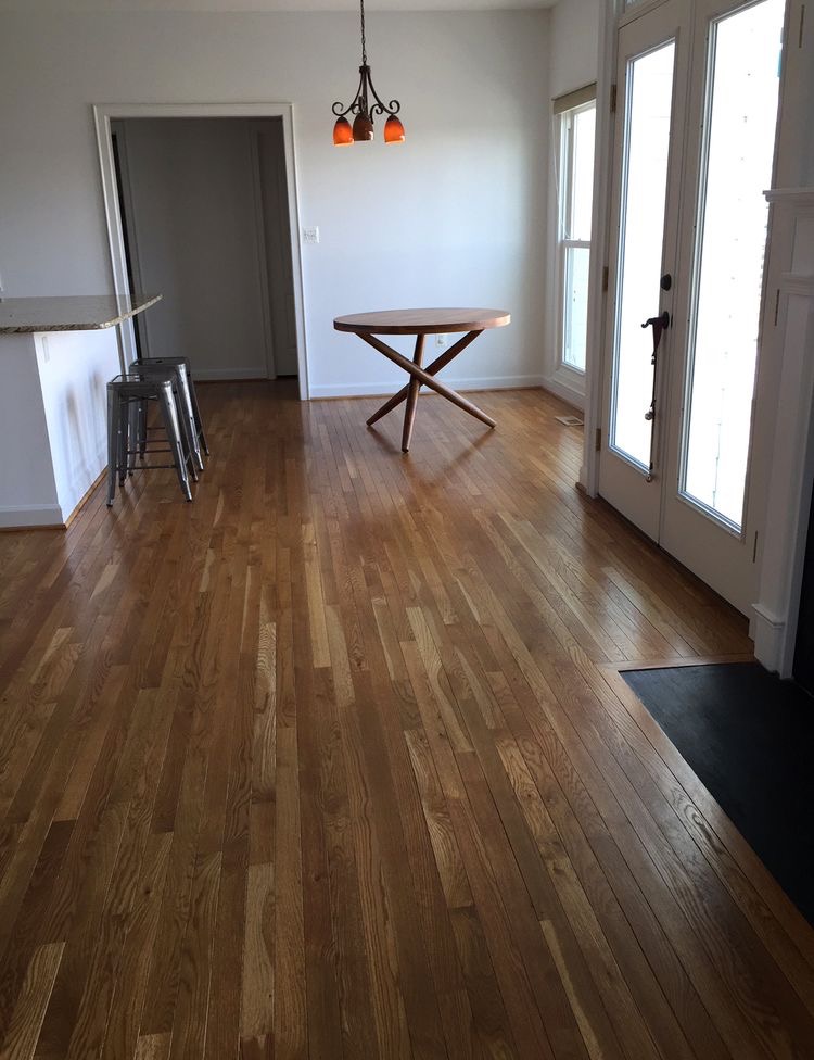
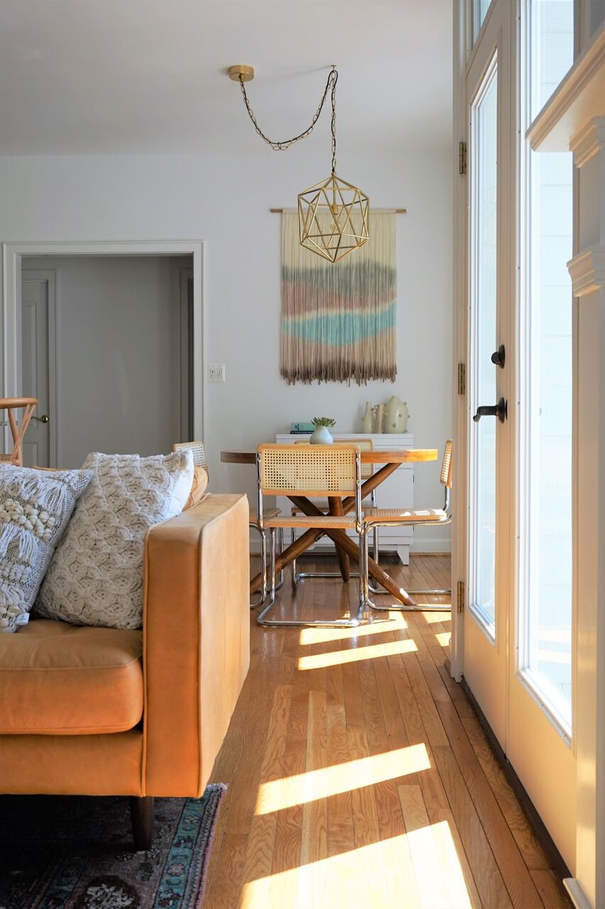
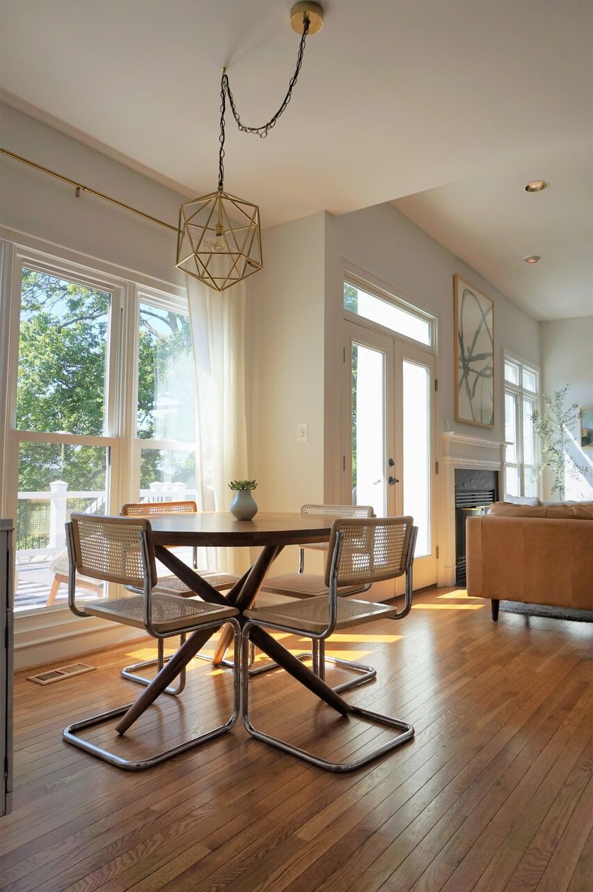
On to the dining nook! Serious confession; I've been waiting for just the right opportunity to use a custom made fiber piece from Designs by Filia, who's work I've been following for a while. I don't know how she does what she does, but she's amazing at doing it! When we selected just the right furniture pieces for this spac and the light fixture, it just needed one final statement. Since we decided to forgo a rug in here, I really wanted to bring a touch of color and texture up the wall - and our opportunity was born! We worked closely with Filia to pick just the right colors for this space and she just knocked it out of the park! As I mentioned earlier, our focus was to maintain the natural glow of this entire space, and this piece does that so well.

When we mentioned that a tree of some sort would be ideal in this far corner, Dani mentioned that she had her eye on an olive tree. Little did we know what a green thumb she had - when we arrived to shoot this space we got to see all the olives on this thriving tree of hers!

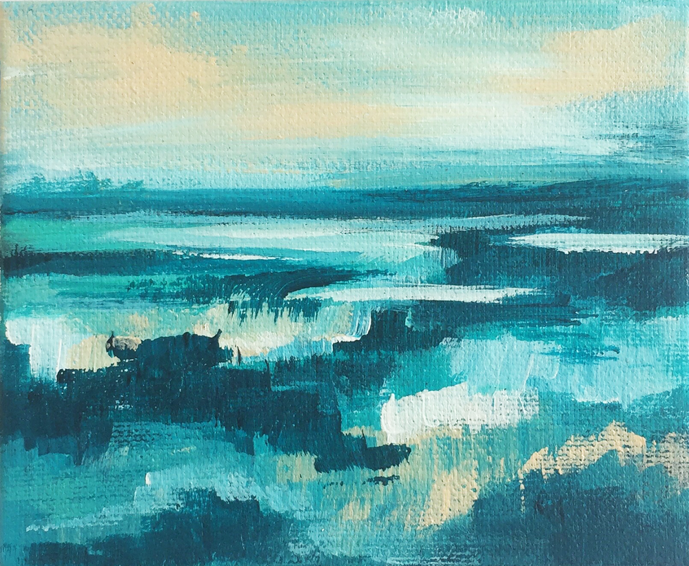
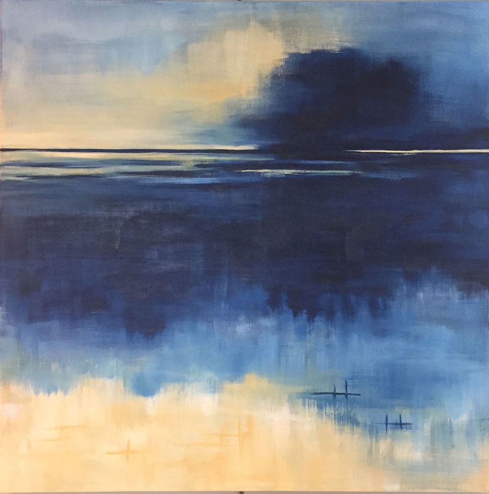
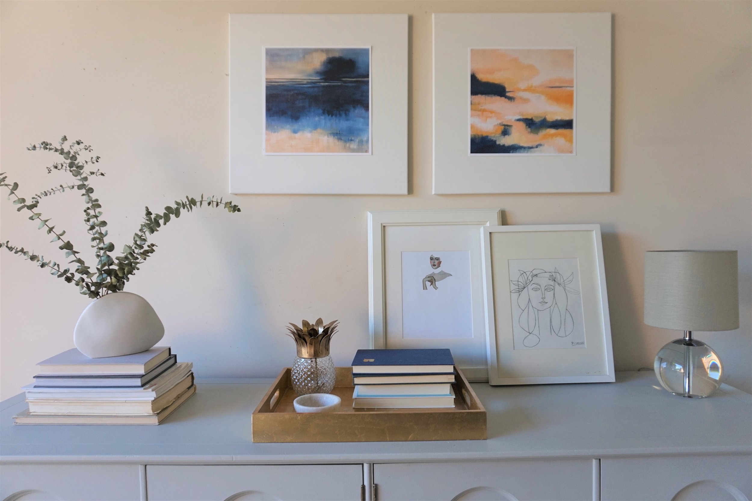
Minted art for the win, folks. The black and white watercolor over the mantle is Minted as well!

Two of our most clutch finds were a StyleMutt Home team effort - McKenna nailed the art for over the mantle and Cate hit it out of the park with this light fixture found in Etsy shop, Intermountain Lights.

That's it for now! As you head out you'll notice this gorgeousbrass vortex fixture that gives the entry way all the attention it needs!

Speaking of attention, Lonny would love to say hello before you go.

Thank you all for walking through our latest project with us! This one was pure joy for us to work on and we thoroughly enjoy getting to share it with you friends. Stay tuned for more from this home! Hint: Green velvet, apothecary storage, raw minerals and gemstones, cement coffee table - we've got another doozie of a reveal ahead for you!

Quatrefoil Credenza ||A Collaboration with Modern South||

Today I have the privileged of debuting not only a fresh piece but also a fellow creative!  Posts like these are some of my favorites - when two creatives join forces to make something together.  I connected with Cory of Modern South via Instagram and jumped at the chance to work with her on a juicy collaboration.

Modern South Studio

Original Artwork by Cory McBee
Charleston, SC

Cory and I share a mutual love of color and abstract art.  When we were looking for an excuse to work together, I had the perfect piece in mind to show off her ethereal landscapes art.  I found this four door credenza without a leg to stand on and the sweet quatrefoil detailing was so endearing that I couldn't pass it up. 

Plus I was jonesing to do something in a buttery gray again.

The classic lines of this piece called for a feminine and glam look - something a little softer than I normally debut in the garage shop.  

The paint color I went with was Hailstorm Gray by Behr Marquee.  In person, it's almost blue, almost purple, almost green and therefore an all-around very mysterious neutral.

It actually did pain me a bit to paint the burled wood inserts on the doors but there were too many areas of damage that needed repair and I just couldn't picture a two-toned look.  I think because the two-tone is more indicative of a modern streamlined piece that wouldn't fit a piece like this with more decorative details.  

For her new gams, I found these metal 7" legs.  Their sleek lines help modernize the credenza so it can appeal to a wider variety of home decor styles. 

The piece's original floret-ed knobs complimented the quatrefoil design on the doors too perfectly to give up so I gave the legs our favorite faux-gold finish to match.

Inside is a cabinet on the left

and a set of drawers on the right.

Any one of her prints would have been the perfect compliment, but Cory's "Blue Fever" and "Dreaming in Orange" make such a lovely couple. 

Blue Fever by Cory McBee, Modern South Studio

Blue Fever by Cory McBee, Modern South Studio

Dreaming in Orange by Cory McBee, Modern South Studio

Dreaming in Orange by Cory McBee, Modern South Studio

The navy and blush paired with the gray and gold of their piece reminds me of a quiet sunrise.  

I kept a relatively neutral color scheme with the rest of my decorative items: dried eucalyptus in a white ceramic vase, a couple stacks of books, white picture frames and touches of glass and gold.

Cory's prints are the precise soft/ feminine accents I was picturing when I finished this piece.  If you want a set of your own, you can shop Modern South Studio or email Cory for customize print sizes.  And if you're local to the DC Metro area, this gray quatrefoil beauty could also be yours.

Gray Quatrefoil Dresser
Now Available for Sale
72"L x 20"D x 30.5"H
$685

If you are interested in this piece or a custom order like it, email me at cate@stylemutthome.com.

eDesign Project: Final Reveal of Keila's Mid-Mod Living Space!

Hi guys! It's a reveal day here at StyleMutt Home!!! These are the posts that make me as excited as they do intimidated - trying to fit 3 months of work and decisions and major ups and downs into an easy 5 minute read is not easy for this details lover! But I'll do my best.

Let's start with a few 'BEFORE' shots, shall we?

Keila reached out to us in mid-February seeking help reviving her condo into something a bit more streamlined. She had a mix of pieces ranging from Asian to mid-century to French Provincial. Much of Keila's furniture had been painted over in a shabby chic look, (including her dining room chandelier), and she was ready for a change; primarily a prominent mid-mod point of view. If mid-century modern is at one end of a style spectrum, I'd say the polar opposite end would be shabby chic french provincial. So Keila had some stuff that just needed to GO. We always tell our clients, if you don't love it and it's not sentimental then there is no reason to hold onto it. Trust us, we can make anything work and look good; if you want to mix french provincial with mid century we will, (and we have, see this bedroom we did a couple years ago). But good design is as much about shedding as it is adding; letting go of what doesn't feel like 'you' anymore is always where we start with a new client.

After selling and donating, (hello, tax refund!), the pieces that she didn't care for anymore, Keila was left with this short list:

a sofa,
a gray painted mid-century dresser,
a mid-century desk chair,
two Asian storage pieces,
and two brass floor lamps.

Now THIS was a solid starting point. And here's where we went from there!

So sleek, isn't it! Keila said she wanted straight mid-century modern, so that's exactly what we did. Let's discuss the dining room first! We had her move an Asian sideboard that had formerly been occupying space in her bedroom out here to her dining room to use as a buffet. We adore the stunning details on the cabinet doors and knew this piece would be a great anchor on the far wall. An oval brass mirror bounces some much needed light from this space, as does the glassy white tulip table. The wood and black leather dining chairs bring home the mid-century style while a brass light fixture adds a touch of polished emphasis. Below is the design board we showed Keila once we finalized the vision:

And here's the vision realized!

When considering the long and narrow shape of the entire room, end to end, I really wanted to add some curve to break up the length. These angles do wonders for the room as a whole and make this dining area feel cozier and more a part of the shared space. Cate has her own white tulip table and McKenna had shared with us one she's had her eye on for her own upcoming move, so drawing inspiration from those gals it seemed like the perfect piece for this space. The shine is really unbeatable and exactly what this darker space needed! (And since this table was an inexpensive Craigslist find, it was a no-brainer)

Now if we just do a 180 we can check out the living room!

The plan for this space was to blend it with the dining room so the two areas of the room looked connected. A strong black, white and wood theme was continued with a graphic rug from PlushRugs, a hand-me-down leather eames lounge chair replica, a new desk, and some minor filling in with curated details. Here is the design board we sent to Keila to share our vision:

Living Room With Black Geometric Print Rug.jpg

And here's the vision realized!

Because this condo is intended to be an airbnb rental, the budget was quite small. So we got really creative repurposing some of Keilas own pieces. The mid-century dresser that she painted gray and had in her bedroom was brought out here, (she had another dresser as well - don't worry, clothing storage is of high importance to us!), and rather than brand new shelves we found this set on Craigslist.

This statement area rug from PlushRugs, (found here) is as cozy as it gets, folks! A high pile like this keeps a sleek mid-mod space cozy, but the pattern slips right in with the style. Truly the best of both worlds!

This statement area rug from PlushRugs, (found here) is as cozy as it gets, folks! A high pile like this keeps a sleek mid-mod space cozy, but the pattern slips right in with the style. Truly the best of both worlds!

Savings and style won once again with this leather Eames lounge chair replica. Keila actually scored this piece from some friends who'd forgotten about it in their basement, (talk about tragedy!).

Keila had more than enough collected treasures from her travels to style her shelves so nothing new was needed here - just a bit of time styling, (aka playing). A happy little plant party by the window softens the shelves and adds just enough freshness to the space.

Another discounted score was this brass 'C' table Cate found while thrifting! Local clients are particularly fun because we can actually do some hands on shopping on our own time.

An old chair that Keila already owned was a perfect match to the new walnut desk we found at Target, (topped with a sleek Target task lamp).

And finally, the Asian storage cabinet that Keila owned was moved to the other side of the living room to allow the light to really filter in and also to create some natural definition to the living room.

We were initially concerned about the wall color as we were not allowed to change it for this particular project, but ultimately we found it to be a non-issue once we decided on such a simple and sleek color palette.

We are so pleased with house this main living space turned out and most importantly, that our client is in love with her home again. Unfortunately she'll be moving, but what better time to makeover a home! We're crossing our fingers that the effort produces eager renters for her down the road.

Thank you all so much for coming by and checking out our latest eDesign project! And a special thank you to our girl, McKenna, for all her help with this one! It was such a blast having her on board.

Source List:

DINING ROOM
-Table (similar) - Poly + Bark
-Chairs - Overstock
-Mirror - West Elm
-Light Fixture - Lights.com

LIVING ROOM
-Rug - Plush Rugs
-Pillows - Corner Oak Design Co.
-Shelves - IKEA
-Desk - Target
-Black Task Lamp - Target
(If something isn't sourced, it's either a UTF - Unidentified Thrifted Find, or something our client already owned)