Intended Flip-Turned-Keeper

Hi friends! Popping by today to share a quick flip from last week - my second piece since the kids started school a few weeks ago, and after the first one sold so fast I was feeling a premature adrenaline rush from finishing another and getting it in the shop. I definitely didn't expect a change of heart!

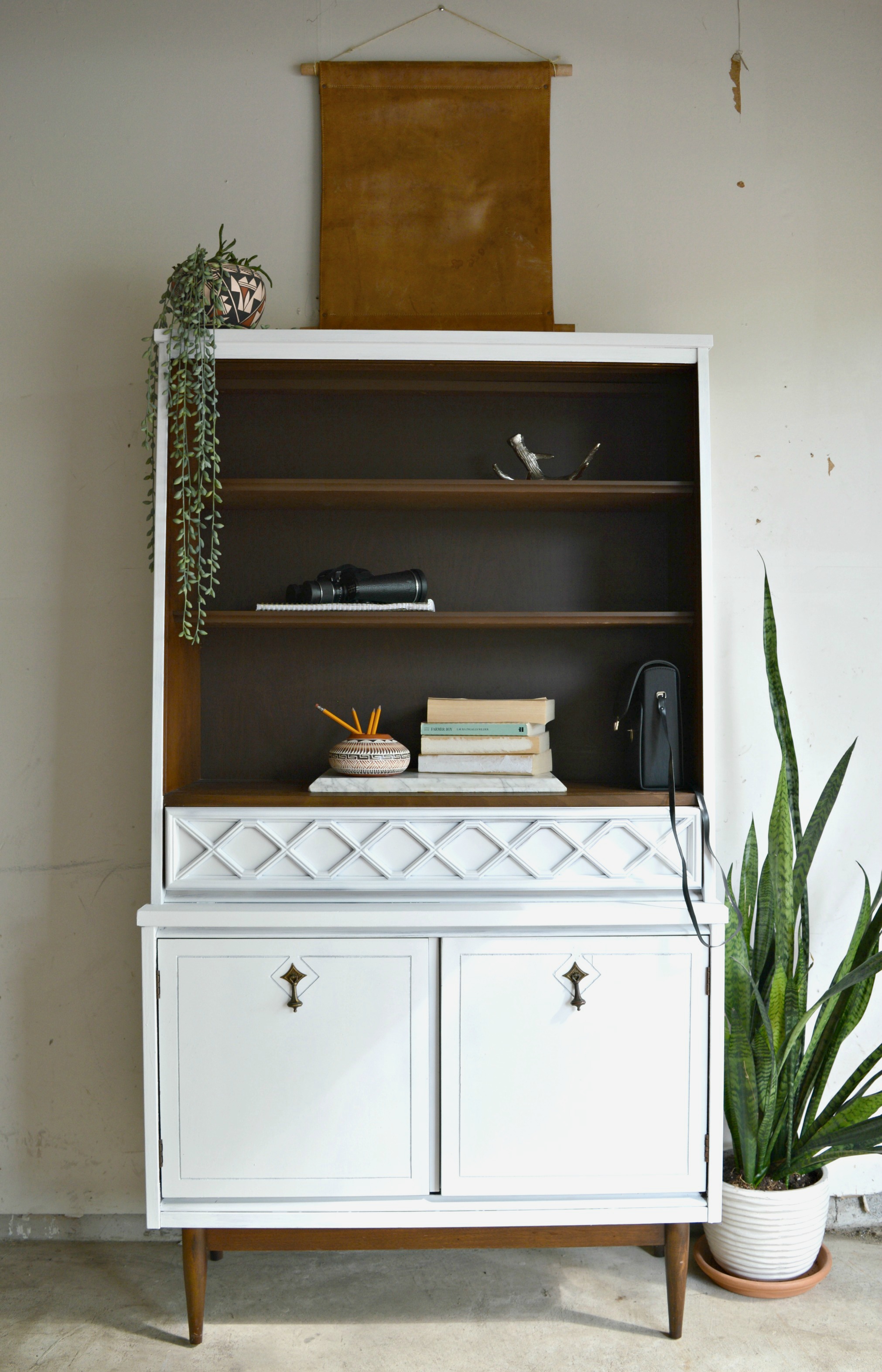
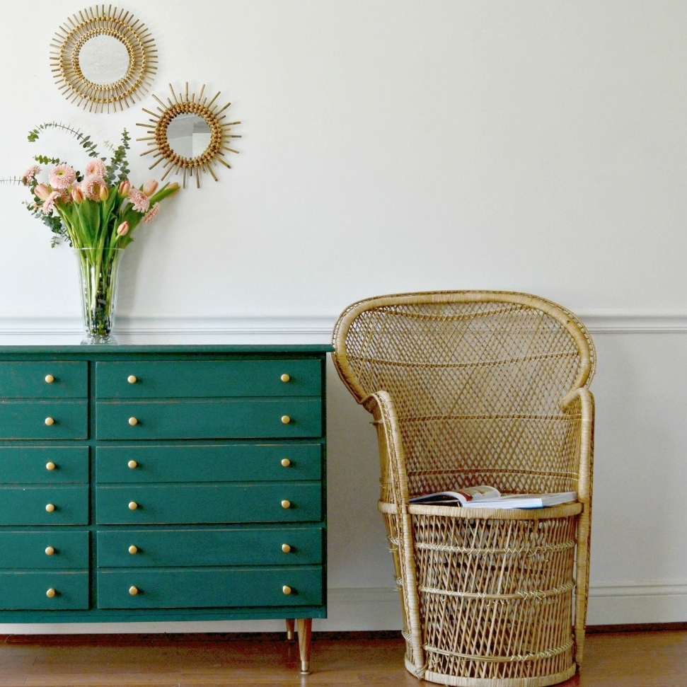
It wasn't even when I was finished painting this piece, (in Rustoleum Protective Enamel in flat white), that I decided to hold onto it. It was the process of styling it for photos!

Matt and I have been planning a little re-design on our main floor which will leave a prominent wall empty. Given the dimensions of this rather petite piece, (it's only 66.5" tall and 37" wide), I wouldn't have thought it proportionately appropriate for a wall that is nearly 12 feet high.

But while styling this piece for photos to get it ready for sale, I started to fall in love with the empty space around it. I added a distressed piece of leather that I stole from a chair, (that I promised my husband I'd put back together), above the piece, as well as a snake plant standing tall by it's side. All of a sudden this piece took on a larger presence than it's modest dimensions.

And the detailing on the drawer and cabinets? Well that was love at first sight anyways!

Cate and I have always remained true to our own unique styles when we refinish furniture. I can honestly say that every piece I've ever done is how I would refinish it for my own home. And sure, my style has changed over the years so what I was doing 5 years ago isn't necessarily what I'd do now, but it's all been true to my style at the time. For this reason it's often hard to see pieces go, but every once in a blue moon I am my own customer.

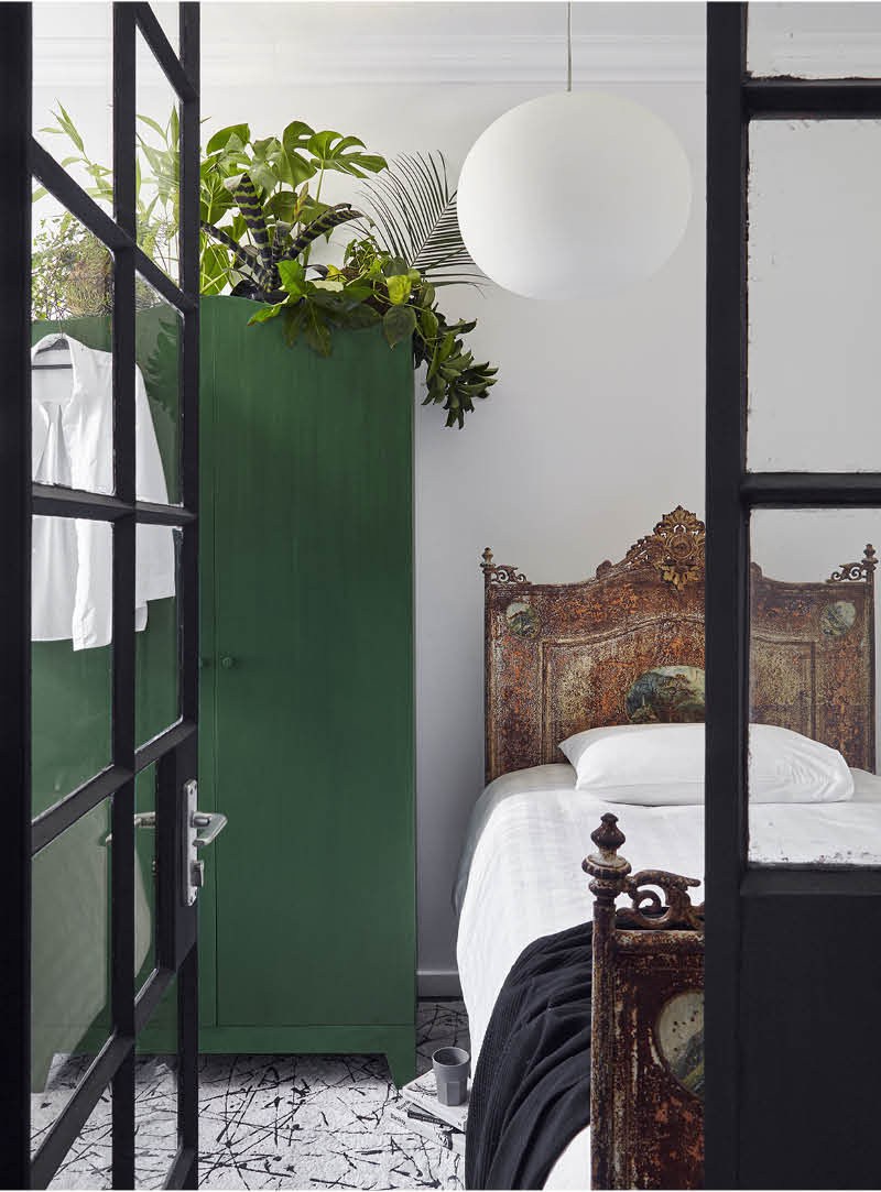
I can't wait to share the redesign of our main floor but it will be a few months, though, as our Fall schedule has left little room for such work; like a current E-Design job that we're wrapping up in the middle of October! It's coming along beautifully - here's a recent progress shot that our client sent over!

We'll be sharing the full tour in about a month - it'll be full of a few surprises we can't wait to reveal!

Thank you all for stopping by and have a wonderful day!

Color of the Year: Did Pantone Get It RIght?

Hi friends! Over the better part of the last decade I have found a tremendous amount of enjoyment from home decorating and styling. I desire to further my knowledge and soak in as much as I can both from a creative standpoint as well as the business. A large part of this business is understanding the ebb and flow of trends. Trends have always fascinated me even well before I stepped into the interior decorating world. How does an idea take off and become trendy? Who gets the ball rolling? Is it every day people or the rich and famous?

Then you have trend predictions which further add to my curiosity. One of the first trend predictions I started following a number of years ago was the Pantone color of the year. Didn't know there was such a thing? Here, take a look at some of their recent selections:

How do they pick the color year after year? I understand it from a marketing standpoint. With every declaration of which color will be leading the way that year you see the ripple effect right down to the most accessible and popular shopping destinations, such as Target, HomeGoods, Pottery Barn, etc. And then the celebrity designers partnering with those stores, (think Emily Henderson and Target), start styling their projects with the newest goodies available, showing everyone just how to incorporate the declared color of the year in a tasteful, manageable way.

This year the color turned out to be a twofer! They picked not just one, but two colors for 2016: Rose Quartz and Serenity. Here, they created this image of a faceless woman wearing a flowing cape to make the announcement:

Since this is an honest place I'll admit, I wasn't terribly excited by this combo. It brought me back to the days of when we had new boy-girl twins under our roof and everything was baby pink and baby blue. And really, other than a blush crocheted throw pillow at target I've barely noticed these colors make any strong statement this year.

Then something strange happened. I started noticing a different color breaking through the color-of-the-year combo - dark green!

If you're a big Fixer Upper fan you may recognize the photo above and the one below. They're just two examples from Joanna Gaines' strong use of dark green in their latest season which finished earlier this year. I noticed this color in just about every episode and I absolutely adored it.

And with the Fixer Upper cult following, I wondered if anyone else noticed as well. So I picked up a can of dark green, (Behr's 'Secluded Woods'), to refinish a mid-century dresser last Spring and it got scooped up within days. I had so many inquiries on that piece that once it sold, I had an immediate request for a nearly identical custom piece, (below on left).

I took the Summer mostly off from refinishing to focus on my family and some design jobs, but as soon as the kids went back to school last week I painted this beauty below in Ralph Lauren's 'Scholar Green', and it was taken within two days.


Is there a new color trending? Will it carry over to 2017? I sure hope so as we've got a little surprise to show you in a design job we're working on right now! But until we're ready to reveal, here are some more stunning examples of this moody color casually staking its claim:

Thank you all for stopping by!

Reader Design: Katie's Colorful Home Refresh

Welcome back, StyleMutts, and happy Friday! Today, I want to introduce you to Katie Banks, of CMB World Designs. She is another talented DC area native. I promise I'm not just selectively featuring DC area people - but I guess the best food city of the year is also a hot spot for designers! 

Before I jump in, I need to tell you all something about Katie's home: it used to be a fraternity house. And an unofficial one at that, which means no regulation! Bless the soul (looking at you, Katie!) who saw the potential through the Animal House leftovers. 

From Katie:

An unofficial fraternity house. Need I say more?! It was TRASHED! We couldn’t move in for weeks. The first thing we needed to do was get a clean new bathroom (gross). We did most of the work ourselves, from refinishing the wood floors, tiling, framing, new windows - you name it!
Our style is a mix of mid century, Hollywood Regency, and industrial. Obviously very eclectic, and color makes me happy. I have always been obsessed with bold color and patterns. I’ve also never been a trendy person, so the fact that bamboo and rattan has made a comeback is working out pretty good for me right now.

Based on what I know of Katie, this living room is a perfect representation of her: the macrame, made by Katie's sister who owns Sealily Designs. The chairs are Craigslist. The couch is made for cuddling. What else do you need?! 

I feel like 99% of the photos I see of Instagram are of these beautiful, bright white spaces. And, real talk, when do you guys think that trend is going to end? Those spaces are the perfect source of art, but that make you ask "could I actually live in that space?" Katie's home is not one of those places. And I assure you, in no way is that a negative thing. 

We are a super casual family, so comfort is a must; no fancy rooms in our house. I honestly have found that the best things in my house have come from Craigslist, yard sales, or are made by my super duper husband [like the dining room table]!
This hallway makes me happy. My theory is ‘if you have kids why would you ever pay for art?’ Framing all these pics was my Mother’s Day project a couple of years ago. Across the hall is the wood wall my husband made, which doubles as a photoshoot place for some the pieces that I refinish for CMB World Designs.

Something else I love about Katie's house? SO. MUCH. GREEN. They say decorating with green has seriously restorative properties - perfect for a busy and lively family home! Both the bathroom and the front porch would make my top two locations in this house for some serious 'me time.' 

And, finally, my favorite spot: my bathroom. Well, my tub area in my master bath. The green mosaic tile, with the skylight and plants, makes a great place to relax. At night I can see the stars.

Follow Katie along on Instagram at @cmbworlddesigns and check out her incredible furniture designs! We love to support our StyleMutt community! Check back next Friday for the next #stylemuttspace