DC Apartment - Living Room Source List

Well you all are just so much fun to celebrate with! THANK YOU from the bottom of our hearts for being excited with us about StyleMutt Home's first design project. Your sweet comments between the reveal post, Instagram and Facebook have deeply touched our hearts and made this experience truly special. You've given us the confidence to look forward to more projects like this in the future. Thank you, each and every one of you.

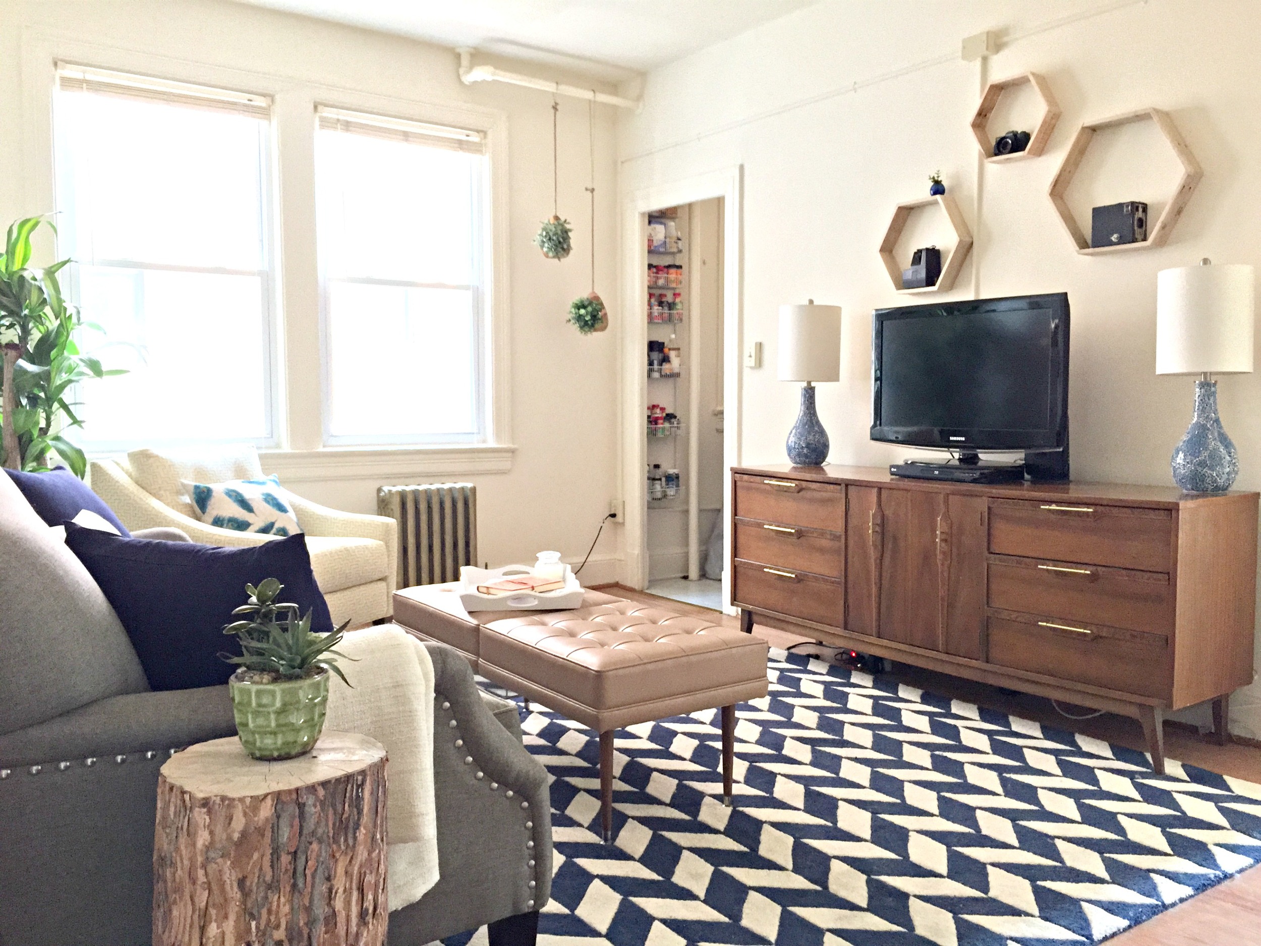
As promised we've got some sources to share! We'll do this room by room so it's not an overwhelmingly long post. First up, the entrance and living room!

Entrance Sources:

1. Coat rack - Rustic Modern Decor
2. Dream Big print - Paper Source
3. Mini succulent - Home Depot

Living Room Sources:

1. Sofa - Belfort Furniture
2. Mirror - Target
3. Blue Pillows - Home Living Ideas
4. Peacock Feather Pillow - The Bluebird Shop
5. Plant - HomeGoods
6. Cream Throw Blanket - Ikea 

1. Yellow Geometric Chair - Belfort
2. Peacock Feather Pillow - Samantha Emma
3. 'Hello' Pillow - Cushion Cut Decor
4. Blue Pillow - Home Living Ideas
5. Tree - Home Depot

1. Wooden Bird Feeder-Turned Planter - Target
2. Faux Greens - Ikea

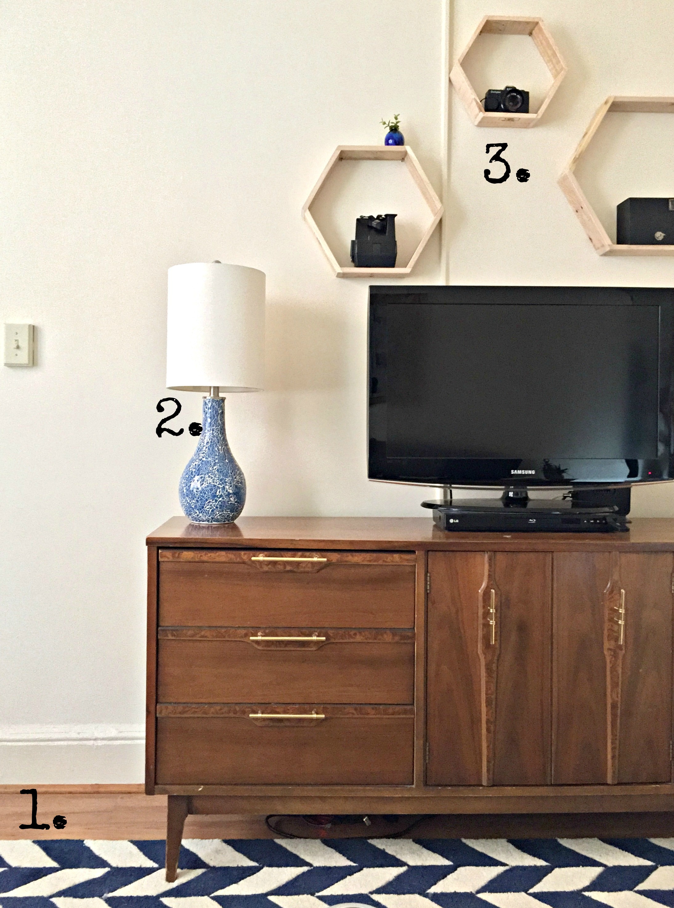
1. Navy and White Herringbone Rug - Rugs USA
2. Blue Ceramic Lamps - HomeGoods
3. Nesting Hexagon Shelves - Axel Co.
*Media center was a thrifted piece that we cleaned up with new hardware


1. Prints - Paper Source - (deets on this pull-down chart look comin' soon)

That's it for the Living Room! Don't hesitate to ask any questions you've got on this room! We'll be back soon with the Bedroom sources. Thank you so much for stopping by! 

DC Apartment Reveal!!

You guys! This is a big day for StyleMutt Home and one we've been dreaming and scheming for a nice long time - and it's such a treat for us to get to share it with you, friends! After several years of flipping furniture, we've felt this natural progression occuring in the direction of interior design. When sweet, young Christine came to us asking if home decorating is anything we would be interested in, we jumped on the opportunity to help her with her apartment! 

Her style is very eclectic with an emphasis on cheerful, she loves nature and color, and her edgy side is perfectly balanced by a gentle, soft side. We were so blessed to work with Christine and wanted to represent the multi-faceted, multi-talented, independent woman that she is. 


So you want to take the tour?! Come on in!

LIVING ROOM

||Before||

||After||

Among a very small handful of pieces Christine already owned was this small shelf that her Mom built and painted!

"TOTES MA GOATS"

Christine has herself a nice little vintage camera collection - we used these nesting hexagon shelves from Axel Co. to display them as a fun statement over the media cabinet, (which we found on Craigslist and cleaned up with new hardware).

Faux greens from IKEA nestle cozily inside these wooden bird feeders from Target.

Recognize the tree stump? We shared the tutorial for how we made these from a neighbors backyard trees a little bit ago! You can brush up on the deets here. :)

These faux engineer prints cost about $6 each and only 4 minutes of time a piece, (after getting the supplies). More details on these prints comin' soon - find the easy frame tutorial here!

Christine got herself a banjo during our time working with her - told you she was a cool chick! 

BEDROOM

||Before||

||After||

As Christine is in grad school, we wanted to give her more surface space to spread out and keep organized. Building her a desk along the bottom edge of her window sill created a long, sleek, inconspicuous space to do so.

Her beautiful headboard is actually an old door that was once used in Chelsea's home! One side is painted Duck Egg blue, and the other is natural wood. We created legs out of 2x4s that can be screwed into the door headboard from either side in case she ever wants to switch things up!

The color scheme for her bedroom was inspired by Christine's most precious piece of art - a painting named "Lilith."

That's a wrap! Happy house warming to the best first design client these two style mutts could ask for! We will be following up shortly with a source list for both rooms. Thank you so much for stopping by and have a wonderful day!


Kitchen Makeover! ||Again||

Hi All! I've been so excited for today forgive me if I whiz through and show too many photos. The truth is, I've kept something from you - our kitchen! It's been the sore spot in our home for a while now and the last time I shared it was several years ago when I painted all the cabinets and a chandelier in chalk paint. I thought it was great at the time! But we didn't have a happy ending. Let's recap:

Phase 1: Prior to moving in we painted our kitchen walls aqua blue. This space doesn't get a whole lot of light so I thought a pretty color would do wonders. Phase 1 also included removing our cabinet doors?? I don't know. But props to myself of 5 years ago for taking night time pictures that would eventually turn into solid 'BEFORE' pictures. I mean, as far as before pictures go, the worse the lighting the BETTER, right?!

Phase 2: I discovered how easy chalk paint was to work with and chalk painted every cabinet and a yard sale chandelier. Upper cabinet doors went back on and we finished with a high five.

This didn't end so well for us. Even after sealing and resealing, old cabinet bleed through was only the beginning of our problems. With three young kids who are only 'yay' high, (that's a universally understood height, right?), our chalk painted cabinets absorbed every grease smudge,  finger print, and foot print, (yes, foot print - the kiddos scale up the cabinets to reach the sink to wash their hands). They were impossible for me to keep clean, (and I specify 'for me' because I know others who are much more on top of keeping up with their cleaning, and perhaps don't have young children climbing up their cabinets).

So the chalk paint was a no-win for us. But it wasn't just our product choice, it was color. I've really come into a style groove with our home which has felt very natural and enhances all the sunlight we get. Our house is nestled in such a way that although we back right into a woodsy yard, we also get a substantial amount of natural light at any given time of day. My go-to for this particular house is to get down to a white canvas, add in some natural wood elements, snaps of black, and a subtle mix of metallic. Various colors come and go as the seasons change, but that's my basic formula and it has worked marvelously for every room. With the aqua walls and creamy off-white cabinets that our kitchen was rocking before, it felt very out of place in our house. My goal with every room is to play up it's positives and try to distract from it's negaatives. The result after the chalk paint debacle did the opposite - it didn't enhance anything!

If at first you don't succeed, try, try again!

Same layout, same mismatched appliances, same cabinets - but a few little change-ups and this space feels fresh and new! Here are a few examples of some lesser appealing aspects of this room which have been greatly improved by this makeover:

Bummer: Unfinished, shortish cabinets - These 35 year old builder grade cabinets which don't even have some of the finishing touches of current day builder grade cabinets. With our vaulted ceiling, the cabinets appear to stop short - both at the top and at the bottom with no toe-kick.
But wait: By using the same exact paint color on the walls AND cabinets, the line between the cabinets and wall is blurred, and their unfinishedness doesn't seem so obvious. 

Bummer: Little natural light - this room is fairly closed off from the rest of our main floor, with just the window over the sink streaming light directly in.
But wait: I opted for a higher gloss paint this time around to help bounce the light around, and now the light just doesn't quit!

Bummer Mismatched appliances - We have a faux stainless steel fridge and dishwasher, and a white oven. But wait: To help streamline the look of our kitchen without spending on new appliances, we closely matched the paint color to our white oven to blend it in. 

After winning a gift card prize from a photo contest by Dot and Bo, Matt and I decided on this hammered brass pendant from the eclectic, curated site. Backed by a natural bamboo shade, we've got our warm wood and touch of metallic, giving that relaxed, yet sophisticated look we've strung through our home.

This time around we used a brand new paint product! To seal in the bleed through we'd been experiencing with these cabinets, I decided to go oil-based. I had used the Rust-Oleum Gloss Protective Enamel spray on this piece, and was so impressed with it I got the idea to use it on our whole kitchen! I used the spray for our cabinet doors and the can and a brush for the cabinet bodies. (We painted our walls in the same color that is throughout the rest of our home, Ultra Pure White by Behr). It cleans like a DREAM and reflects the light all over the space.

I love this progression! It took a little time to get it right, but everything I've learned through this room alone makes it so worth while!

Displaying our new DIY hand towels that the kids helped make!

And finally, some daily practice.:) 

That's it! Any questions or want to know more? Feel free to leave a comment!

Thank you so much for stopping by! Don't forget to check back in tomorrow when we announce our One Thousand Gifts giveaway winner - there's still time to enter if you look back at yesterdays post and leave a comment! And friends, thank you, from the bottom of my heart, for your incredibly touching birthday wishes yesterday. You guys are the greatest. Nuff said. :)