Hi guys! It's a reveal day here at StyleMutt Home!!! These are the posts that make me as excited as they do intimidated - trying to fit 3 months of work and decisions and major ups and downs into an easy 5 minute read is not easy for this details lover! But I'll do my best.
Let's start with a few 'BEFORE' shots, shall we?


Keila reached out to us in mid-February seeking help reviving her condo into something a bit more streamlined. She had a mix of pieces ranging from Asian to mid-century to French Provincial. Much of Keila's furniture had been painted over in a shabby chic look, (including her dining room chandelier), and she was ready for a change; primarily a prominent mid-mod point of view. If mid-century modern is at one end of a style spectrum, I'd say the polar opposite end would be shabby chic french provincial. So Keila had some stuff that just needed to GO. We always tell our clients, if you don't love it and it's not sentimental then there is no reason to hold onto it. Trust us, we can make anything work and look good; if you want to mix french provincial with mid century we will, (and we have, see this bedroom we did a couple years ago). But good design is as much about shedding as it is adding; letting go of what doesn't feel like 'you' anymore is always where we start with a new client.
After selling and donating, (hello, tax refund!), the pieces that she didn't care for anymore, Keila was left with this short list:
a sofa,
a gray painted mid-century dresser,
a mid-century desk chair,
two Asian storage pieces,
and two brass floor lamps.
Now THIS was a solid starting point. And here's where we went from there!

So sleek, isn't it! Keila said she wanted straight mid-century modern, so that's exactly what we did. Let's discuss the dining room first! We had her move an Asian sideboard that had formerly been occupying space in her bedroom out here to her dining room to use as a buffet. We adore the stunning details on the cabinet doors and knew this piece would be a great anchor on the far wall. An oval brass mirror bounces some much needed light from this space, as does the glassy white tulip table. The wood and black leather dining chairs bring home the mid-century style while a brass light fixture adds a touch of polished emphasis. Below is the design board we showed Keila once we finalized the vision:

And here's the vision realized!
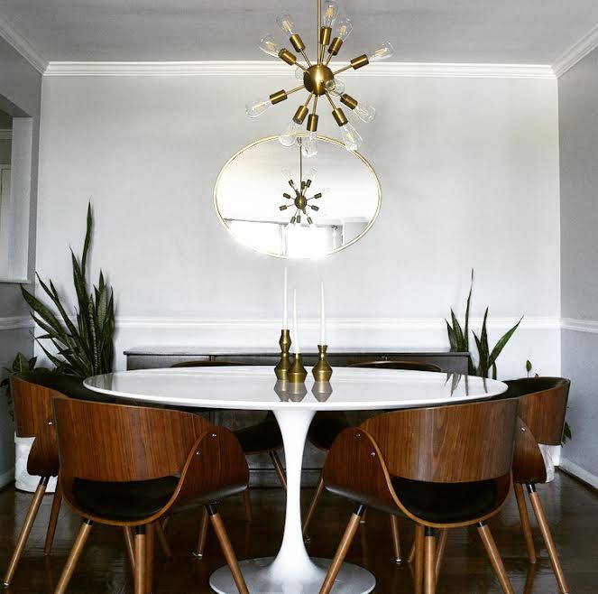
When considering the long and narrow shape of the entire room, end to end, I really wanted to add some curve to break up the length. These angles do wonders for the room as a whole and make this dining area feel cozier and more a part of the shared space. Cate has her own white tulip table and McKenna had shared with us one she's had her eye on for her own upcoming move, so drawing inspiration from those gals it seemed like the perfect piece for this space. The shine is really unbeatable and exactly what this darker space needed! (And since this table was an inexpensive Craigslist find, it was a no-brainer)

Now if we just do a 180 we can check out the living room!
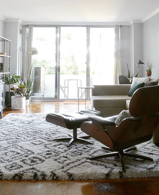
The plan for this space was to blend it with the dining room so the two areas of the room looked connected. A strong black, white and wood theme was continued with a graphic rug from PlushRugs, a hand-me-down leather eames lounge chair replica, a new desk, and some minor filling in with curated details. Here is the design board we sent to Keila to share our vision:

And here's the vision realized!


Because this condo is intended to be an airbnb rental, the budget was quite small. So we got really creative repurposing some of Keilas own pieces. The mid-century dresser that she painted gray and had in her bedroom was brought out here, (she had another dresser as well - don't worry, clothing storage is of high importance to us!), and rather than brand new shelves we found this set on Craigslist.

This statement area rug from PlushRugs, (found here) is as cozy as it gets, folks! A high pile like this keeps a sleek mid-mod space cozy, but the pattern slips right in with the style. Truly the best of both worlds!
Savings and style won once again with this leather Eames lounge chair replica. Keila actually scored this piece from some friends who'd forgotten about it in their basement, (talk about tragedy!).


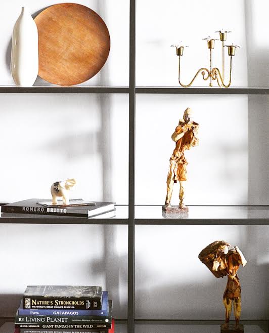
Keila had more than enough collected treasures from her travels to style her shelves so nothing new was needed here - just a bit of time styling, (aka playing). A happy little plant party by the window softens the shelves and adds just enough freshness to the space.

Another discounted score was this brass 'C' table Cate found while thrifting! Local clients are particularly fun because we can actually do some hands on shopping on our own time.

An old chair that Keila already owned was a perfect match to the new walnut desk we found at Target, (topped with a sleek Target task lamp).

And finally, the Asian storage cabinet that Keila owned was moved to the other side of the living room to allow the light to really filter in and also to create some natural definition to the living room.

We were initially concerned about the wall color as we were not allowed to change it for this particular project, but ultimately we found it to be a non-issue once we decided on such a simple and sleek color palette.
We are so pleased with house this main living space turned out and most importantly, that our client is in love with her home again. Unfortunately she'll be moving, but what better time to makeover a home! We're crossing our fingers that the effort produces eager renters for her down the road.
Thank you all so much for coming by and checking out our latest eDesign project! And a special thank you to our girl, McKenna, for all her help with this one! It was such a blast having her on board.

Source List:
DINING ROOM
-Table (similar) - Poly + Bark
-Chairs - Overstock
-Mirror - West Elm
-Light Fixture - Lights.com
LIVING ROOM
-Rug - Plush Rugs
-Pillows - Corner Oak Design Co.
-Shelves - IKEA
-Desk - Target
-Black Task Lamp - Target
(If something isn't sourced, it's either a UTF - Unidentified Thrifted Find, or something our client already owned)