Hi Friends! Goodness me has summer sizzled and fizzled already?! I spent the end of last week and this past weekend getting all back to school shopping done! Our twins start kindergarten in a month so this was our first time in the back to school chaos. My. Word. No need to exercise after THAT task! I didn't realize it's like a contact sport!
On a brighter note, I got a sweet little pair refinished and ready for the Sweet Clover Barn sale that we're hoppin' in on August 21-23!
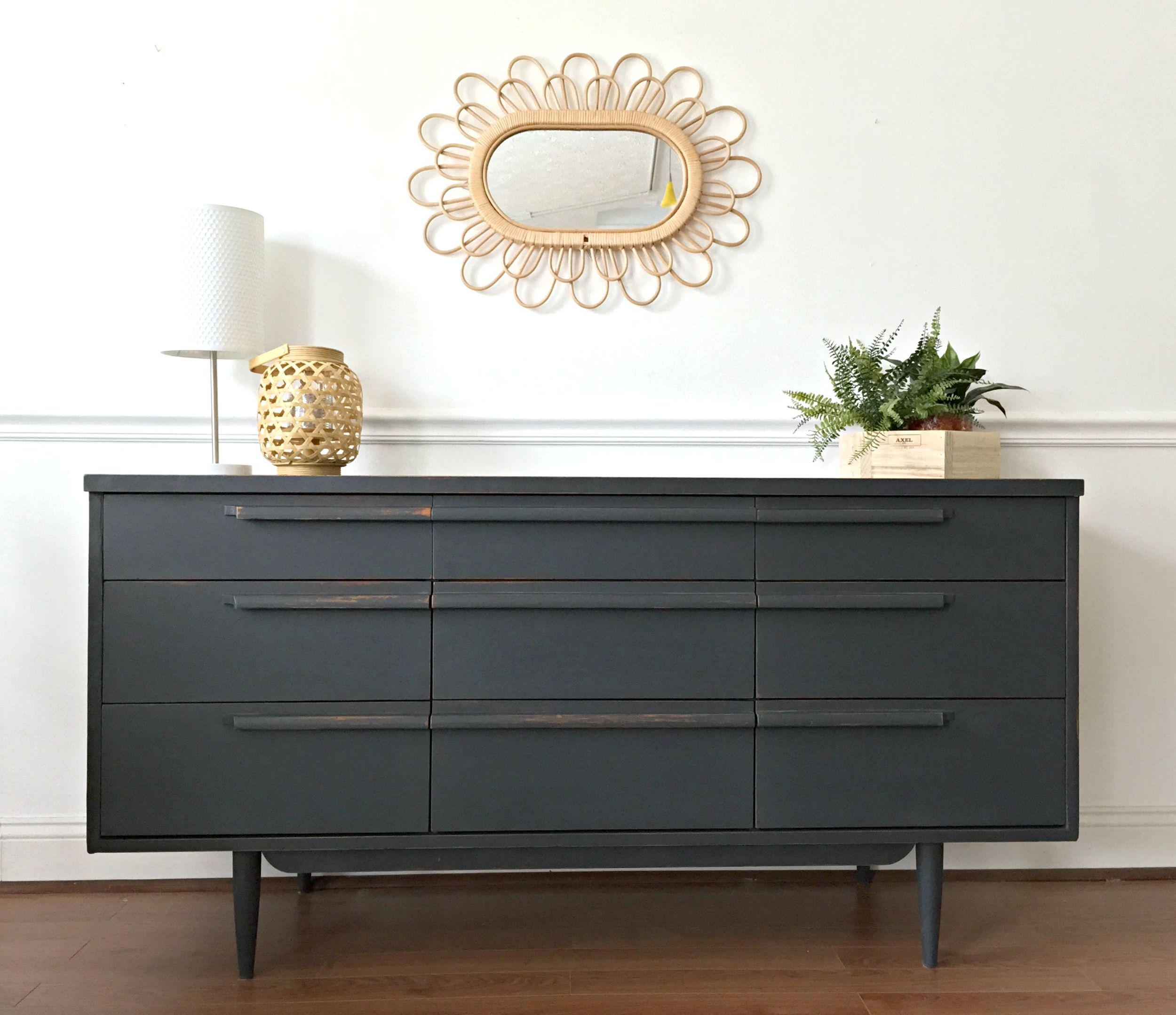
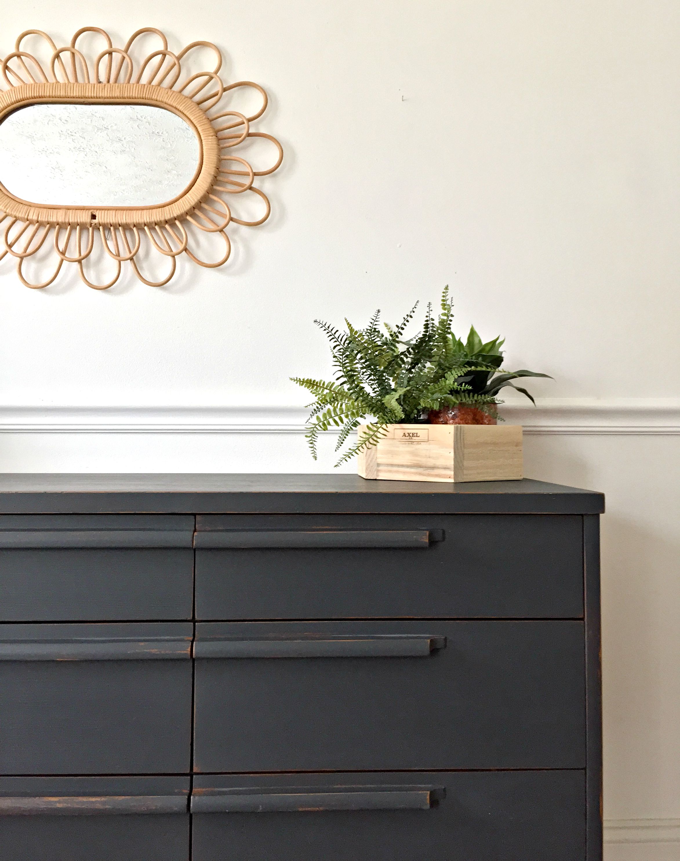
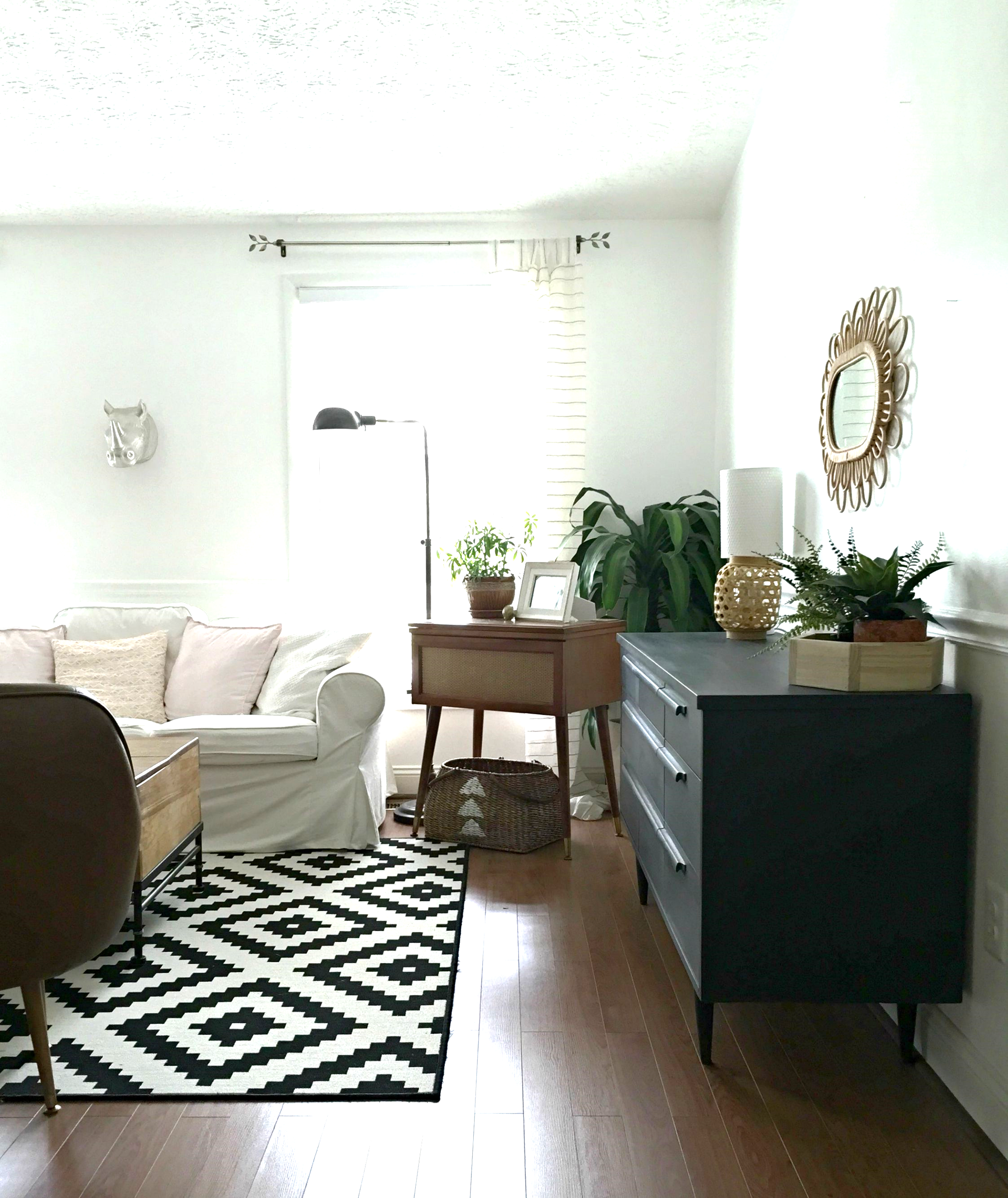
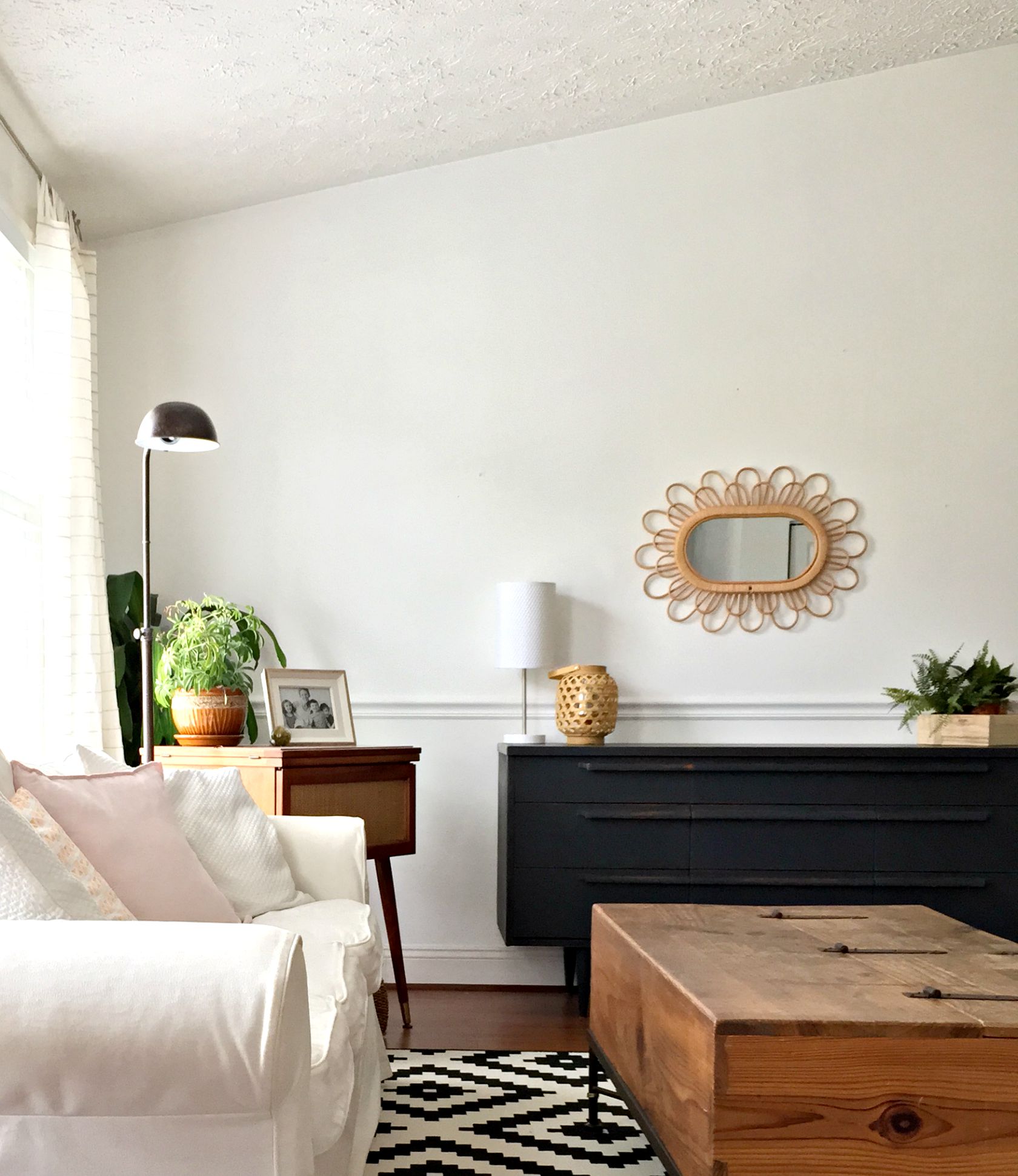
The warm wood peeking through is the real diva here, isn't it!? SUCH a stunning contrast.
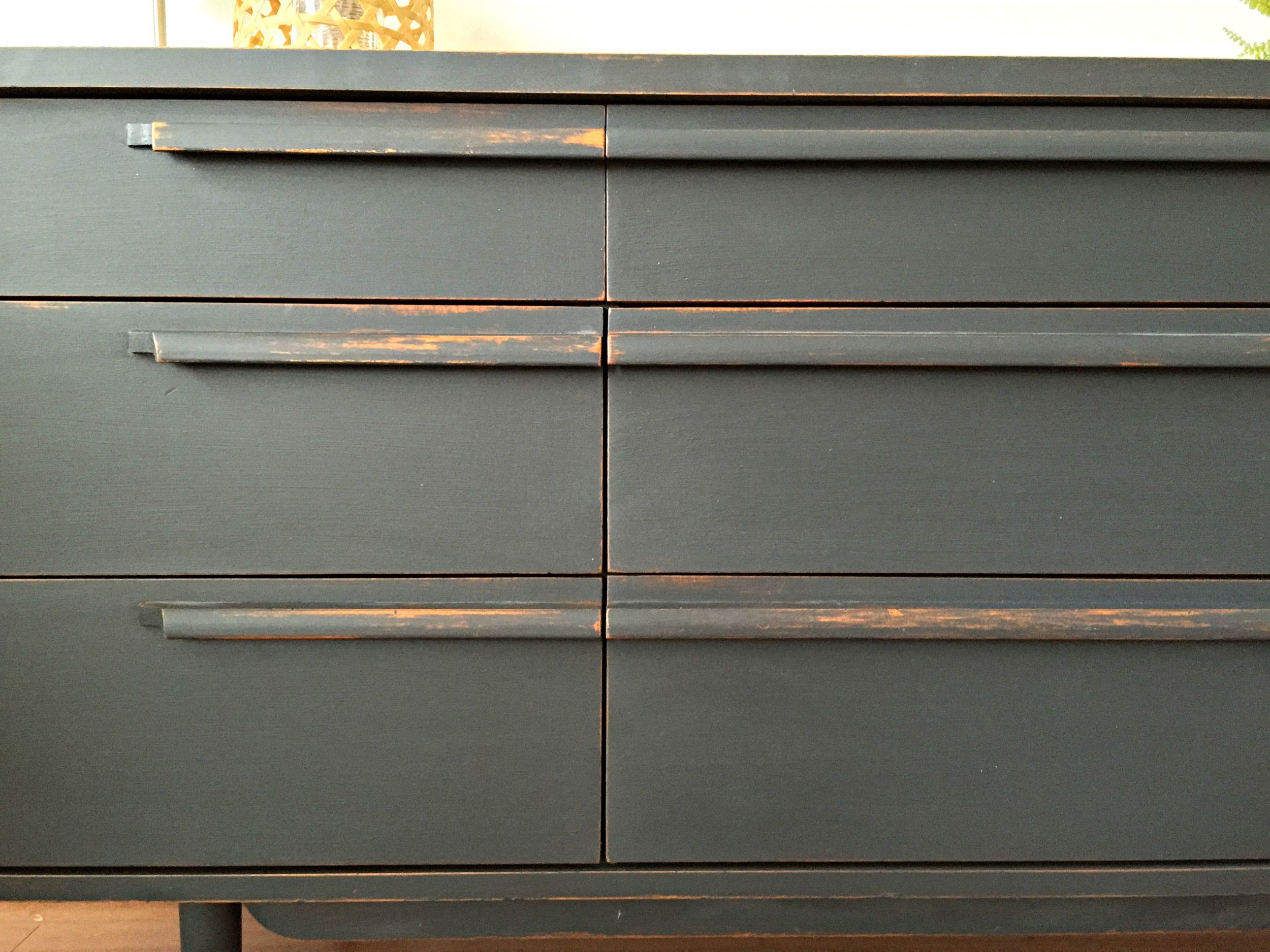


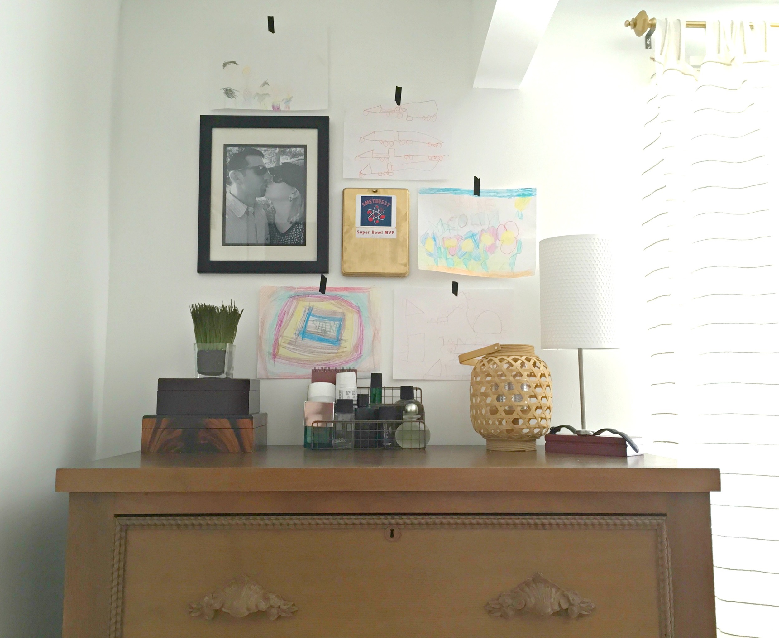
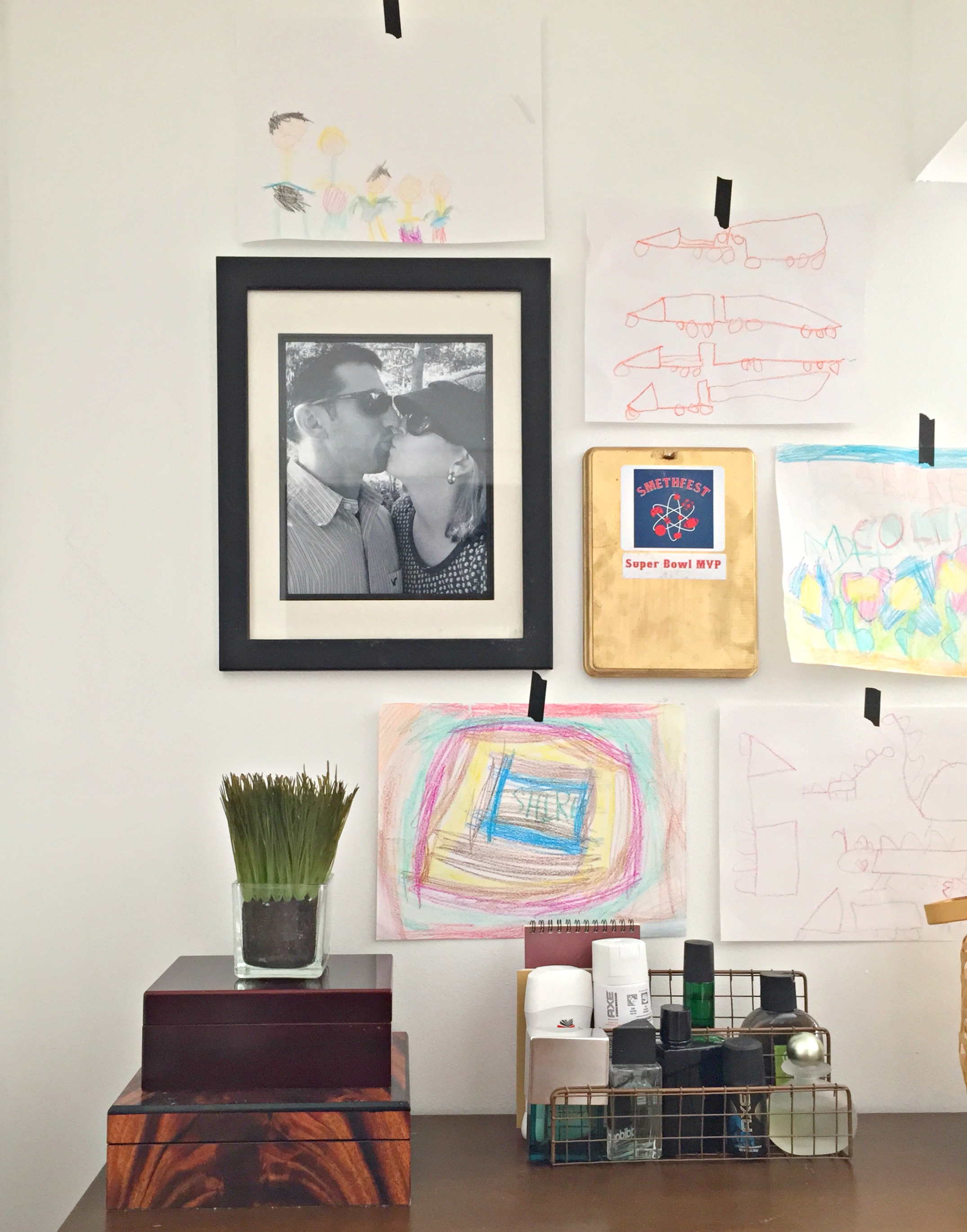
Not to be outdone by it's larger counterpart, this little nightstand / side table is lookin' pretty fly now, too!

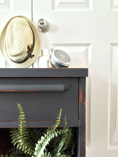
For this piece I used Annie Sloan's 'Graphite' - her darkest chalk paint color and truly a top favorite. Since it's been a while since I've used chalk paint I wanted to answer some questions I've received recently on the product! Most of these questions came from Instagram, and a few more came in via Periscope, (I'm on @ChelseaStyleMuttHome if you want to catch my live demos on refinishing, styling and the like)!
Q: Why do you prefer it, (chalk paint), and is it easier? Because I'm all about easier.
A. I only use chalk paint when I am going `for a very rustic, matte finish. It's a very flat, absorbent, 'loose' (like chalk), paint. So, it adheres well to any surface, but can also be distressed beautifully. It's definitely my go-to product when I want to give a piece a really time-worn, weathered looking finish. Chalk paint has an old-world look to it because it is so flat and distresses so well. And it is easy! No need to prep a surface before hand; just make sure the surface is clean and you're ready to paint!
Q: I just bought a can of Annie Sloan Country Grey today to paint a nightstand. I have only painted 1 piece of furniture with AS chalk paint before, a dresser using Old White. Any tips you can offer? The nightsand is unfinished pine. I want to have a smooth look to it.
A: I love Country Grey! Just make sure the surface is clean and then you can get to painting! You will probably want to use 2-3 coats for solid coverage, especially if you do not want it to appear distressed. Chalk paint brush strokes tend to be really apparent because it's so thick, so if you desire a perfectly smooth texture, I would paint on two coats, sand it over using a fine grit sanding sponge, then seal it in clear wax. A fine grit sanding sponge won't take the finish off if you just rub it over lightly, but it will smooth out the brush strokes.
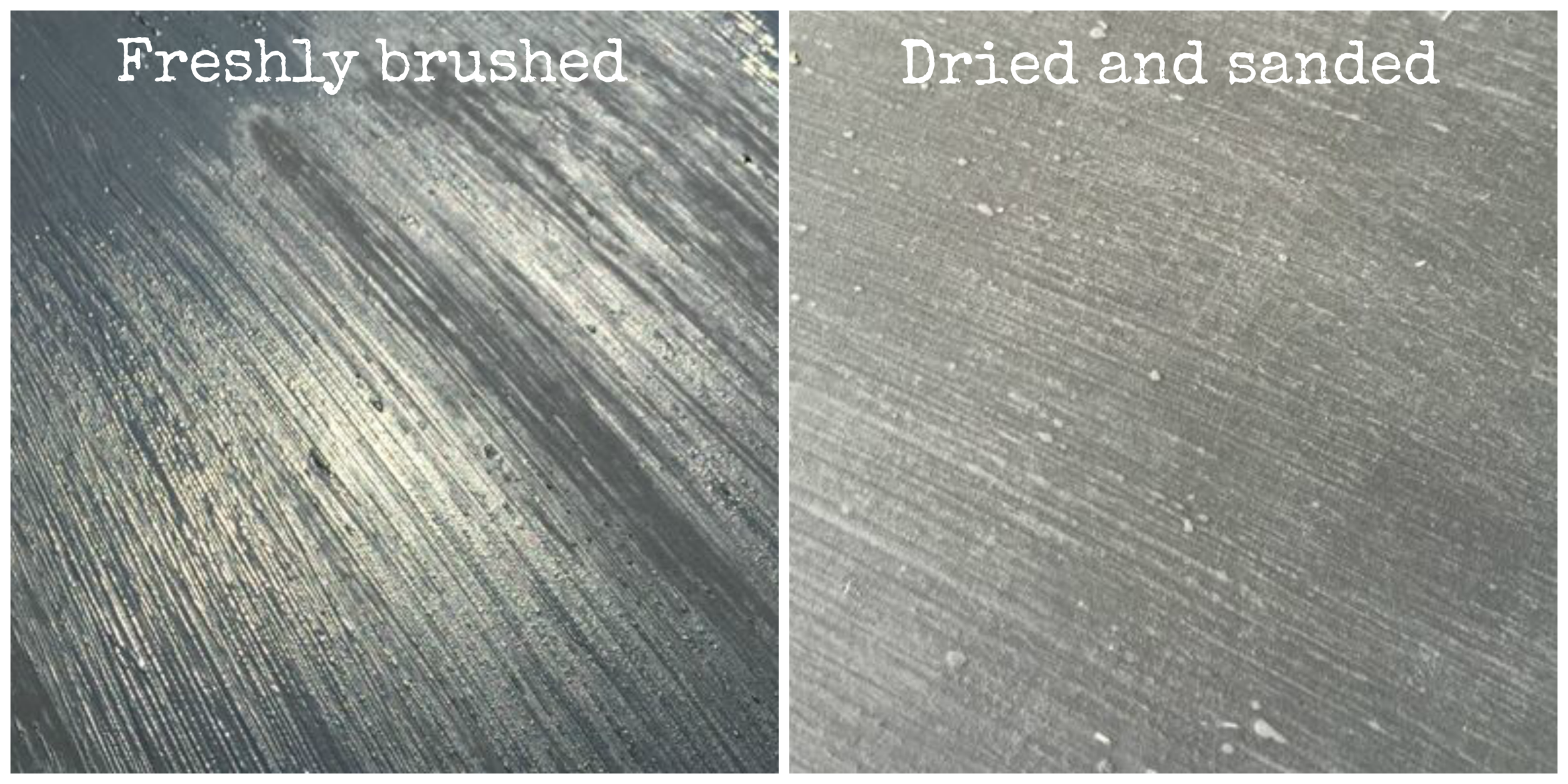
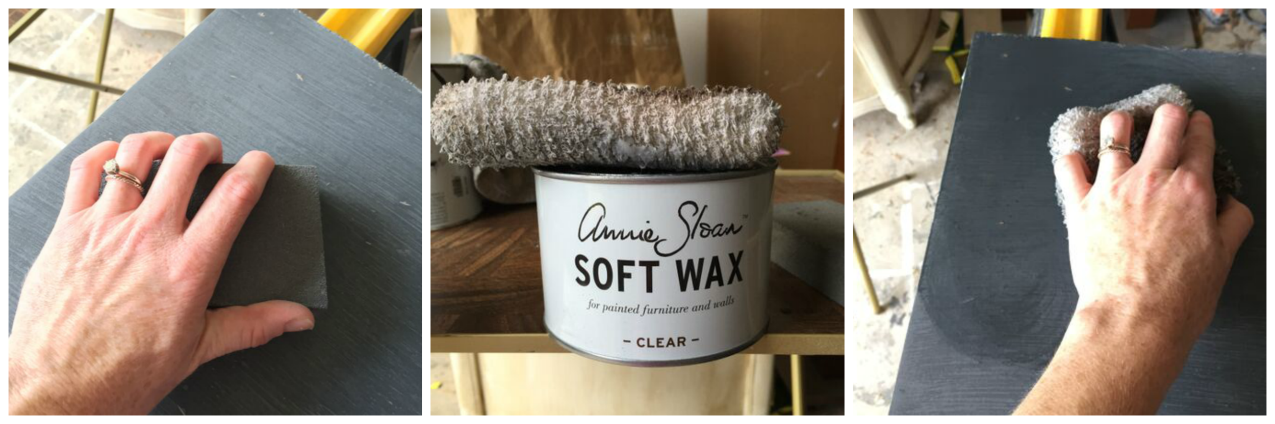
You can see above that the left picture has really raised brush strokes. The right side shows the same section smoothed over with a sanding sponge. There's a little discoloration from the sanding dust, but once it's waxed, it's all evened out and one solid color. I apply wax with a staining pad, found next to the wood stains in the hardware store.
The photo below left is smoothing the finish out with a fine grit sanding sponge. The photo below right is using a staining pad to apply the clear wax. You can see that the color is 'reawakened' with the wax. :)
Q: I'm hoping to paint a wooden chest of drawers with chalk paint and would like a glossy finish - what should I use to finish it?
A: Chalk paint is very, very flat and matte in finish. NO shine, whatsoever. To get it to shine in the least with wax, you would want to use two coats of wax and buff, buff, buff. So if you truly want a high gloss you can either a) Choose a glossier paint that might make more sense for the particular finish you are looking for, (I LOVE Rustoleum's Clear Protective Enamel paints, but if you need a wider range of color, try Behr's Marquee paint line), then you can seal it in a Polycrylic clear satin sealer. OR b) If you'd prefer to use chalk paint, then I'd use the steps above to smooth it out once you're finished, then use a Polycrylic clear high-gloss sealer. It won't shine quite as much as a glossier paint, but it will shine more than if you seal it with wax.
Q: Why is 'Graphite' difficult to work with?
A: Graphite gets SO grey when you start distressing it or smoothing out the texture with sanding! It can be a bit alarming:

The right side of the photo above shows where I gently sanded over 'Graphite', the left side is untouched. To restore the color you will want to apply a liberal amount of wax. If you want to touch anything up with paint afterwards, the process, (gentle sand and wax), will need to be repeated over that spot to even out the tone. It's a color that needs a little more sweet talking than other colors, that's all. :) But it's so worth it!
I used to paint everything white. White and Duck Egg blue. I still love the softness of those colors, but I am totally crazy about the contrast of this deep color in a white room! What a show stopper.

It's really quite dangerous to stage a piece which you intend to sell in your own home. Especially a piece that fits right in. Oh forbidden love, it's torturous!
Have a wonderful week, friends! Thank you so much for stopping by and making StyleMutt Home a part of your day. We are so grateful for you XO