Hi friends! While we've been busy moving forward tackling some new projects for an exciting event in August, (stay tuned for the juicy details!), our DC Apartment project has carved out a nice little wake for itself! Last Friday Apartment Therapy featured a sneak peek of the space in an article on decorating tricks for small spaces! We've been quite overwhelmed and humbled by the response to this project and are excited to welcome some new friends to our cozy blog!
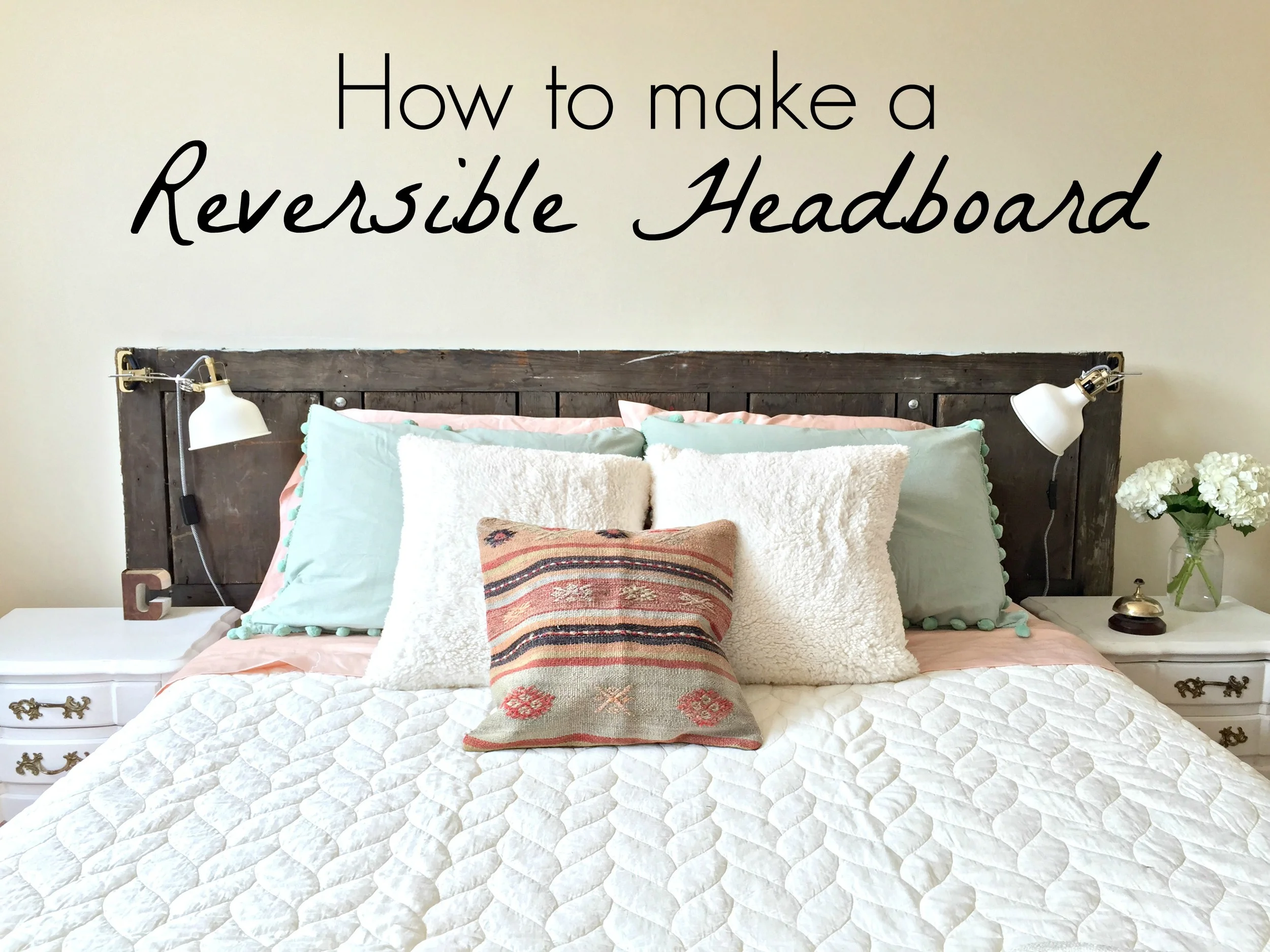
As promised, we'll be covering some of the DIY projects we tackled to make this space extra functional, chic and customized to our client. First up is the reversible door headboard! This was a brilliant idea of Cate's that will hopefully give our client long lasting use for this piece.

The first thing you'll need is a door! We found this piece several years ago at the Lucketts Spring Market, (along with a handful of other goodies)!

I, (Chelsea), bought it to give our master bedroom a bit of height variation and to cozy up a little reading nook. I painted one side in Duck Egg blue, and used that side for about 2 years before giving our bedroom a completely fresh look.
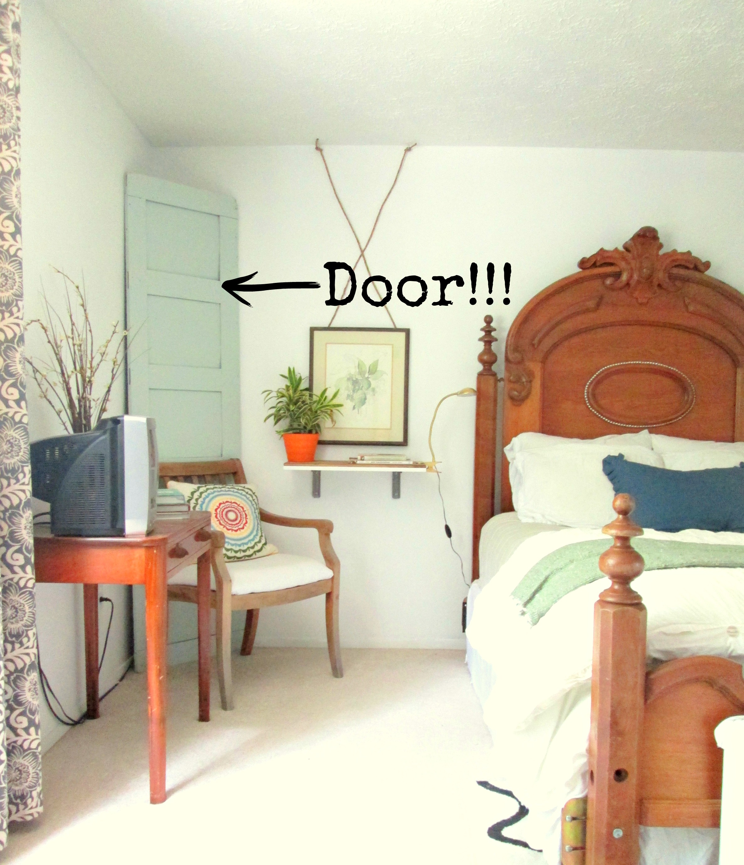
Although we had no use for this door anymore after refreshing our bedroom, I'm so grateful I kept it! **I don't typically keep things I have no use for and don't recommend holding on to things for the sake of waiting until you find a use - this piece was one of the few items over several years that struck me as special enough to hold onto, and since it was flat, it stored easily. When we started discussing headboard options for Christine's apartment, this piece was like striking gold! It was already the perfect size, and the painted side happened to be in the color palette we were using.
Although we ultimately decided to use the wood side for now, we turned this door into a headboard in such a way that Christine can always switch sides whenever she wants a fresh look!
Here's how:

So, diagrams aren't my forte, but this is how we rocked a reversible headboard! Rather than screwing the door into the wall, we made legs for it to stand on out of 2x4s. We knew how high we wanted our headboard to stand, so we took that measurement to Home Depot and had them cut two pieces of 2x4 to size., (45" in our case). By pre-screwing an appropriate sized hole through the door and 2x4s, we were able to then use 3.5" bolts that went all the way through both, and secured with a nut on the other side. If Christine ever wants to use the painted side of the door, all she has to do is unscrew the nuts, pull out the bolt, and bring the legs around to the other side of the door, then stick the bolts back through and secure with the nuts.
Since our headboard is not attached to the wall, we made sure the legs were close enough together that the bed itself could be pushed up against them, securing the piece against the wall. The legs are completely unseen, but provide a sturdy base for the piece.

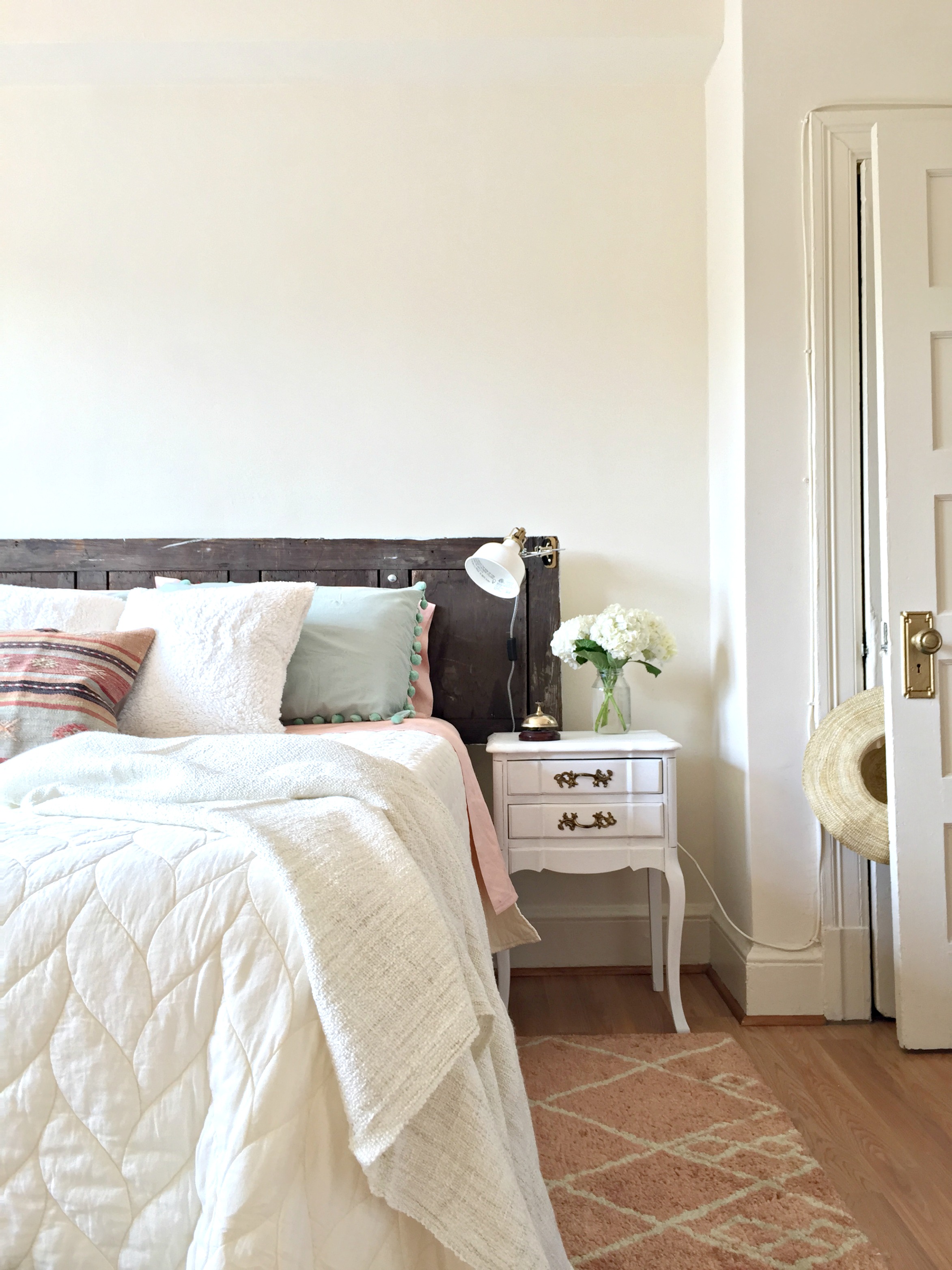
The RANARP clip light from IKEA adds a snap of sophistication for a reasonable $19.99! We opted for the screw-on attachment rather than the clamp, (the instructions on how to use either option are in the box).


A reversible headboard might be a fun option for all you fellow mind-changers out there who like to switch things up at the shift of the wind! We totally get it and hope this tutorial helps inspire new ideas for multi-functional pieces!
Thank you all so much for stopping by! Stay tuned for a colorful Reader Design tour coming all the way from Germany tomorrow - auf wiedersehen!