Reader Design: Sara's Approachable Rental

It's December 1. Where has 2017 gone?! 

While I sit here and reminisce, let's take a trip to DC, where I lived at the start of this year. We're off to explore Sara's rental in our nation's capitol. Sara's one-bedroom spot is a step-up spatially from the studio she once had - the same spot that inspired her to start sharing her design tips in the first place.

nov 10-012.jpg
nov 10-025 (1).jpg
nov 10-031.jpg
I started my blog because I didn’t find enough resources for studio apartment decorating and living when I first moved into my own studio apartment in DC a 4 years ago. I’ve since upgraded to a one bedroom, but after living in studios and apartments under 800 square feet, I really enjoy the process of designing a space on a budget and that’s entirely renter-friendly. It will probably be awhile before I own a place, so the challenges of making a rental your own are really fun. If your home or apartment is a rental and a place where you spend a lot of time, it should make you happy and reflect your style. Whether it’s new paint, changing out the hardware, adding art or anything else- I believe every home can be beautiful- rental or not!

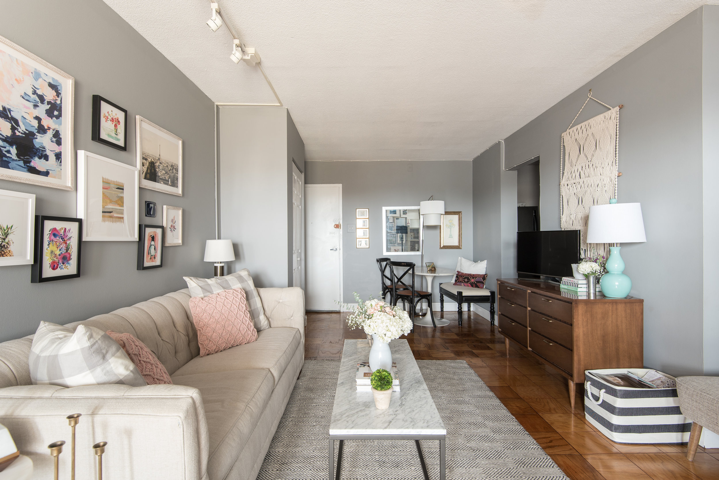
Sara has pulled together the perfect home base escape, with mid-century, Parisian, and Cali cool vibes throughout. 

nov 10-027.jpg
171110_SSB_3537.jpg
I strive for my home to be inviting, stylish, yet approachable. I want people to admire the space, but also feel comfortable to sit anywhere and put their feet up. I don’t believe any space should be too ‘stuffy’ or so ‘perfect’ that guests are afraid to touch anything. I also have a dog (who is allowed on the furniture) so everything must be pet-friendly, too!
nov 10-049-Edit.jpg
171110_SSB_3518-2.jpg
nov 10-060.jpg

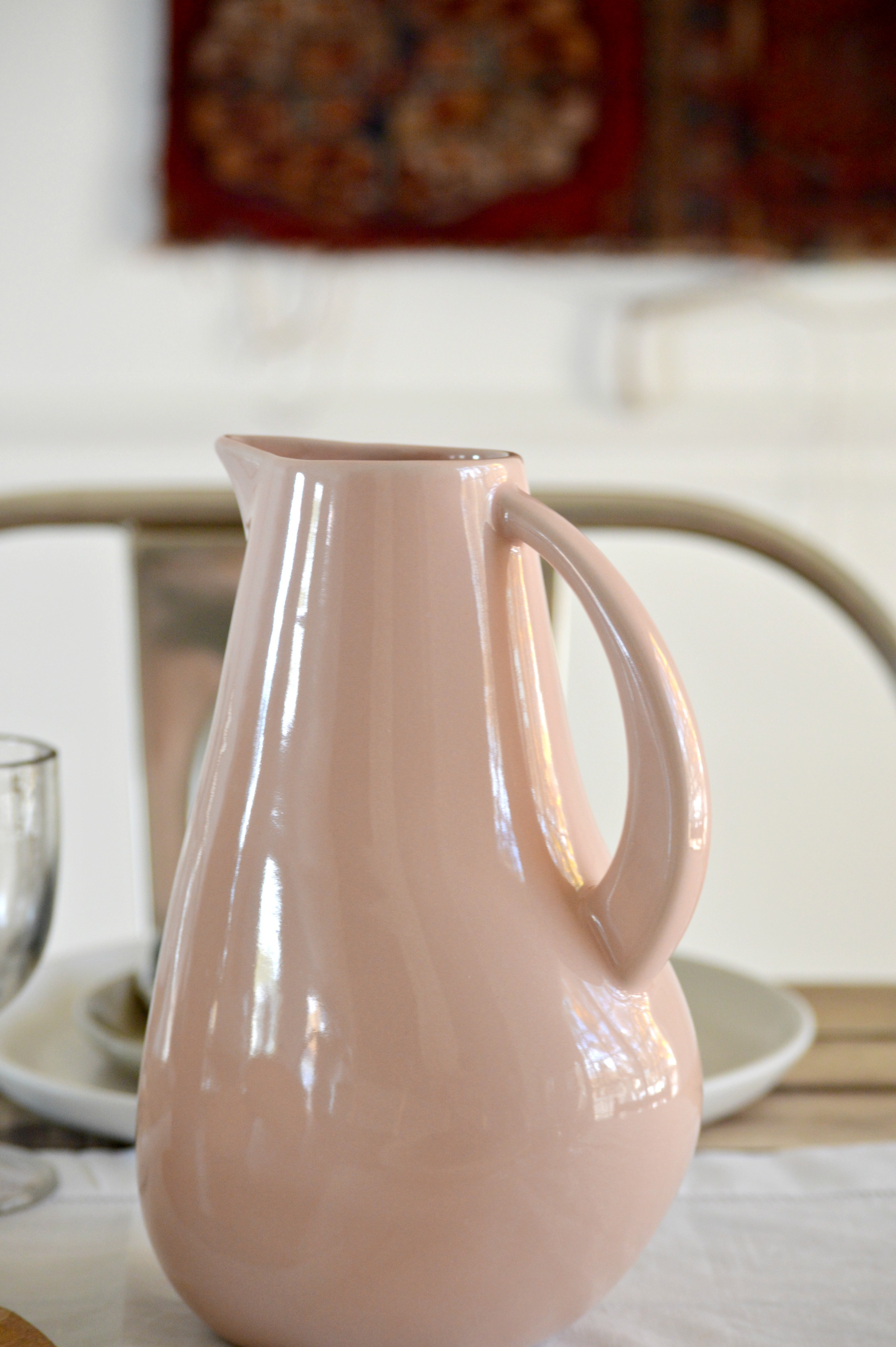
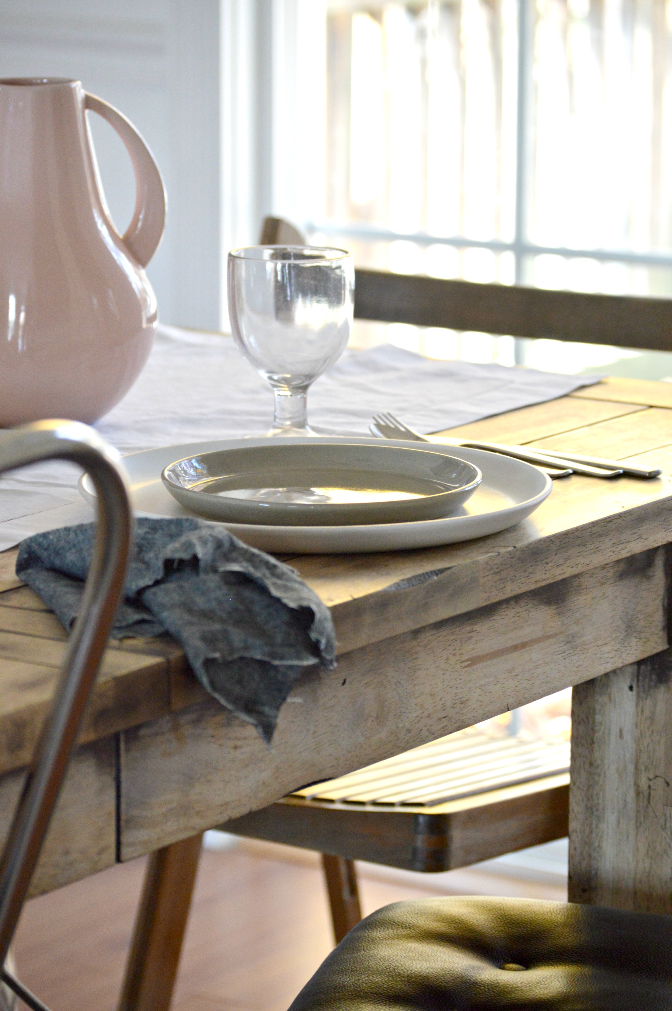
In her home, Sara keeps things simple and calm with neutral tones and subtle pops of visual interest, using color, patterns, and texture. 

The images all over pinterest and instagram constantly give me the urge to paint every inch white and go very scandanavian and remove all color from my place. However... I don’t think I would realistically like that long-term. My apartment is fairly neutral but I do like a pop of color here and there. My bedroom is all white and muted pink accent of the rug and metallic elements keep the space calm and neutral and it’s really relaxing to come home to each night.
171110_SSB_3506.jpg

Since the room is rental, Sara still keeps her design budget-conscious and smart.

I’m always willing to splurge on bigger staple pieces that I know I’ll use for 5-10 years or more. My bed frame and my sofa were both on the higher end of the price scale but I know they are quality investment pieces that I’ll use for years to come. I try to save on accessories and other elements in the apartment- scouring thrift stores and craigslist for great vintage finds.

Sara, thank you for showing us around your home! And thank you, Laura, for the stunning eye candy.

Follow Sara along on Instagram @studiostyleblog for more! Follow the talented @laurametzlerphoto for photos like these and more!

McKenna Sig.jpg

Pop of Color Custom Order

It's a REAL treat to work with a client with similar design sensibilities.  I mean, that’s gotta mean you’re doing something right, right?  Your tribe is finding you.  And you get to work with people that inspire your creativity.

This fall, I had the opportunity to develop a DIY nightstand tutorial for Apartment Therapy.  Shortly after, a couple reached out to me hoping to get a customized a version of the tables that could work around two specific design elements:

The tables needed to be large enough to showcase a West Elm Pelle Table Lamp:

Source: West Elm

Source: West Elm

And they wanted a pop of color that played well with the West Elm Expressionist Printed Rug.

Source: West Elm

Source: West Elm

So with these specifications in mind, I rendered two options for them to consider - one with a teal accent color and one with an "inky" black. 

Deep Breath S460-7.jpg
Black Boudoir PPU26-23.jpg

And which color did they choose...?

DSC02649.jpg
DSC02599.jpg

Instead of painting the entire piece to match the rug, I proposed we just paint the inside to preserve their "airy" quality while giving the clients more versatility down the line if they ever got the itch to rearrange things. 

DSC02602.jpg

I used the same materials as my original design for the rest of the build: blonde wood + camel leather straps but I did have to modify the proportions a little to accommodate their ideal dimensions.

DSC02607.jpg
DSC02622.jpg

To highlight the interior pop of color, I chose to style with warm earthy tones comprised of...

DSC02641.jpg

1) Terracotta touches (always)

DSC02621.jpg

2) A grouping of paintings

DSC02599.jpg

3) And a salvaged tree branch (ok, I pulled it off a sapling in the parking lot)

DSC02628.jpg
DSC02618.jpg

The happy clients picked up these custom orders this weekend and I'm happy to say they are already settled in their new home!

If you are interested in your own custom order, please contact me at cate@stylemutthome.com

Cate.jpg

Simply Set, Fully Enjoyed || A Holiday Collaboration with Carthage Co.

Hello and Happy Thanksgiving, Friends! We hope you have been able to enjoy time with those near and dear to you and that your hearts are feeling full. We are delighted to continue the celebrating on here with you today through a partnership with a wonderful company who is hosting a giveaway!

Allow us to introduce you to  Carthage Co., an ethically responsible company creating beautiful stoneware with local manufacturers in North Africa.

We're proud to work with local manufacturers that employ and empower their communities with dignity and equity. We believe in sustainable entrepreneurial growth that would rather partner with, than compete against.  -Carthage Co.
16.jpg

So their ethics are sound, but what about their pieces? Well, my photos don't do the beauty and quality of their products justice, but take a gander at some pieces I've had the pleasure of getting my hands on these past few weeks.

What I find so beautiful about these pieces is their quiet presence on our table. I don't want anything to distract from the faces that gather here. I desire for everyone to be able to see one another, to talk to each other and pass dishes around with ease, so I keep centerpieces simple and to a minimum. When I set my table it is with one purpose in mind - togetherness.

Carthage Co. stoneware dishes support that goal with pieces that are beautifully simple, uniquely designed, and allow quality time to happen around them.

8.jpg
5.jpg

-Pitcher in 'Rose' (10 colors available)

4.jpg

-La Marsa Dinner Plate in 'Chalk' (5 colors available)
-La Marsa Dessert Plate in 'Muslin' (5 colors available)

2.jpg

As I have gotten older I've come to appreciate a few things I once took for granted: higher quality pieces for my home, raw beauty straight from this earth, and most of all, time with those I hold close to my heart. If you've spotted something of interest, (whether for you or someone else), or you resonate with Carthage Co.'s mission, I invite you to enter a Giveaway they are graciously offering the StyleMutt Home community for a $50 gift card to their shop! Please leave a comment below of a special item you've spotted in their shop that's piqued your interest - your comment will be your entry. Entry closes at midnight tonight so this is a quick one, guys!

Winner will be announced in this post tomorrow, so if you enter be sure to come back tomorrow to check the results! And whether you see your name or not, all are welcome to use the discount code STYLEMUTT15 for 15% off their entire order now through December 5!

Thank you so much for taking the time to stop by today! Have a wonderful rest of your holiday weekend!

Chelesa.jpg