Reader Design: Jen's Fabulously Functional Home

We are so pumped to have so many inspiring entries to #stylemuttspaces.  Chelsea and I want so dearly for StyleMutt Home to be a resource for our readers and we certainly don't believe the buck stops with us.  We pine for input from you all!  And we hope you never shy away from reaching out to us with your own ideas.  You don't have to be a professional designer or blogger to have your voice heard here.  Love your space?  Then...

Work It.png

(or boy ;)  and share it with us!

Ok, I need to reign in my sassy snapping fingers and get back to serving your double helping of juicy inspiration from our next reader design.  Are you hungry?  Because dishing it out hot is our first international feature from Alberta, Canada: Jen from Fresh Crush.

From Jen:

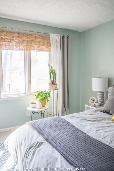
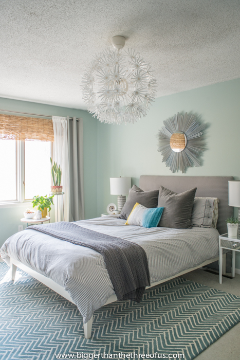
"The goal was comfort and colour!  I was crazy for coral while doing this project, and pairing it with neutral walls, a little black, aqua, and yellow was the perfect match."

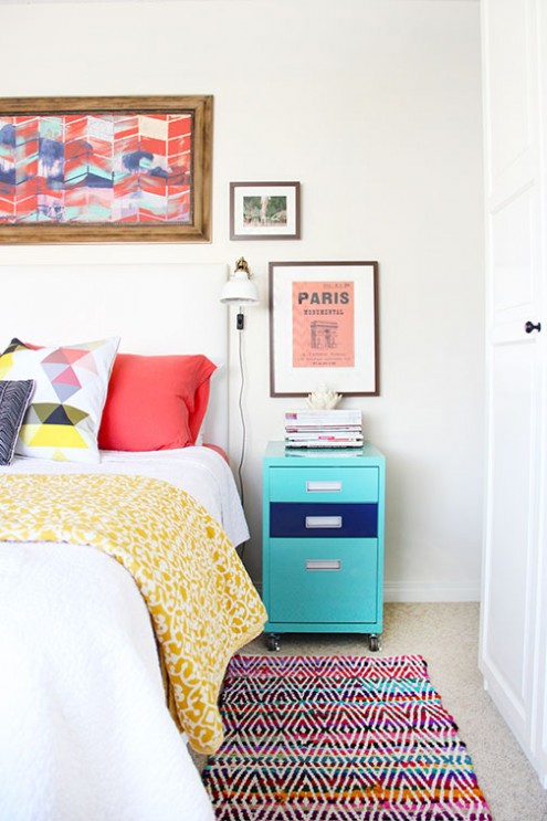
Fun fact!  I have a filing cabinet that I painted this color aqua.  Jen - great minds eh?! 

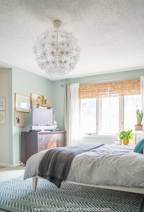
Jen's wall-mounted clip lamps make the best use of surface space without sacrificing style.

"A few simple DIYs brought everything together, the easiest (and cheapest) of which had to by my addition of a drum shade to our ugly old (but needed) ceiling fan.  And custom shelving added a lot of pretty for very little cost, but huge comfort impact.  Definitely a great space to unwind at night." 

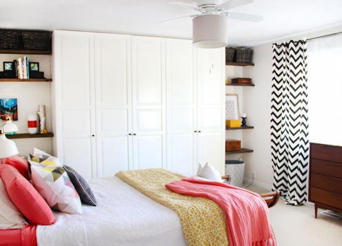
Did you even notice there was a ceiling fan?!  I didn't!

Don't those shelves masterfully maximize the dead space in the corner?

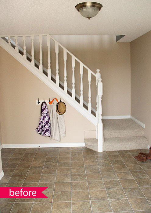
Jen's marriage of form and function does not stop here.  Wipe the drool from your mouths and let's go gawk at the before-and-afters of her foyer:

"Our foyer needed a serious update, but on a budget..."  

You're speaking my love language here Jen ;)

"The goals were to make it welcoming and warm, get it organized with easy to use storage, and make it easy to clean.  The open concept of the foyer [makes] it easy for our little one to help out.  The previous heavy doors [on the hallway closet] were too hard to operate and kept everything hidden and hard to find.  The new flooring and neutral paint warmed everything up..."
"...and new lighting, along with a few DIY projects and accessories kept everything on budget.  My favourite project from the space was my DIY copper shoe rack."  

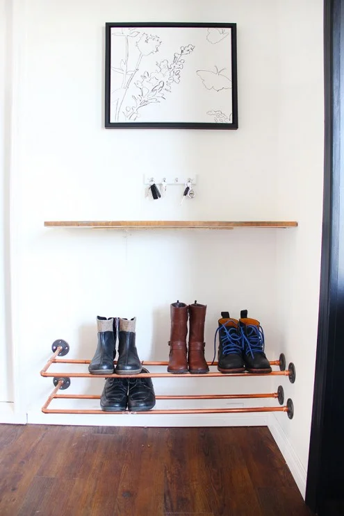
Me too Jen.... meeeeee too.

Read about more of Jen's bedroom makeover and foyer transformation on Fresh Crush,  Thank you Jen for sharing with us all the way from Canada!

So what do y'all think?  You crushing on Fresh Crush yet?  

Don't forget, we want to celebrate your individuality with you!   So don't hesitate to tag #stylemuttspaces on Instagram or post your photos onto our Facebook wall!  The whole point of Reader Designs is simply to share incredible rooms with fresh ideas and document these features in our SPACES section to use as a reference of inspiration.  These submissions are seriously the jewels in the StyleMutt Home crown.  

You never know who else will be inspired by your space so don't deprive us of your unique YOU people!

Reader Design: Ashley's Evolving Dining Room

Cheers to the weekend! Back with another Reader Design today from the talented Ashley of Bigger Than The Three Of Us! We shared her stunning 'Airy Bedroom', (at left), last week which had us spinning with fresh ideas, and her dining room sure doesn't disappoint either!

Just as a reminder, Reader Designs are an open invitation to share your unique design and creativity! There are no requirements to be a professional decorator or even a fellow blogger. The purpose of Reader Designs is simply to share incredible rooms with fresh ideas and document these features in our SPACES section to use as a reference of inspiration. Besides, who doesn't like getting to peek inside beautiful, creative homes?!

So, are you ready to see more from Ashley?!

From Ashley:

"When we moved in to our house three years ago, I hated the formal dining room space. The built-in was definitely not my style nor was the wall coloring. I painted the walls gray first thing. Next, I tackled all the trim and the built-in. They both got a coat of bright white."

"I found a vintage credenza on Craigslist as well as some mid-century chairs. I paired those with an old table that we had and some garden chairs. Instantly the room had life. I kept adding more layers to make it my own. My husband painted the ikat painting for me and that helped finish the space."

"Things have to evolve for me and continue to evolve and that's the only way I know how to decorate."

Well, Ashley, your home is evolving absolutely beautifully! Thank you so much for sharing your hard work and creativity! Now, how can we commission your husband to paint a few more ikat paintings for us???

There are two ways you can share your SPACES with us: Tag #stylemuttspaces on Instagram or just post photos right onto our Facebook wall! We LOVE seeing your handiwork and are thrilled about the line-up of Reader Designs coming up - one of which is by a beautiful French woman living in Australia!

Thank you all for stopping by and have a splendid weekend!

Reader Design: Ashley's Airy Master Bedroom

Hey guys! Cheers to Friday! I'm pumped to be closing the week with another Reader Design. It's been a wihle, eh!? In case you've forgotten what Reader Designs are, (or are a new friend to StyleMutt), here's a quick recap: Reader Designs are an ongoing series on our blog where we share short tours around other decor enthusiast's spaces. There are no requirements to be a professional decorator or even a fellow blogger. Our goal is to share incredible rooms with fresh ideas and styles and document all of these features in our Spaces section, (on the top menu bar). Who doesn't like peeking inside beautiful homes?!  It's inspiring to see the intentional and creative work someone has put into their own home. And that's the root of it; to pass along some inspiration.

I put out a little request on Instagram for folks to share their favorite rooms, (or entire homes!), with us here at StyleMutt by hashtagging their photos with #stylemuttspaces, and let me tell you, we were not disappointed in the least. The response was awesome and I've got some amazing Reader Designs lined up to share with you!

Today it is such a pleasure to share the gorgeous bedroom created by Ashley of Bigger Than The Three Of Us. I was thrilled when she tagged her bedroom because when I saw it for the first time, I literally just stared at it in awe. It's light and airy, and yet so full of life!

From Ashley:

"For our master bedroom it was really about layers and adding them over time. I don't have the "eye" when it comes to decorating or the extra cash to just buy what I love. So, our stuff is always trial and error."

"I love mixing high and low pieces to get the look that I want. For example, the bed frame was a West Elm clearance find as was the the three drawer dresser and the corner chair. The nightstands were a steal from the Goodwill. The sunburst mirror and headboard were both DIY's. I happened onto each of these pieces over the course of a year and during that year, my style for the room really evolved."

So, so cool...Do you guys have a hundred ideas for your own homes running through your mind right now too? If you'd like to hop over to Ashley's full bedroom reveal, you can find more fabulous photos and details here. Next week stay tuned for Ashley's beautiful dining room! 

Ashley, you rock. Thank you so much for sharing all this goodness with us! If you'd like to follow Ashley on Instagram, you can find her at ashley_biggerthanthethreeofus

Thank you all for stopping by and have a wonderful weekend!