Design Reveal: Color, But Make It Sophisticated

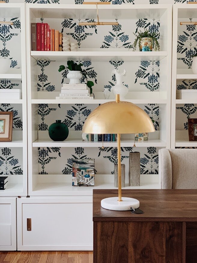
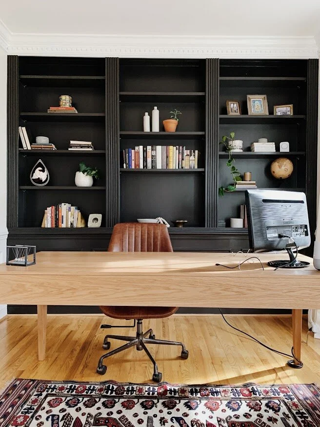
It’s a design reveal day! These are among my very favorite days of the year. The precious day when I get to share the fruit of many months, sometimes over a year, of work! I don’t share all of my work - 10% of it, in fact! So these projects that make it are truly special to me and I feel so humbled to get to share them with you friends.

Speaking of friends, the amazing client who owns this home has been an acquaintance for many, many years! Her older sister, Lori, was my Young Life leader in high school! In fact, it was Lori who suggested this effort together in the first place. Sure enough, Jenny and I hit it off right away and now is a sweet friend!

When we first connected, she wanted to completely transform her main floor, which includes a family room, dining room, den and kitchen. She had been saving up for this and was ready to hit the ground running! The main objective was to fill her home with color but make it feel grown up - whimsical yet sophisticated. Jenny realized she had gotten about as far as she could with the assortment of hand-me-downs and random pieces she’d found here and there, but (like many), the more she added to her home, the further she got from her vision.

Family Room

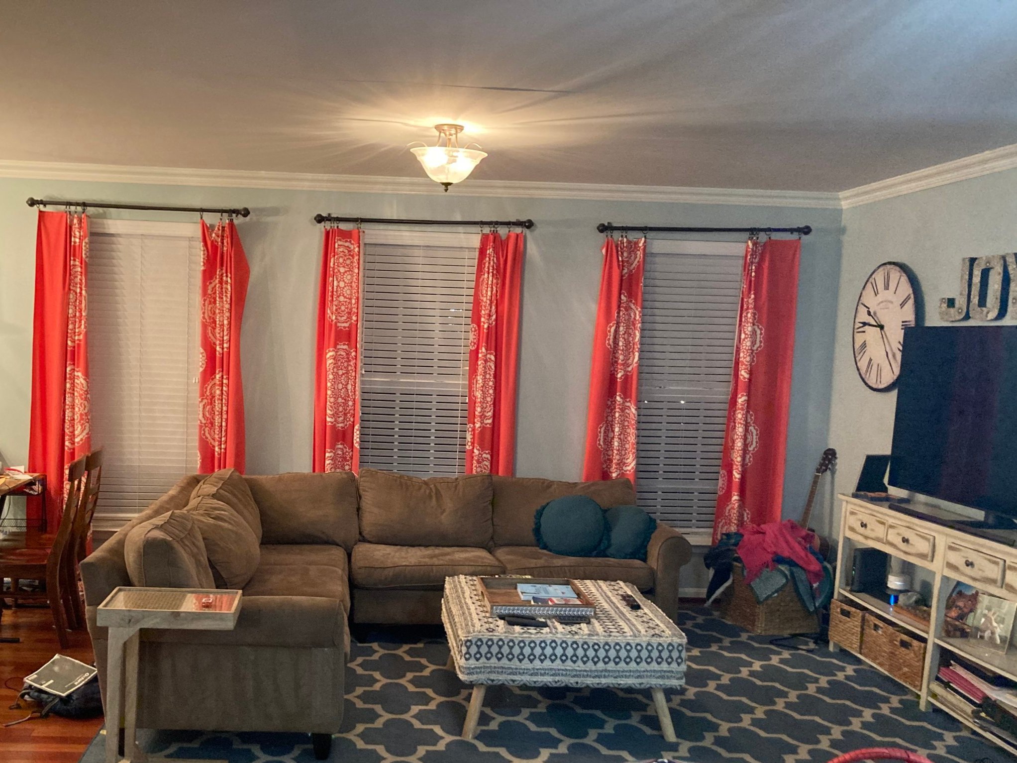
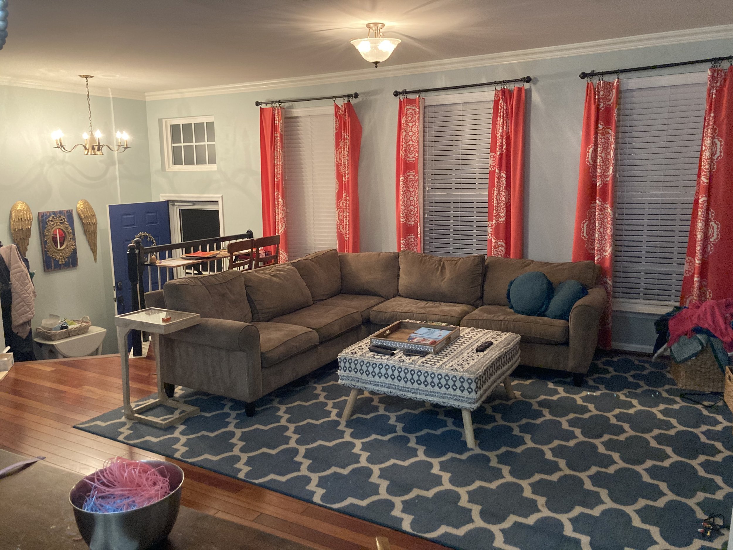
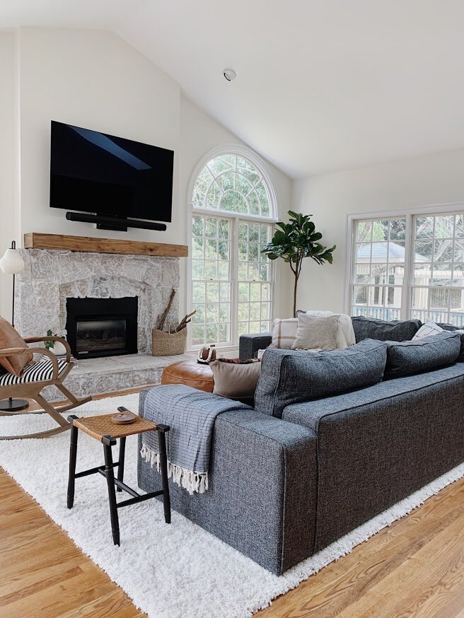
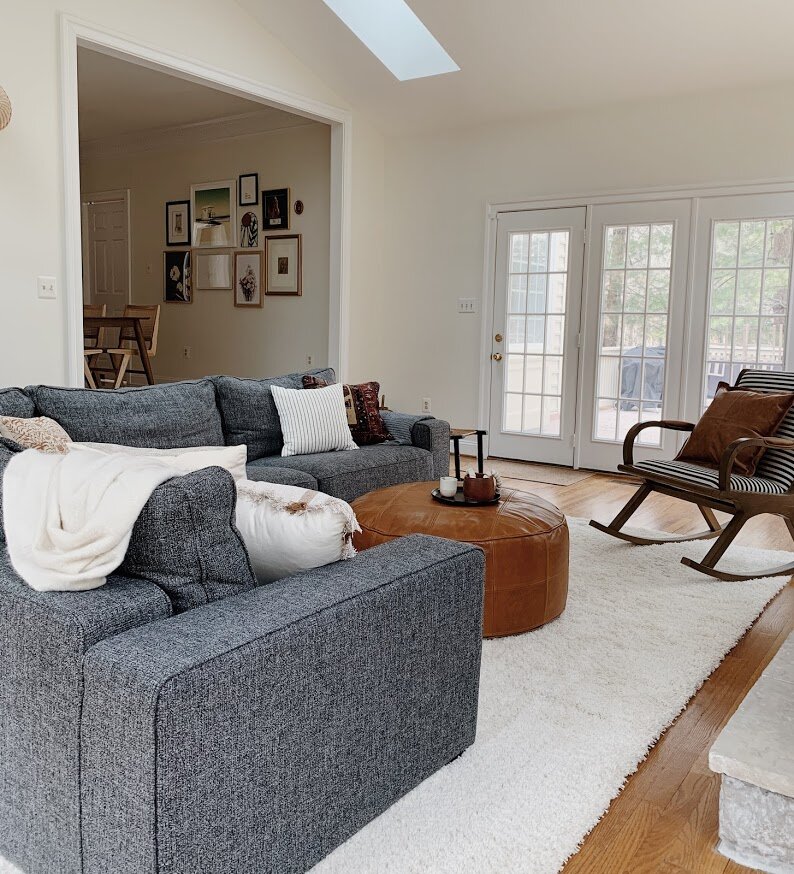
It may seem counterintuitive to get your walls white when you love color so much, but this was a move I really encouraged from the beginning. But not without a vision of what would come next:

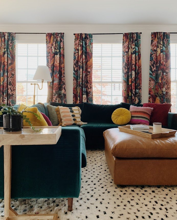
I don’t think white walls are the answer for every single project, but I knew that it would be the game changer for this home; the defining factor that would enhance all the colors we were about to explode. Now, this home glows like a sunset!

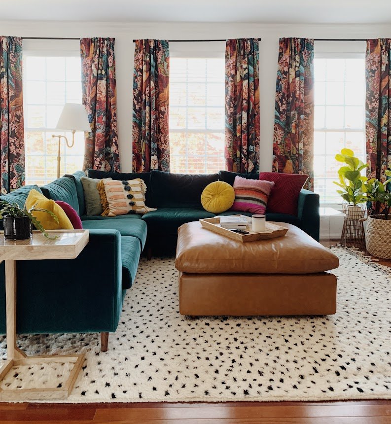
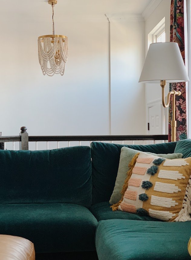
I mean, it absolutely GLOWS! And there was no laying out samples of patterns and fabrics together to come up with this. I stayed in the general family of jewel tones and then ran in every possible direction. Jenny wanted allthecolors so there was really no holding back. Of course, playing off the color well are very grounding elements like the black and white rug and the camel leather ottoman. It’s all about striking balance where it matters most!

Let’s shift to the dining room!
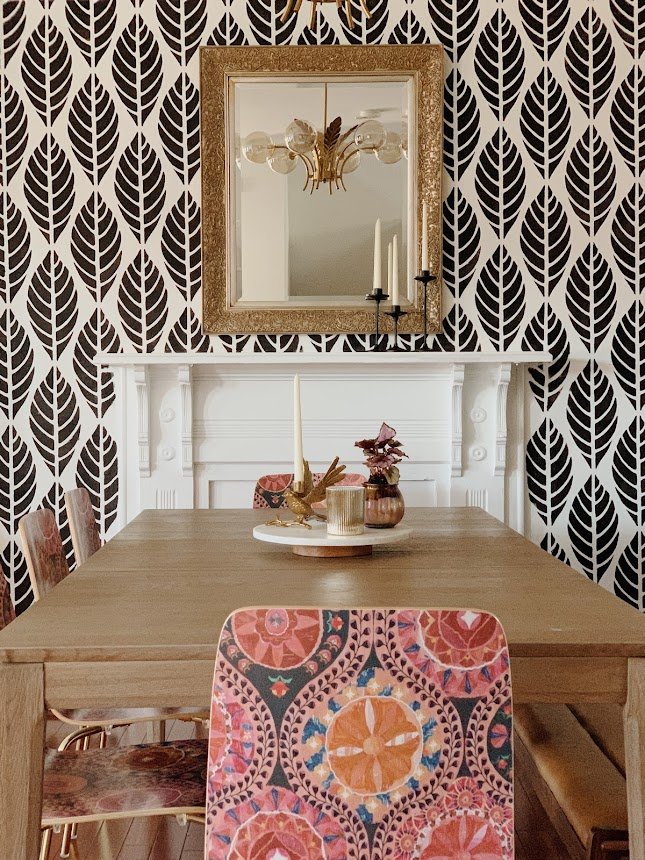
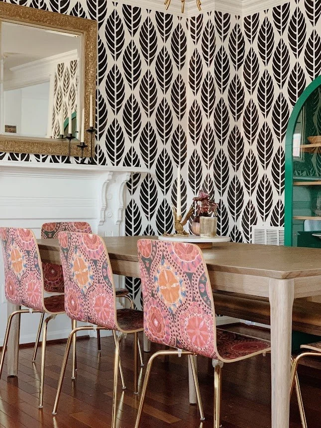
Dining Room

Since the dining room and family room are literally side by side, I wanted to carefully craft a TOTALLY separate space that felt as exciting as the family room, without making it feel like it was a completely different house. The objective here was more cohesion than matching. A playful but black and white pattern on the walls creates a balance to the family room, while the chairs and cabinet echo the jewel tones. Again, there was no matching or looking closely to be sure that the colors ‘went’, but it was staying in the jewel tone family that I knew would be enough.

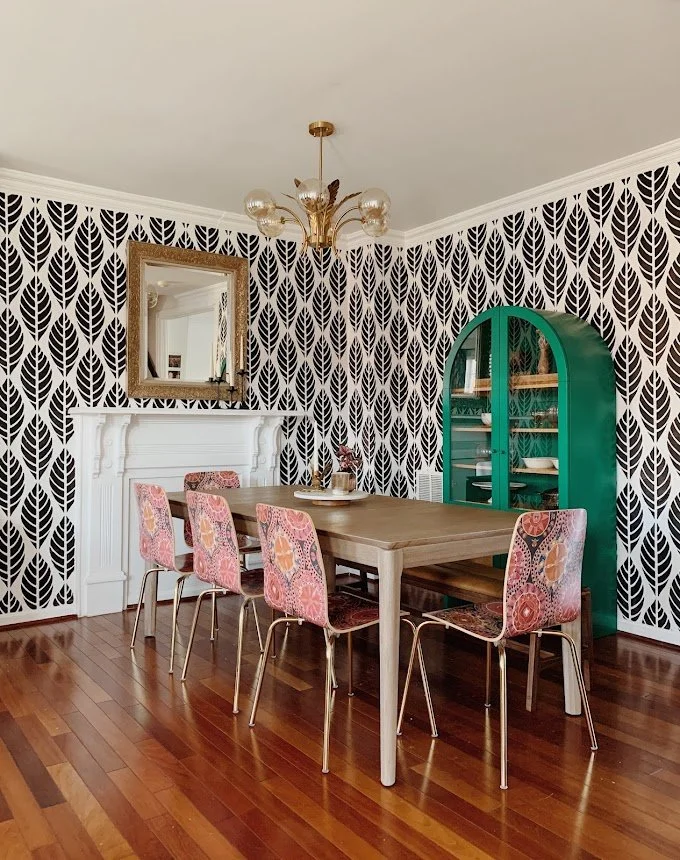
There is not a dull line of sight from any point in this home!

Den/Kitchen

Like the other areas around this main floor, there was already quite a bit of color going on. Yet, the heavy wall color and the varying tones of color between the rug, chair and decor were all competing to make this room feel very heavy and dark. The strategy in here was the same as the other spaces - get the walls a nice clean white and then build up the color using jewel tones, balanced by beautiful uses of wood and leather.

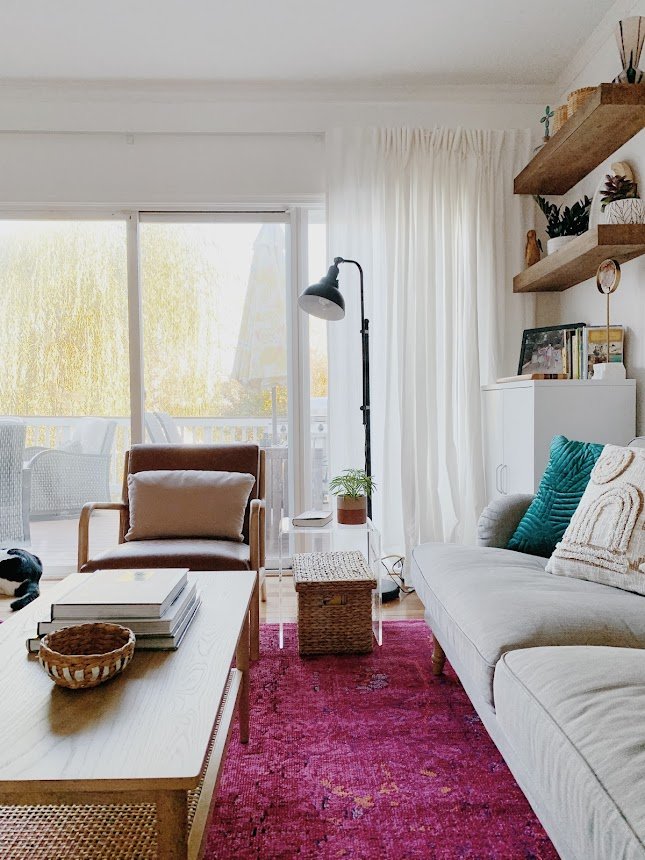
Replacing the two lower floating wood shelves with a simple white cabinet decreased the visual weight of the space, providing a relaxed balance to the assortment of color used in the pillows and rug. I have never loved fuscia more in my life! I LOVE this rug in here!

The kitchen is still in a bit of progress until tile backsplash is installed, but painting all the lower cabinets and this accent wall in a saturated teal just creates the most incredible contrast to the freshly painted white uppers (with saturated teal knobs). And just look how rich the leather stools are against this color. Oh my word! It’s just stunning.

I absolutely delight in the work I get to do and feel so incredibly grateful to be trusted with peoples homes. To be given the opportunity to work on a project SO unique like this is just such a treat. If you’ve been a part of this community for any amount of time you know this is unlike any other project I’ve shared - and that’s what I’m feeling particularly proud of right at this moment. To go all out and deliver my best work in a style that is different from my own is what I love about design! Trying new things and having so much fun playing around! I don’t like feeling boxed in or delivering only what’s expected of me; rising to a challenge and even showing something surprising satisfies so much of who I am as a person.

Next week I get to go shoot my last project of the year! It’s another doozie, just a heads up :)

Thank you so much for coming by today!

Design Reveal: Deedees Digs

Hello there! There’s no dancing around it, THIS is my favorite design project to date. I got to work with my sister! Quick story, when she was around 2/3 and I was 9, she pronounced her name (Casey), as ‘Deedee’. I was Cha-chi (Chelsea). The nicknames stuck and we use them here and there! The past year has been a whirlwind as Casey fled overcrowded NJ as the covid cases started exploding and came to live with us for a bit! Then she moved in with my folks, and just this past January moved back up to NJ! Getting to be a part of her apartment search was a fun and exciting insight into her subconscious. I learned she likes quirky spaces with interesting nooks and angles - and a strong aversion to cookie cutter! So it may be surprising that the below apartment was her winner:

Blank 2000 x 2000-1.png

It’s BASIC. And she was weary - in fact, she had seen 4 identical apartments to this one in the same building, which is precisely what she was trying to avoid. But here’s the kicker:

IMG_5509.jpg

A million dollar view of the worlds greatest city. NYC is a global landmark herself and a place we have enjoyed visiting with our Momma over the years for girls weekends away. This Jersey Heights apartment is nestled high above charming Hoboken, with an unobstructed view of this beautiful skyline. At Christmas, the Empire State building (left window), is list up in changing colors. On Valentines day it glowed pink. There is nothing basic about this view. This apartment is on the corner of the building, so Casey’s other views look out over a bustling park busy with dogs and their owners - one of Casey’s greatest amusements. So, the views of this top floor apartment tipped the scale. But how to create that quirky, nook-y feel?

0964E433-3E7C-4BA3-BB2B-AFD7CD80278E-D7700233-1CB3-42A2-8BEE-92754CEE0654.jpg

One of the first ideas I shared with Case was this washed brick wallpaper. I have NEVER used a faux stone wallpaper before and thought I never would…but this was a perfect project for it! It’s non-committal as it’s a peel and stick paper, and it does wonders for this otherwise box-like room. My Mom and Casey installed it together (without a stool or ladder, I hear), and I can’t believe how awesome it looks. Sometimes as a creative I will get really excited about an idea, and still be blown away by how awesome it turns out - like it’s a surprise lol!

56507D08-1565-4B07-A245-2A1F8379DE3A-B5155988-75A2-4CD8-B8F6-084EEEB48635.jpg
844A9E85-DF89-49E2-B76B-F6C1AA79C034-AF9DD0A1-4FF5-45FE-B590-44E52EB1268A.jpg

Mixing up the heights of the elements in the room helps, too! Balancing high pieces with lower pieces is a great way to create some movement around a space. These shelves from Castlery were one of Casey’s early requests - a place to shelve books, and ultimately collect a whole shelf of childrens books and short stories about disabiliy (not just the career Casey has pursued but a tremendous passion of hers to learn and share through education).

1826A273-040C-41BF-BCB3-B8FE2245BF36-DAD9FCBB-BC88-4FA7-B8CD-E8A49C2B1DC7.jpg
5E567561-9567-4962-B472-36C50D06A3E7-B25AFCEF-1D3A-4EA2-9749-8D0C15CB7903.jpg

The sofa itself was a complex decision - being that this is a one bedroom apartment, Casey really wanted to have a place for guests to sleep. The obvious choice was a pull-out sofa, but I was having a hard time finding pull out sofas that also functioned as long enough sofas. Most of them were in the 50-72” length, which would have been too petite for this space. I, myself, have an Article Sven sofa, and one afternoon was doing my work from it, and realized how comfortable the cushion itself is. And not only does the cushion come off, but underneath the cushion is a memory foam type padding. SO, this Article Sven sofa could sleep 2 people comfortably, but as a sofa by itself, it’s 86” length is perfect for this space.

0D530791-5A77-444B-B889-584065197694-EB1CED9F-C626-4D9B-9F68-579B65FDAD97.jpg

And a typical stop in anyone’s home these days, the WFH corner (work from home). Casey does not like clutter ( we are cut from the same cloth, afterall), so having a modern secretary style desk that can close and hide all work-y materials was a perfect solution here.

38E537F9-D48C-44B5-85F5-A69AD27C25FC-65B0D559-F555-4879-A7BE-73BF59C8D6D9.jpg
F687E345-8D67-428A-A8A7-4AC2CEEAFC4B-4224827A-7475-4E1E-A870-426461B3961E.jpg
61D64D96-9115-4249-910B-0764FD8EBA4E-AD4E1EF1-0FFE-46AA-91DA-89F3632D26FA.jpg
4DA2A486-9E03-4001-8C8E-9A9EA6CCBC7C-76C3CB5E-A21E-4809-BD3C-07F05F7026BF.jpg

Another little architectural detail one can add to make a space feel more unique is lighting! This plug-in sconce adds some height, a little shine, a little interest, and does a fantastic job illuminating the space at night so she doesn’t have to use her overhead. Thank you for installing this, Dad! My Dad could work for TaskRabbit, he’d love it.

7F929351-E537-4DA6-90C9-D82838F59BA1-EF08CA8A-66B8-4096-B241-FCBE2C050021.jpg

One must-have in this apartment was closed storage. With zero closets in the main living spaces or entryway, I really wanted to give Case a place to store things like towels, linens, textbooks, etc, without cramming her small bedroom closets. This ‘sideboard’ is actually a pair of kitchen uppers bought new from Lowes, that I then painted and added legs to, while Matt added a flat top surface.

F7AF4526-9ACF-4509-8C5C-2243018938D5-B0F8B82C-55E4-492D-884A-229316FC083D.jpg
7B250C7B-7855-4692-818C-154AC7894261-852AF547-3730-49AD-9B16-7C873A1006F8.jpg
C746430E-9D3C-4882-B999-2763B08A5E7E-87178F6C-28BA-4D04-B7FB-4C1DAAE88C8A.jpg

In the bedroom, the solution de quirk is the canopy bed. I didn’t want to cram a lot of things in here, but knew a canopy bed would feel very cozy and nook-like all on its own. Paired with simple bedding from Magic Linen, a cane nightstand, leather pull dresser and a woven chair (FB Marketplace), this space came together very organically. The very first element, however, was the rug! I found the rug at one of my favorite Etsy shops, Rugville. My inspiration for this room was the gorgeous sunrise that poured in over the skyline on the first morning I woke up in this room - Casey and I came up to see the place together after it became hers, and we slept a hard night on the floor. But it was so totally worth it. The surprise in the morning was like heaven kissing the city right in front of us. I wanted this room to have the same glow.

8FFF2280-9235-4199-89DE-996745300C5A-A5E674C6-737C-4172-94A8-ABE35A768F3E.jpg
0B13AFBD-BF8A-41A6-8684-7867909DCFD5-F2E14B02-F159-4ABA-A8E3-42906D9A5422.jpg
99DCD911-3031-42A9-96FA-05A82BB69764-1069AE43-A621-445D-B4CE-419DA9B219D0.jpg
C84C3719-F8EE-4D34-9520-0564B096D2B4-6D9F8740-CEED-46E0-96D0-E35F714DDC71.jpg
C972D140-0960-4829-8077-AE2ACF96B186-23D8A80E-21A1-4ADA-B78B-F1EBF7C5686E.jpg
6A1D9881-822B-453A-A565-82FE23069AA9-AA021BAB-5AE8-4CF8-9DFE-446F2B267AE4.jpg
84F39FF7-CD2F-4969-BF2C-663AABDC0829-720A9DC9-6B45-40C3-B9BF-8B67112CE2C0.jpg
E7508F02-CDC2-457C-9056-5750C9B59A62-EA5820E1-D2DE-47A0-8764-6CF5FCE90A86.jpg
30765964-7FBB-44B4-B709-55DD9ECB5672-679DFD77-5CA7-4932-A3AC-DDA423B1C6EA.jpg
44207095-6FA6-4F68-803B-F94B30FB6A95-2C3F7018-D53A-4A65-A7FE-C9C87CCEE3F7.jpg

As I mentioned, this apartment is a bit short on closets. This storage piece from Vasagle is a perfect entryway drop-zone. Easy to walk around, it doesn’t take up a lot of room but it carries a heavy load.

C8263EFB-615A-410C-A0E0-7AE5553B00CE-EBF94570-A86B-4C29-8262-6D205B4E2759.jpg

Rugs are literally one of my favorite elements of creating a home. This was another vintage find from Etsy shop Vintport.

65B56DFC-E243-43B6-ADE8-60AA2E0688F4-A5DC325C-80D3-43EB-B8B8-5B0AC8AA1DD2.jpg
8AC67CF6-1D34-458D-9CDF-4CA979C26322-29C26127-0E45-42BB-BBE6-8EB0FDB1C9EC.jpg

The kitchen is simple, cozy. We had held out hope that we’d be able to paint the cabinets something neutral, which was denied. So to suit the space, a gorgeous blue-green chair just felt right. After sorting through a few options, Cate found these while we were all sitting together one evening amongst children, video-gaming men and wine. And they’re lovely!

99F6D66E-B552-4818-BE2A-9F7AD9300220-46823193-D06C-4CFF-B18B-C3B40AEB9C9A.jpg
39D3C5C9-8557-4CEB-AA7C-75CF2B48CC39-C7166168-CB8C-4F04-B732-C536A372F370.jpg

There you have it! A not-so-cookie-cutter apartment anymore. Shire and I have already been treated to a weekend visit and while we thoroughly enjoyed the fun of Hoboken and the neighborhood parks, it was so special to enjoy this home together at the start and end of our daytime adventures. The fun of this project is only just beginning.

Thank you so much for coming by!

Chelesa.jpg

Design Reveal: Cali Meets Traditional Part 2

Welcome back, friends! In case you missed it or want a recap, part 1 of this 9-room reveal is here. But I’m especially excited for what’s in store with this second half of our design reveal! We’ve got wallpapered walls, bold built-ins, a refinished stone fireplace, and some serious Pearl Jam appreciation. In my opinion, today’s rooms are even more dramatic than what I shared on Monday in part 1!

But I’m going to start with the most laid back of the bunch - the family room! As I mentioned on Monday, the clients hired me to really make this home feel 100% them - vibrant, fun and echoing their California roots. This was a tall order for a heavily traditional colonial style home - complete with rounded windows and lots of dentil trim throughout. This job was all about making intentional decisions big and small - doing what we could and making the rest work.

The one major update in the family room, aside from white paint which I had them do throughout, was the fireplace. The clients were on the fence with the stone - they didn’t hate it but something wasn’t right. We decided to do a limewash treatment which made a drastic difference. After swapping the mantle for a rustic wood piece, the fireplace looked brand spankin new!

Family+ROom1.jpg

Here was my strategy with this room: Since I couldn’t do anything about the obvious traditional style of the home itself, I could at least bring in an overall organic feel with woven pieces, camel leathers, and natural dyes. I wouldn’t say organic is a style, but rather a feel, or a tone you can incorporate just about anywhere.

1.jpg

Due to the very long and narrow shape of this room, we had a custom sofa made by Interior Define, covered in an extremely family friendly fabric, (we used ‘Pepper’). Surrounding pieces had to be comfortable, durable, and interesting (without being loud). A striped rocking chair, for example, is visually interesting and balances the left side of the room, but it’s not distracting from everything else.

2.jpg
3.jpg

TVs are just not something you see in a lot of design reveals, but I’m here asking, Why not?! They are a part of most homes and I don’t like pretending they aren’t. Why designers refuse to show the TVs in their projects is perplexing to me. When styling this room with finishing details I pondered what to do on the fireplace mantle. I like a well dressed mantle just like anyone else. But nothing felt right. Books, plants, candles - any items I added just felt like clutter. I think when the only place for your TV is over the mantle, a nice clean mantle is the way to go. Instead, I focused on the hearth which balances the visual weight of the TV above.

4.jpg

I need to point out this brass and rattan sconce. The previous light fixture was a half dome that had moons and stars punched out - like a child’s nightlight. Actually, I just need to show you:

 
Matrix.jpg
 

It’s not the best picture but you get the idea. It had to go! This light below is one of my favorite pieces in the house (interpret as you will - I have lots of favorite elements in this home)

5.jpg

Is this what people did before open floorplans became a thing? A little unusual, but we worked it out and I don’t mind it at all with a bit of soft styling.

6.jpg
7.jpg
8.jpg
14.jpg
10.jpg
11.jpg

One more fireplace appreciation shot. I can’t get over how gorgeous this stone turned out. I mean, I imagined it and loved it in my head, but seeing it in real life is just so much fun.

12.jpg
13.jpg
Jaime+Office1.jpg

I mentioned this on Monday, but one of the best parts about designing in a colonial is getting to do whatever you want in each room! I mean, I aimed to give this home a consistent feel throughout - fun, vibrant, laid back - but how we achieved that feel from room to room is so different! The couples’ two offices are a prime example of how I created two TOTALLY different rooms to reflect them as individuals. And because they are on completely opposite sides of the home, it really doesn’t matter! Here is her office:

1.jpg

The star on all her zoom meetings? Why yes, yes she is. (No really, she told me so) We had the idea to paper this wall right off the bat, and float her desk in front. The paper itself is secretly edgy - there are snakes woven into the pattern which lend to her edgy personality. The family moved with the white base under the shelves, so I added on with additional units from this CB2 line.

3.jpg

Battery operated picture lights finish off these shelves for a subtle evening glow highlighting the various pretties on the shelves themselves.

2.jpg

If you must work from home, you may as well add a sofa to that office! A perfect lounge place to answer emails, review files, etc. A little movement throughout the work day feels like a luxury these days, and since she had the room for it I wanted to give her a second option during the work week.

4.jpg

Not once did I compare the blue velvet of the sofa to the blues in the wallpaper. I didn’t need nor want them to be a perfect match, and I love that the sofa has a very subtle green tone.

5.jpg
6.jpg
7.jpg
8.jpg
alex+office1.jpg

Like I said, the two home offices are polar opposites! Where I went soft and feminine in one, I went hard and bold in the other.

6.jpg

If I had to guess, I would bet his coworkers appreciate his zoom meeting background, too. Even if they aren’t outright saying it. ;)

2.jpg

True story, this space was designed and complete before one evening when I got a text from the clients asking if there would be anywhere to add their collection of Pearl Jam concert posters. It was like meeting them again for the first time. A shared obsession with one band?! I was THRILLED to use these pieces and promptly had them frame their collection at Framebridge and played with an arrangement that would suit this office. I had actually picked that pole wall lamp before knowing about these pieces, so it was really fun to work the gallery wall around that piece. I am still beyond words excited with how this turned out!

3.jpg

Sophisticated meets rock n’ roll? Oh yes. Please and thank you.

4.jpg
7.jpg
1.jpg
Kingsley+Room1.jpg

Hard pivot now from Pearl Jam’s shrine to adorable childs room. Hope you’re hanging on tight, lots of twists and turns in today’s reveal! From black and bold to…butterflies!

3.jpg

I need to stop us here really quick to say, I think we can all agree the wallpaper MAKES this room. Well guess what? I was utterly stuck on wallpaper. I was chasing after big bold florals, enchanted forests and everything in between. But nothing felt right. I wanted a wallpaper that would suit this 5 year old little one as she is now, and when she’s a teenager. Everything I was finding seemed either too nursery, or too sophisticated. Fast forward to one of several afternoons I got to spend with a teen from our church over the summer, when her and her brother would come over and literally just play with my kids (and the other 234 kids in our neighborhood) for a few hours. I asked if she’d help me with this room if I paid her for her time, and within an hour she sourced THIS PAPER. It knocked me right over. So, huge shout out to my friend, Meredith Jolly! Thank you!!

1.jpg
10.jpg

The velvet teal bed felt like an unexpected pairing with this wallpaper, which made it feel just right. I really got into this groove of making brave choices with this home, and their daughters bedroom was no exception. Don’t overthink design, friends! You never know what you’ll uncover.

9.jpg

The rug felt like another unusual choice - the bed doesn’t really match the wallpaper which doesn’t really match the rug - and it all totally works and is glorious.

6.jpg

I wanted to finish the room off with more neutral pieces - you don’t really see the winks of black and brown in the wallpaper until you layer those colors in and it hits you.

11.jpg
5.jpg
7.jpg

I think if happiness were embodied in a physical room, this is what it would look like. It’s just pure delight in here!

8.jpg
2.jpg

I can’t believe that’s it for this reveal! Or is it? Good news, the family has just hired me to work on the master bedroom with a quirky adjoining side room, and their finished basement. Who knows what we’ll get into but I’m all in. After these rooms I am sure it’ll be very exciting, indeed!

Thank you so very much for coming by! Every hit to our website helps our little business so much, so we sincerely appreciate you taking the time to visit on our very special reveal days. It truly means a lot! Have a wonderful rest of your week!

Chelesa.jpg