Today, we're off to Canada! Johanne, who is a professional interior designer, is welcoming us in to her Montreal home that she shares with her husband and two adult children.

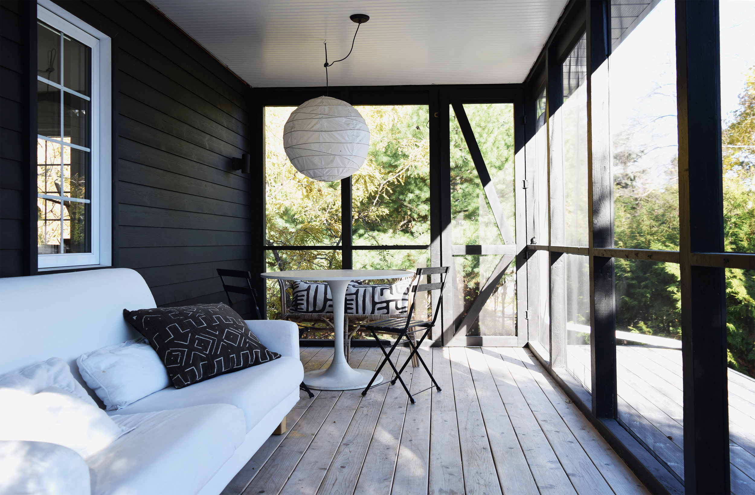
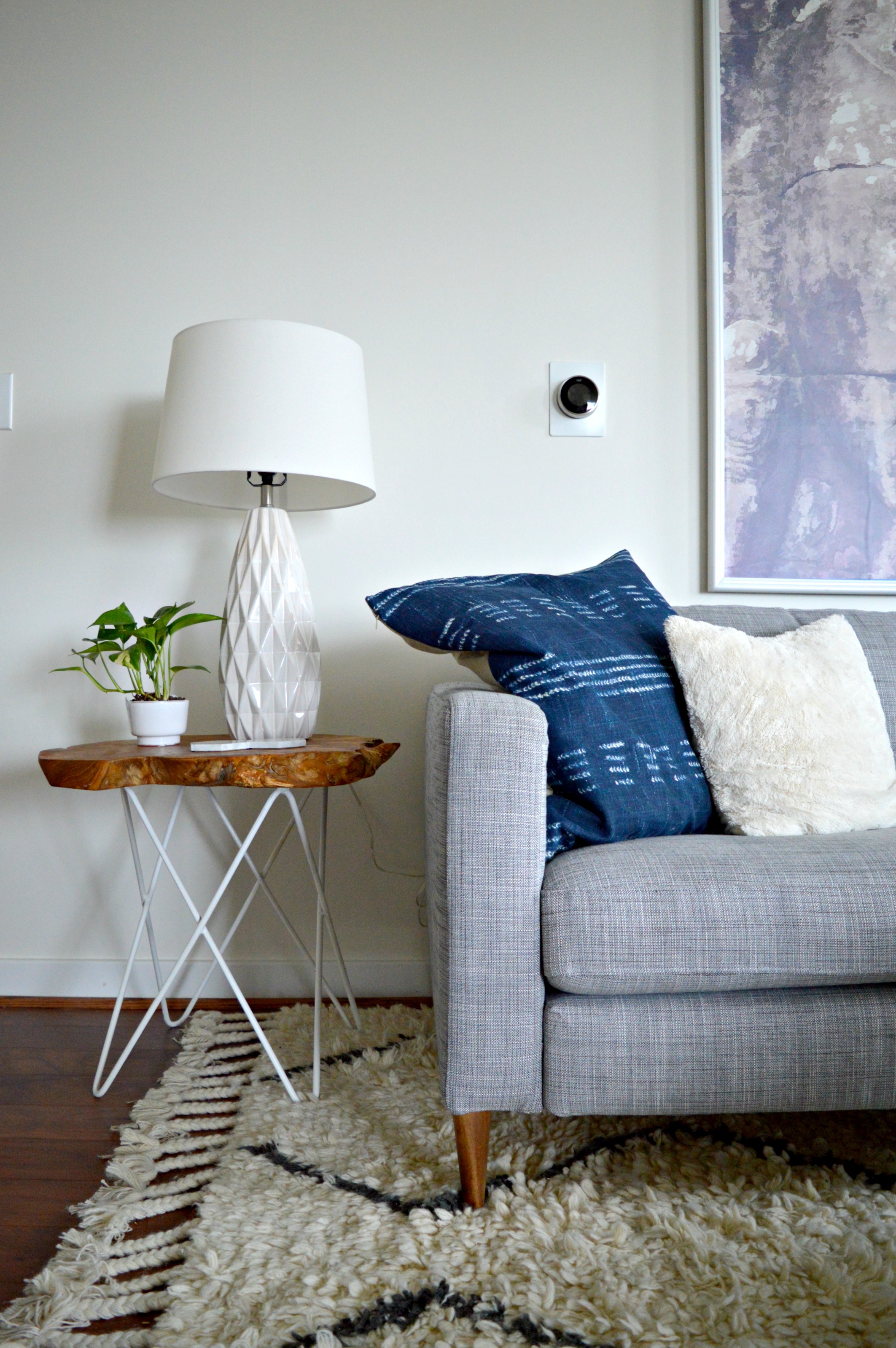
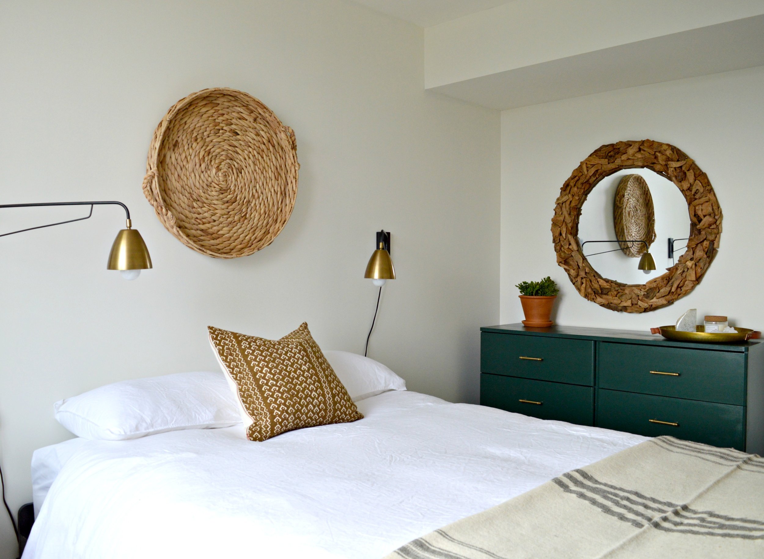
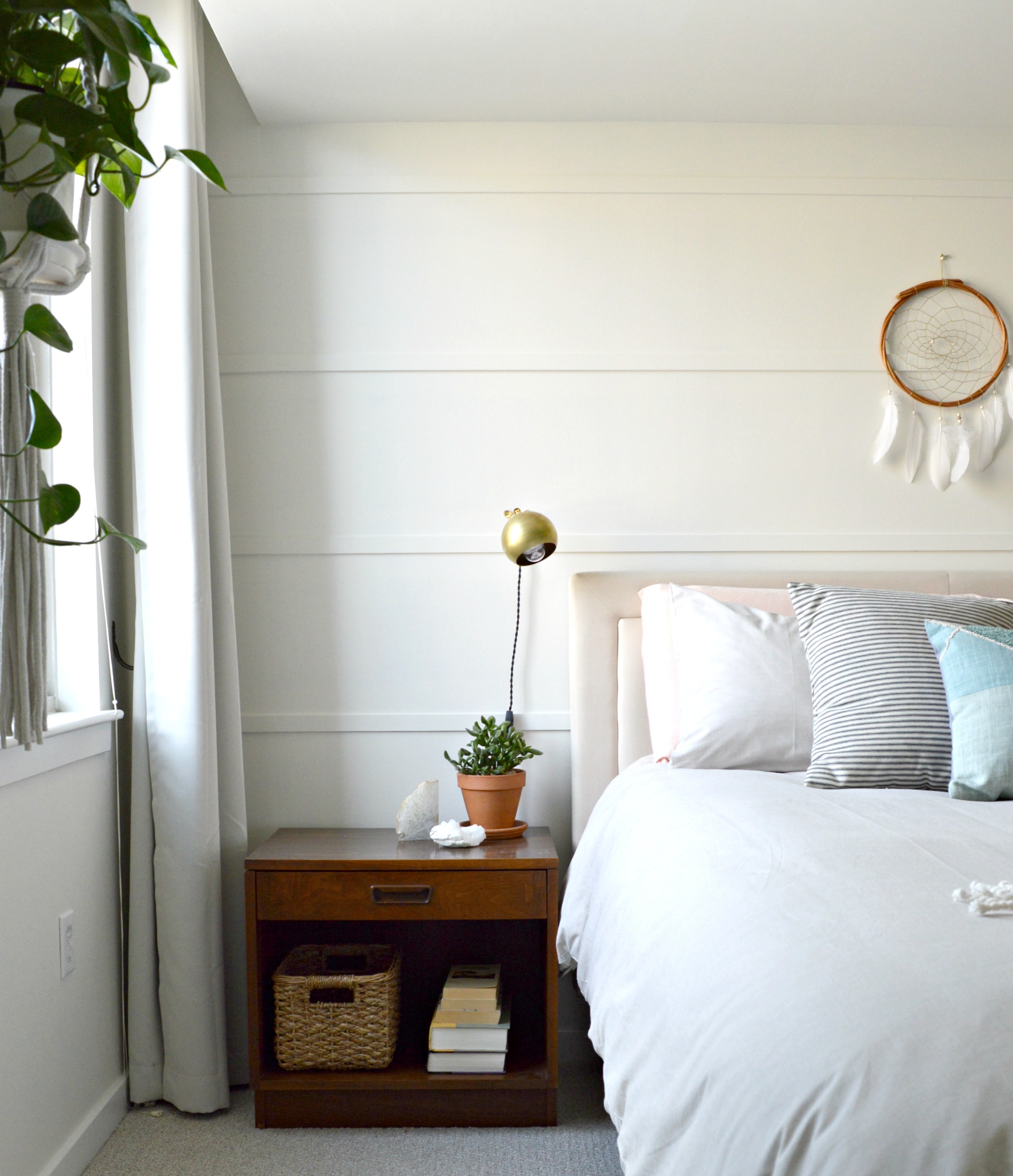
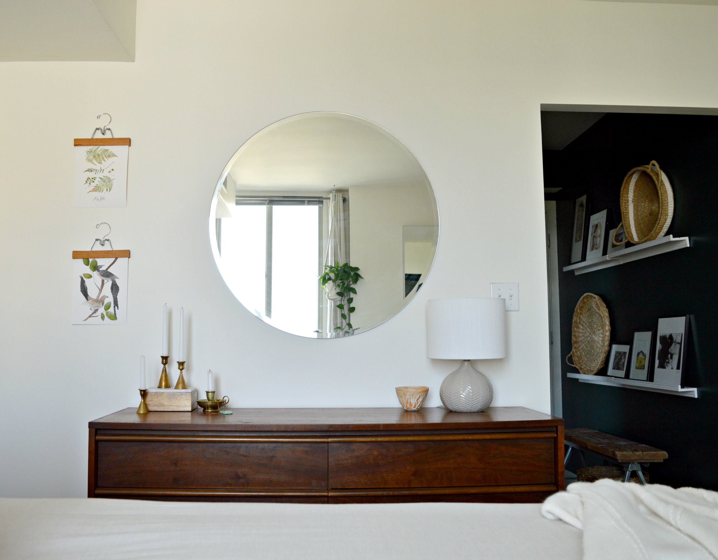
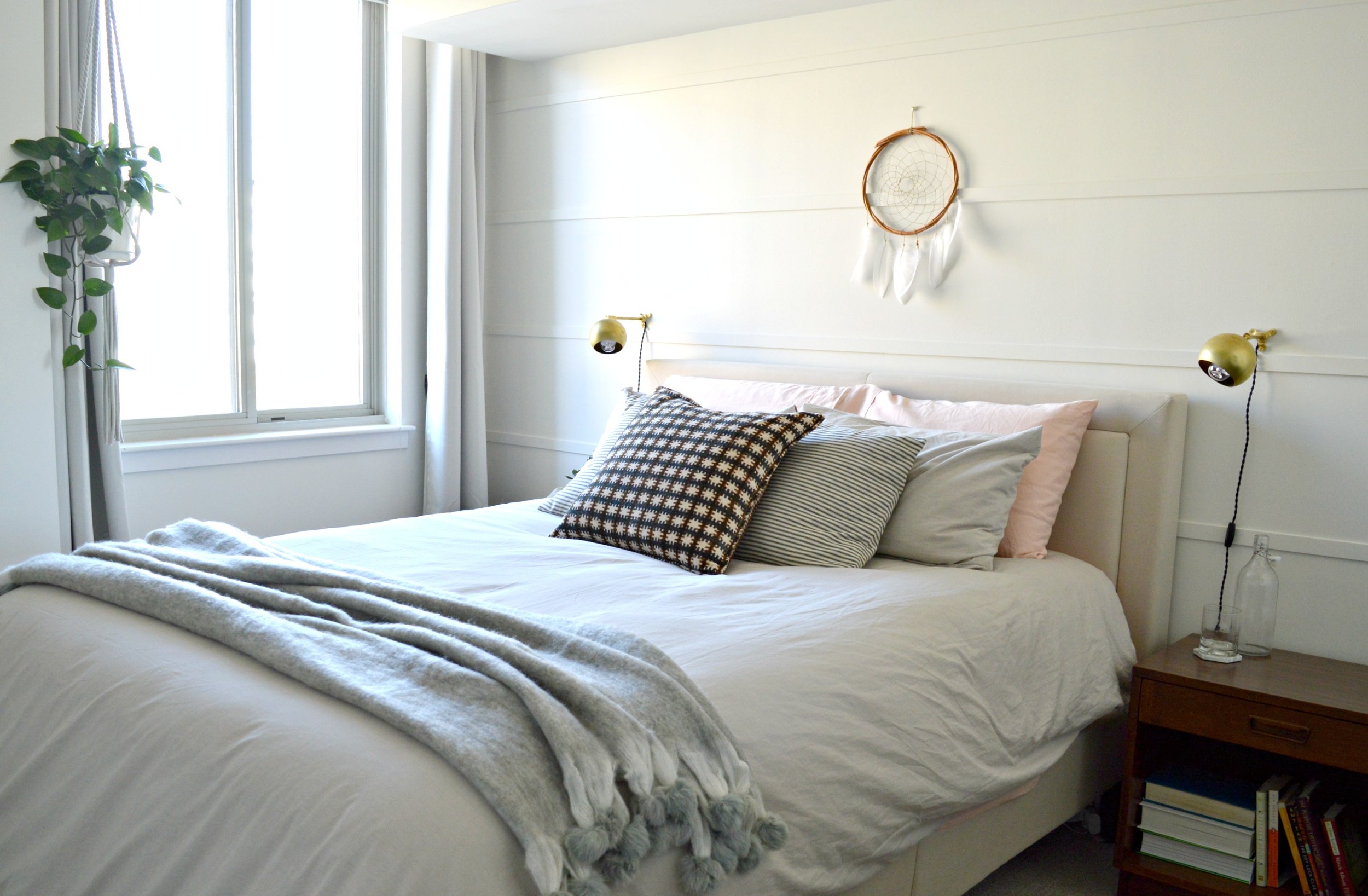
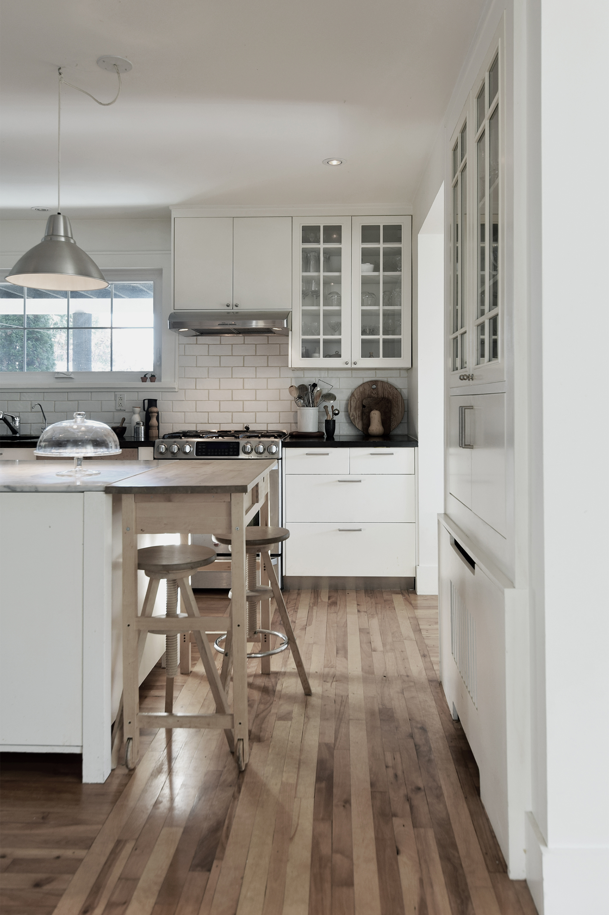
Johanne and her family moved in to this 1950's cottage 15 years ago. It sits outside Montreal in a town known for its stunning mountains and parks. Johanne doesn't use a lot of color, but that doesn't mean that her home is devoid of depth or emotion. Her neutral palette just bring other features to life - like the wood fireplace, used year-round, that Johanne calls "the best investment in the house."
From Johanne:
“Many things come into play when designing a house. The first thing I look at is the architecture. This cottage has very large windows, so our first move was to open up the space and take advantage of the ever-changing light and nature surrounding the house. ”


The second thing Johanne considers? Location.
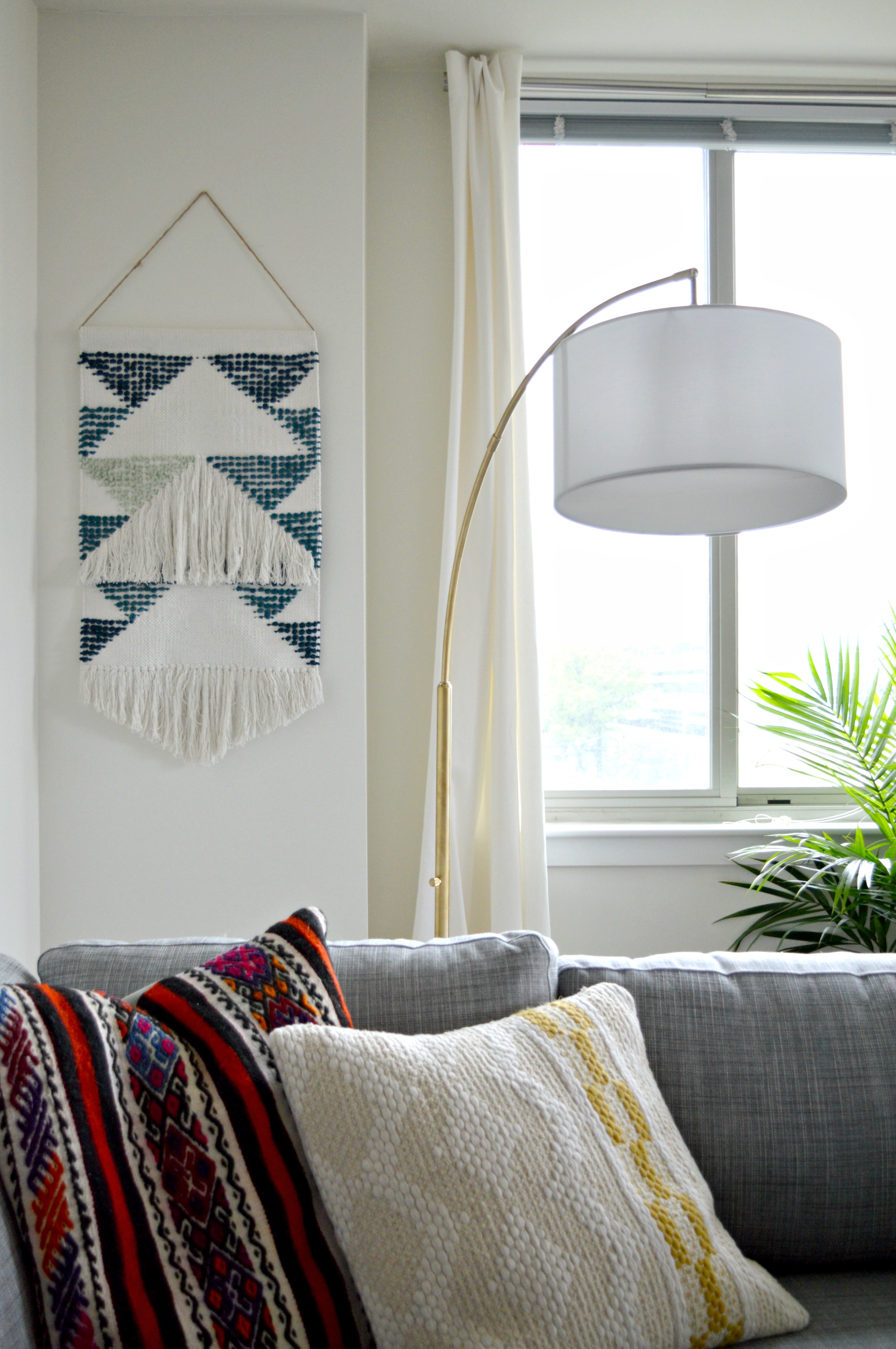
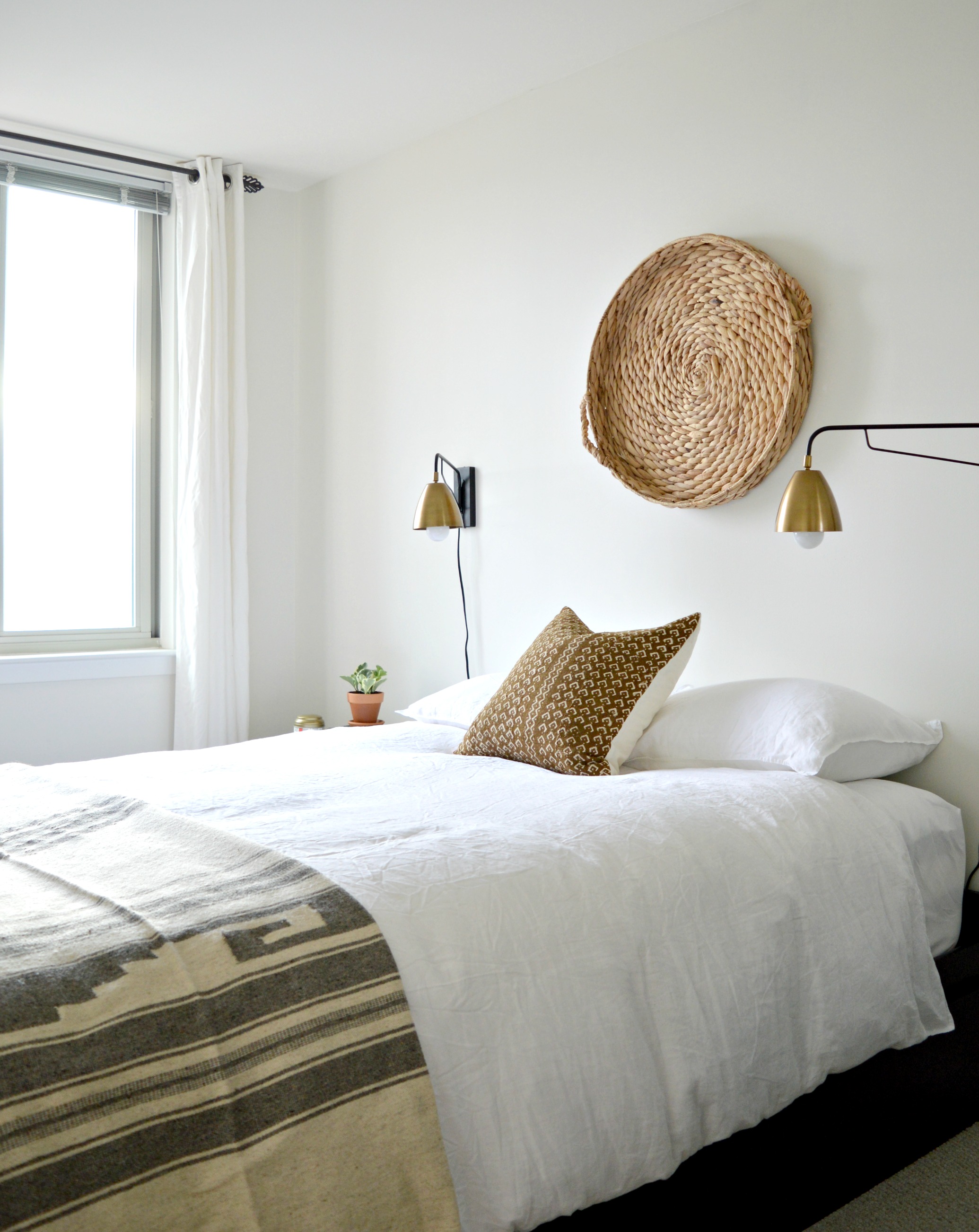
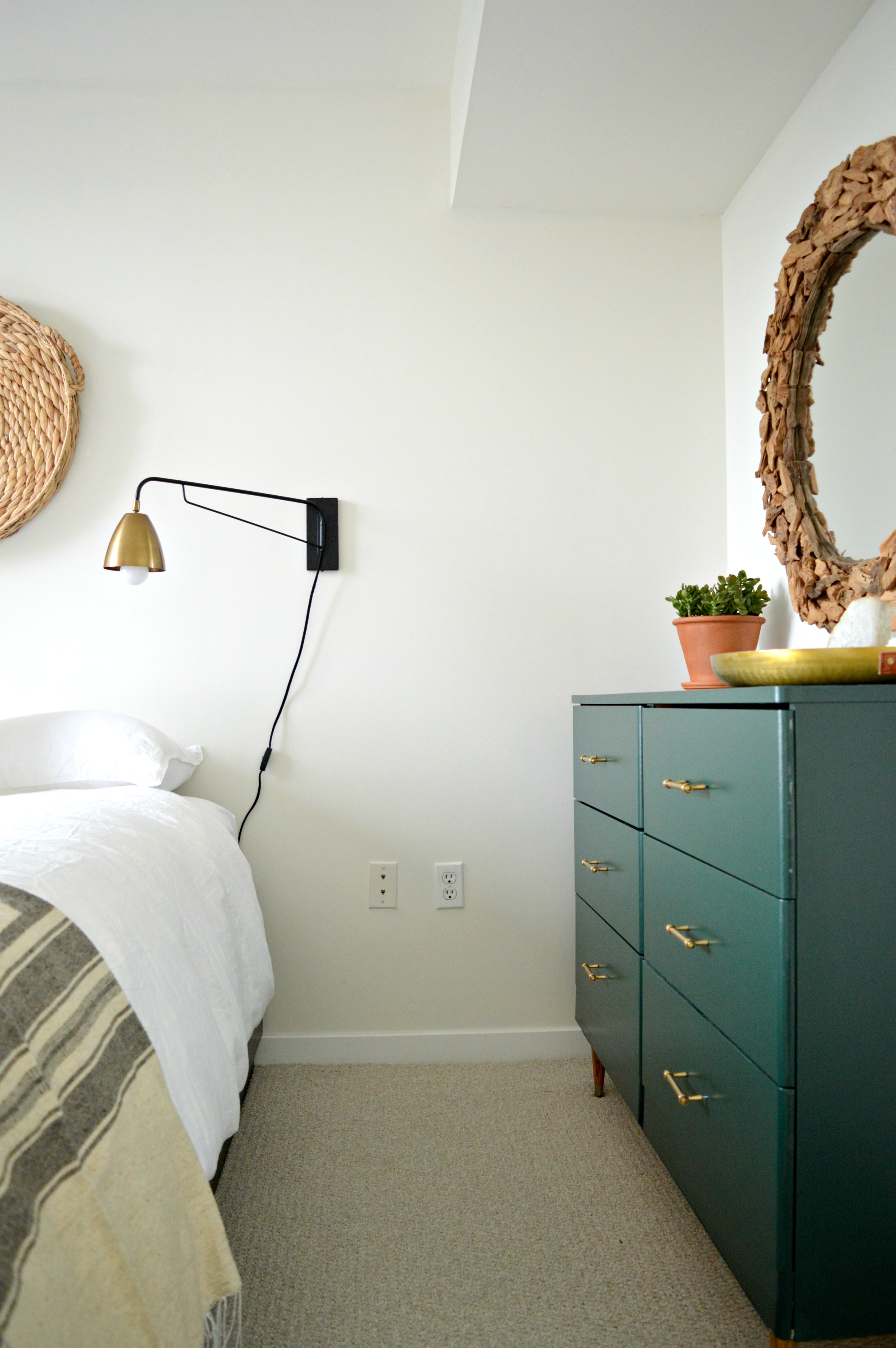
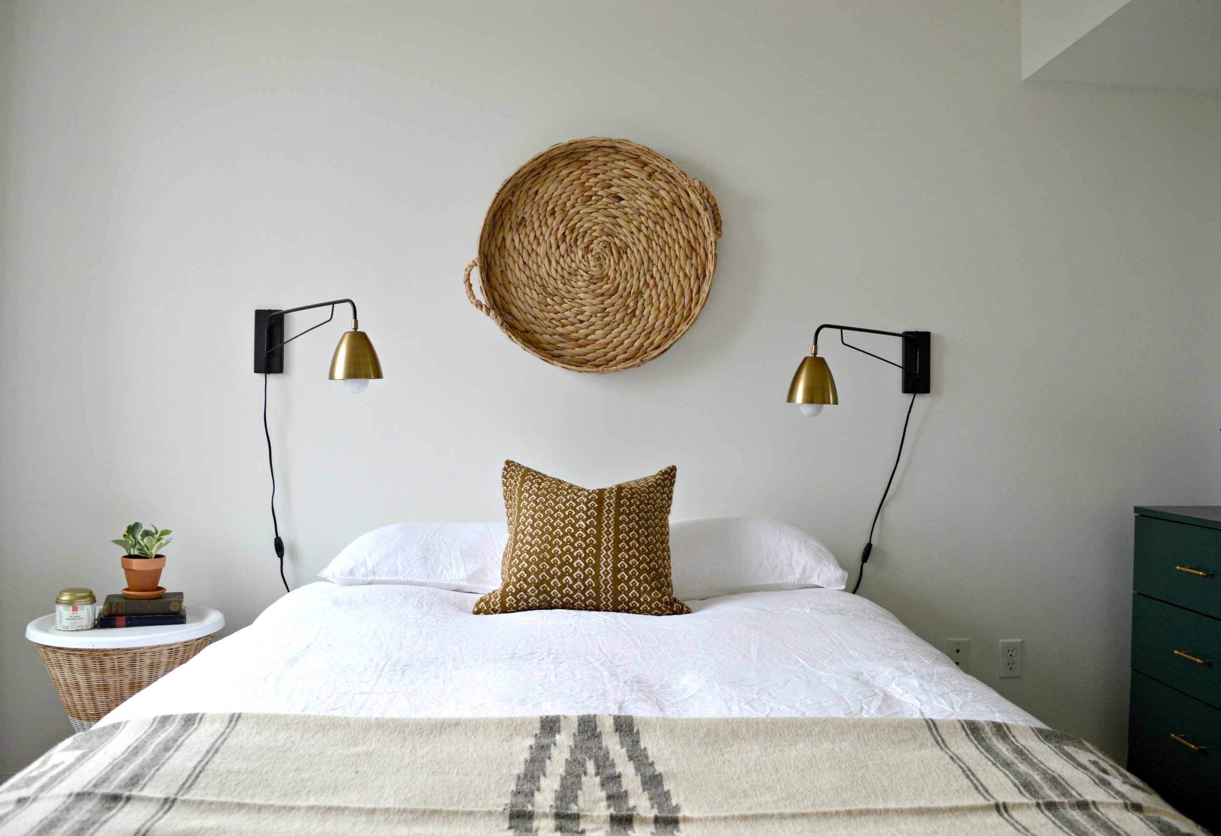
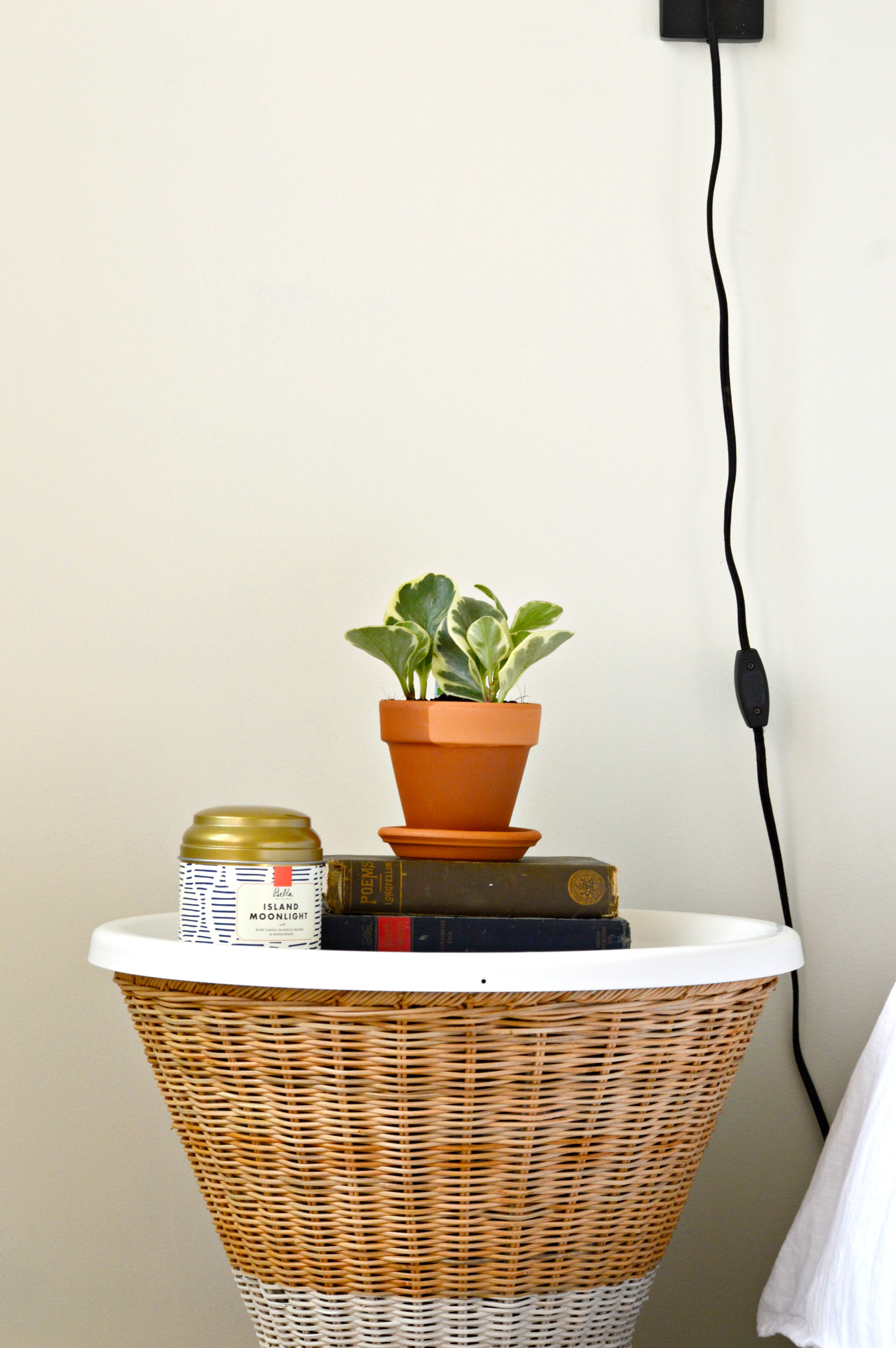
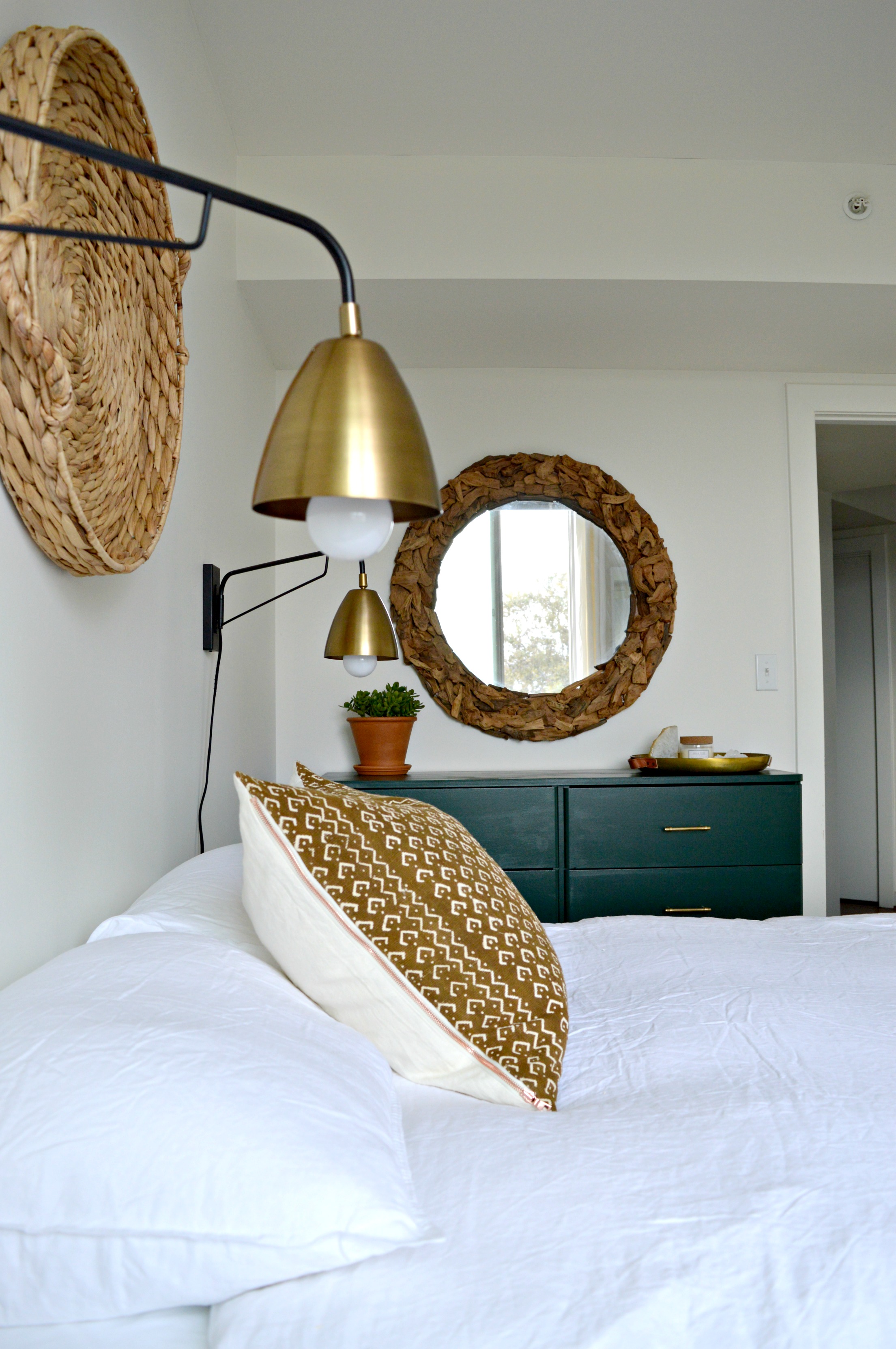
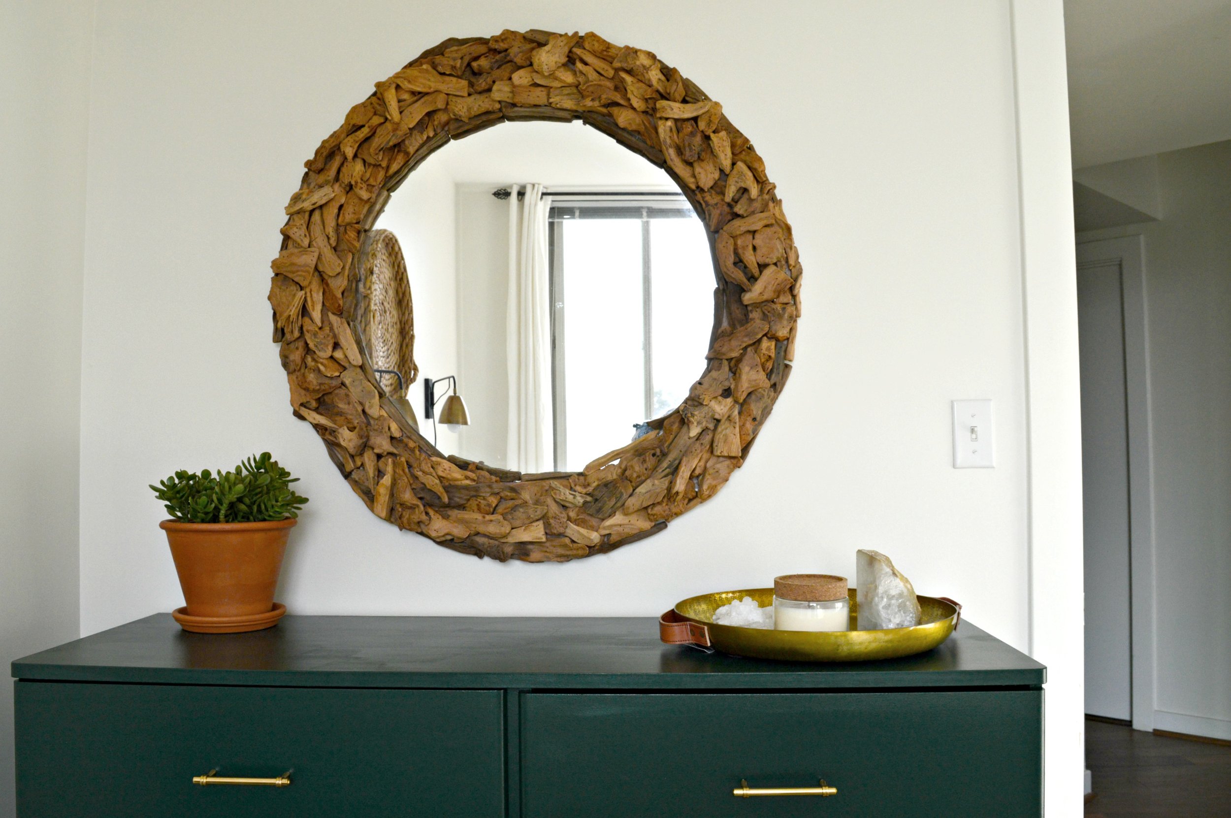
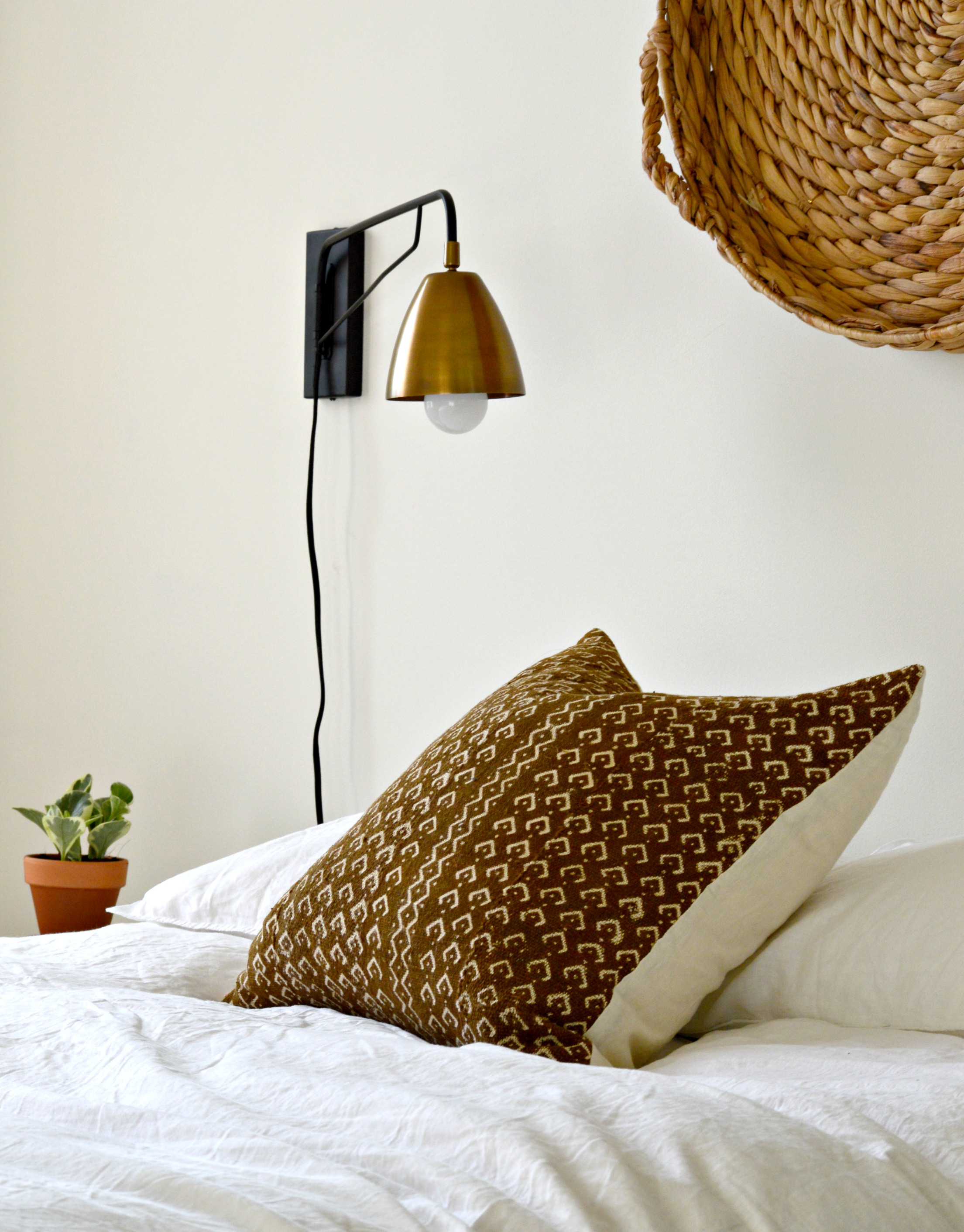
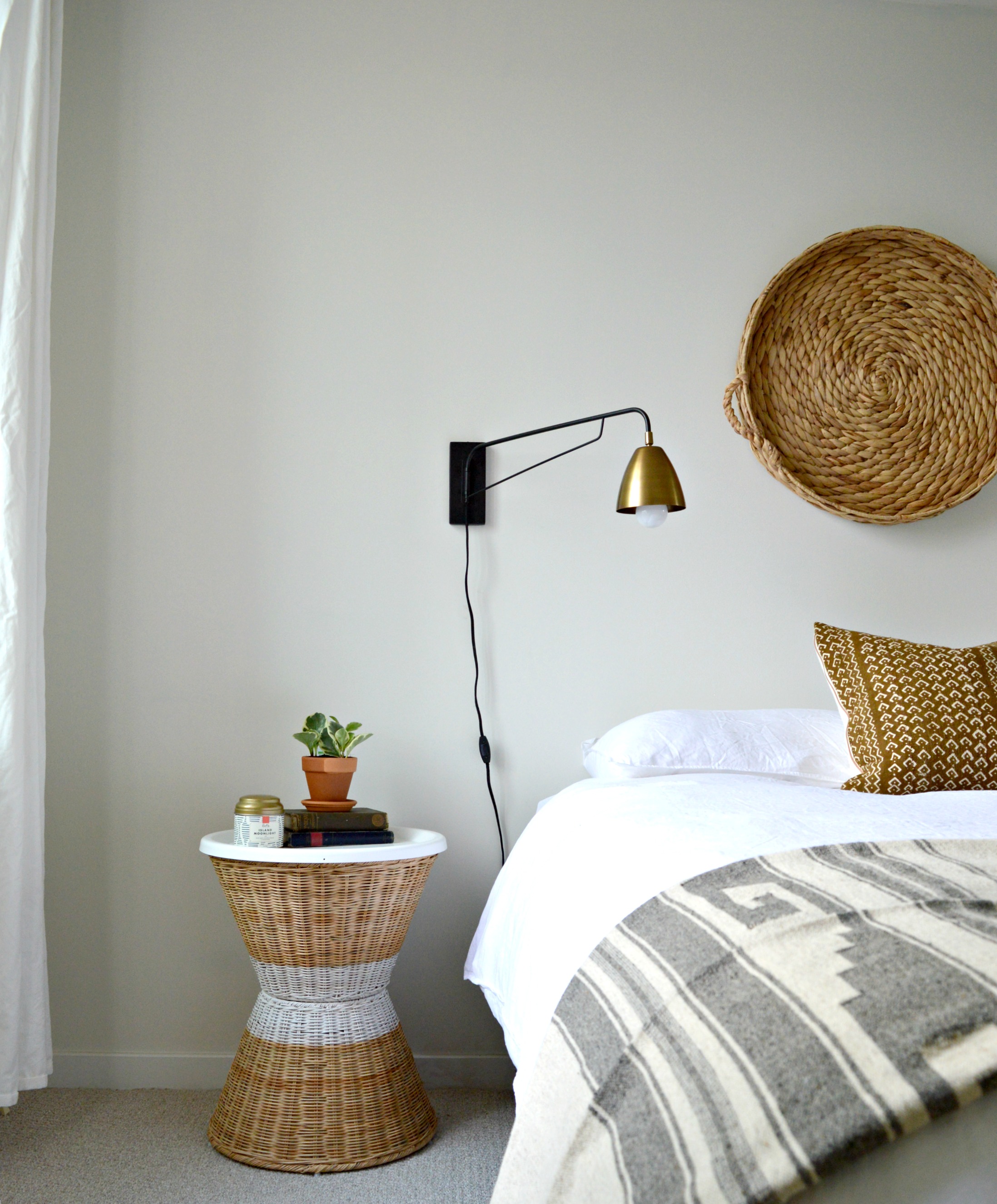
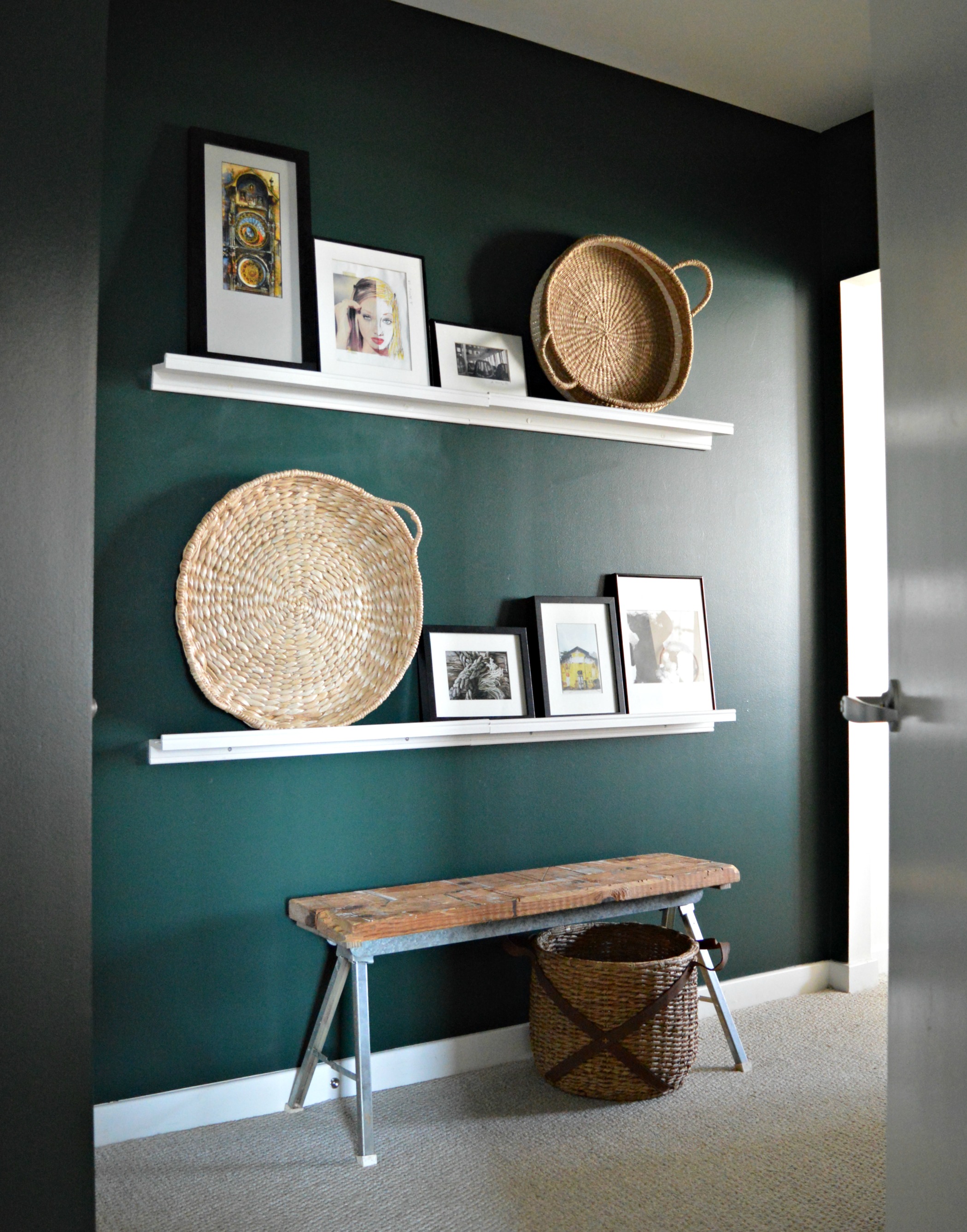
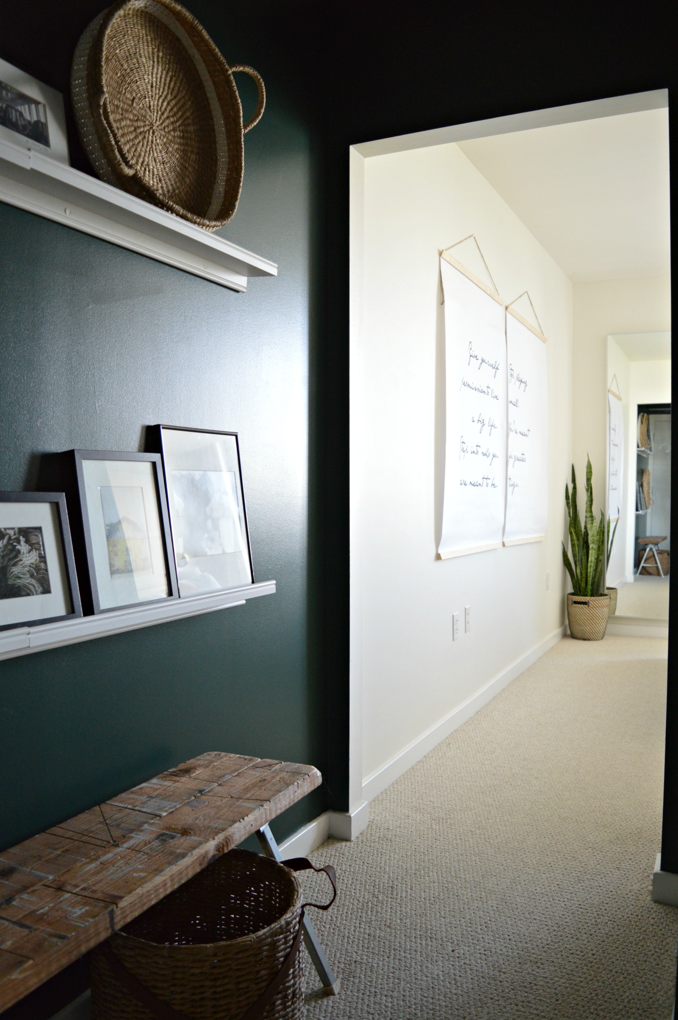
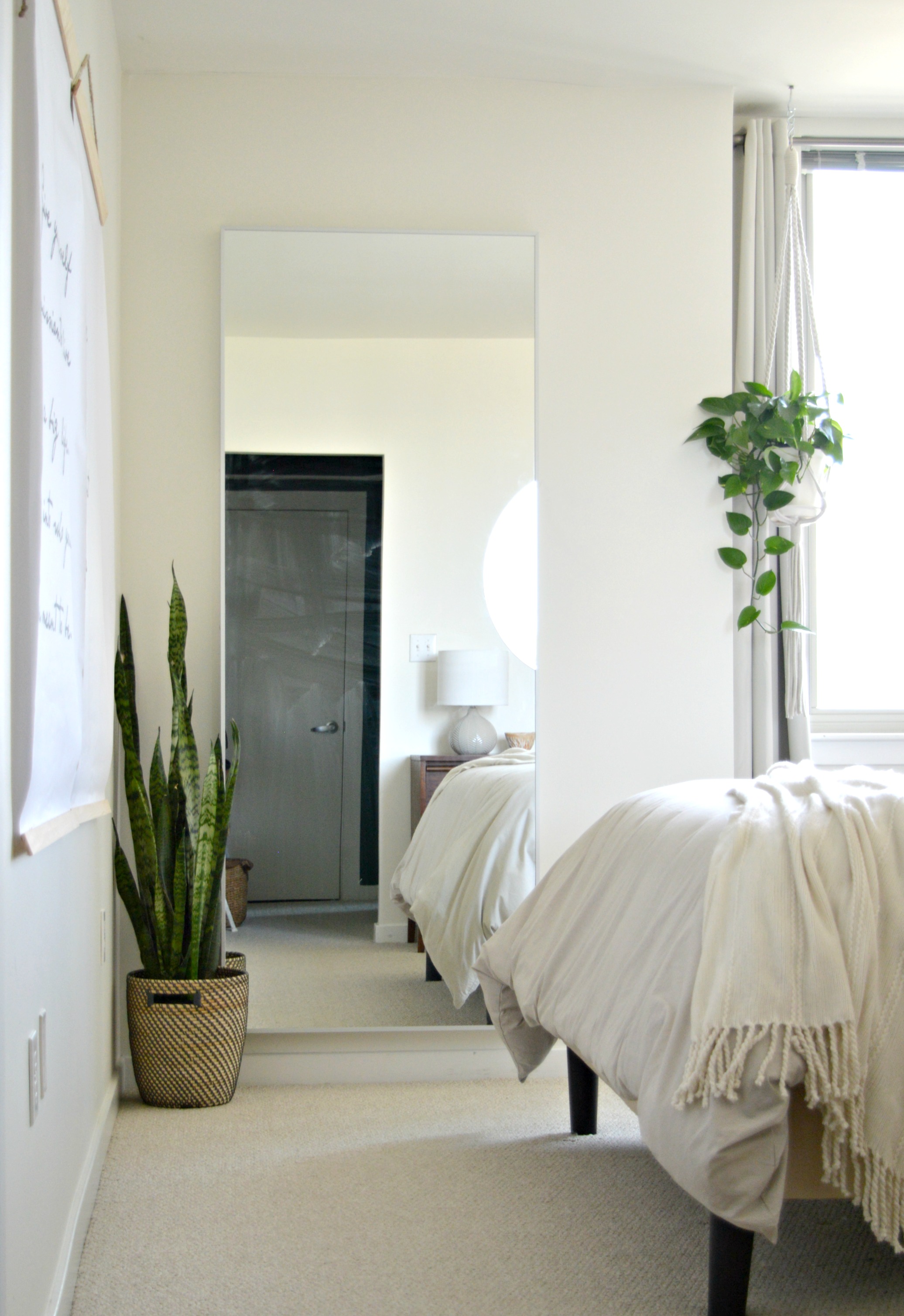
“We live in a Nordic city, so I am very influence by Scandinavian design not only for its style but also for its way of life: simple, modern, warm, and practical. I love wood and try to use it as much as possible along with natural materials such as stone, straw, wool, and cotton. ”


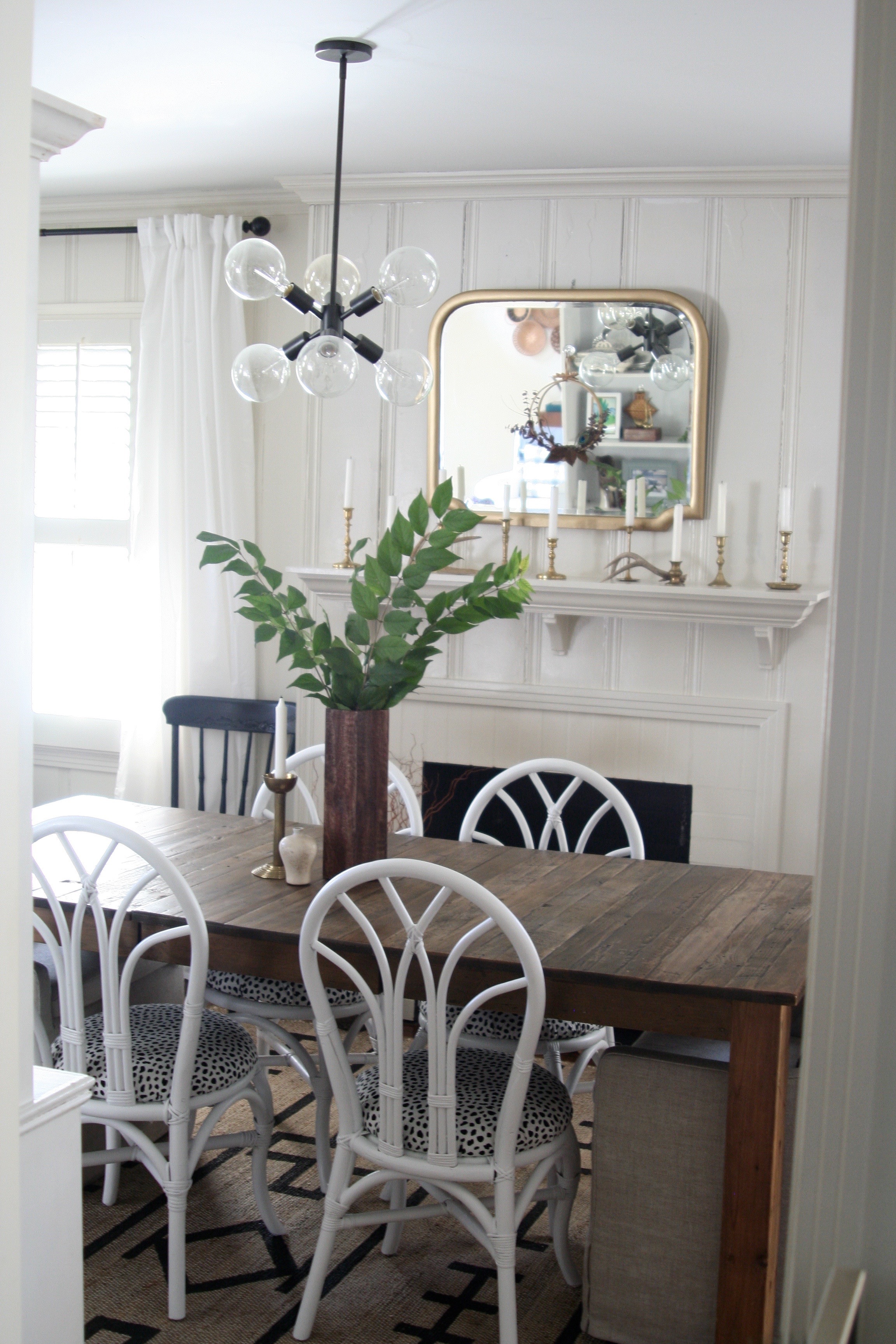
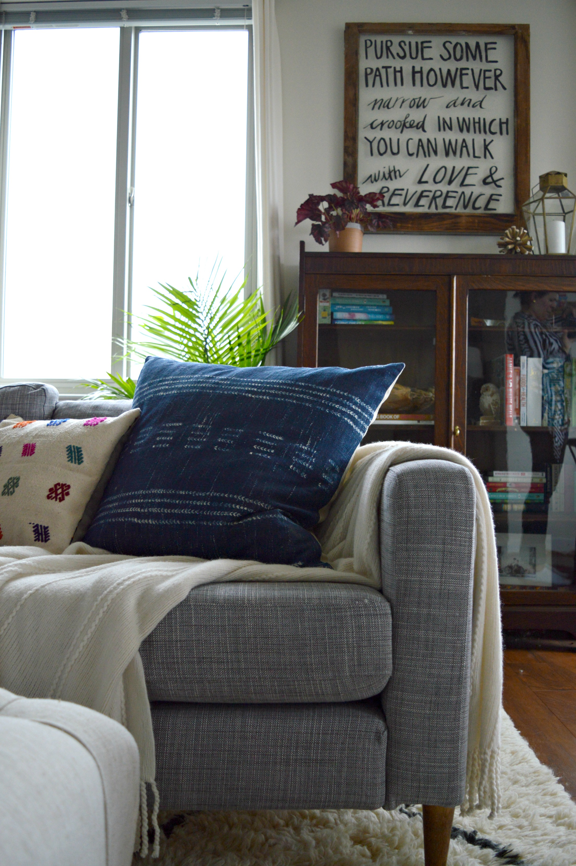
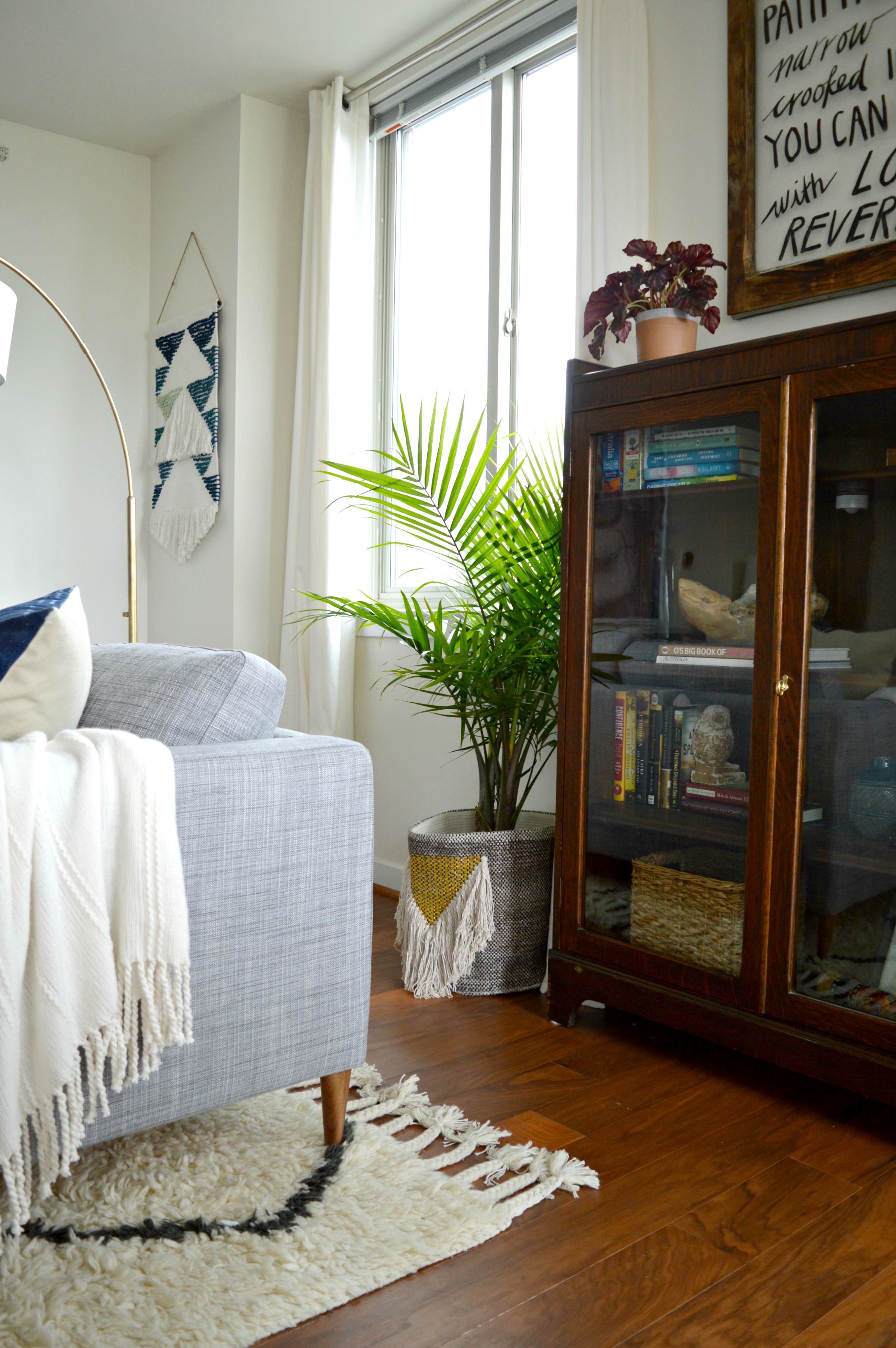
“Midcentury and Scandinavian furniture design offer modern furniture that blend well with many different styles. They are good quality and timeless which is always a good investment. I like to mix them with older pieces such as our tulip dining chairs with our rustic dining table, which we found in an old barn and have had for many years.”


The third consideration is nature. Johanne seriously considered the world around her and took advantage of those influences in every way she could.
“Soothing grays, greens, and earth tones are always a good choice for me. Those are the colors I see when walking on the mountain, but they are also the colors I see when I go on the gorgeous beaches of Maine, USA, where I have spent every single vacation of my childhood and where we have taken our children as well since they were born.”